The Principality of Liechtenstein

This post falls squarely into an imaginary new-to-me category, as it’s apparently been around since 2004 and I’ve never ever seen it before. I’m not sure how, I’m convinced I’ve looked at stuff related to Liechtenstein in the last 6 years, and this is exactly the kind of thing I like. So yes, the other day I was emailed a link to the portal of The Principality of Liechtenstein with a message to have a look at their ‘new’ brand (I think my correspondent may have seen it here on Creative Roots). I’m wondering whether the brand just hasn’t been promoted much — or maybe I’ve just missed it. That website doesn’t do it any favours that’s for sure. Anyway, big surprise: it turns out the brand was designed by Wollf Olins, so I can only assume that their work from 2004 must predate whatever decision they made to push ugly and huh? as brand virtues, as this is rather lovely.

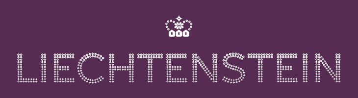
The type is essentially made from dots (an idea I love) and this presents a nice twist on that, using stages on a morph between a flower and a star, theoretically including a circle as one of the steps. According to the brand documentation, the flower represents the agrarian roots of the Principality, the circle is the financial side and the star is ‘industry’. I’m a little unconvinced by that, as I’m pretty sure that industry wasn’t the endpoint in Liechtenstein’s development, nor was finance merely a step along the way. Perhaps it’s best thought of as a device to indicate the range of things you can find in Liechtenstein. Regardless of that, it makes for a pretty story and an attractive logo. The overall effect is of something encrusted in diamonds (or at least Swarovski crystals), though looking at it again I’m reminded a little of early-20th Century theatre illuminations, the old ‘name in lights’ thing. Certainly the associations are of glamour and wealth, which seems to suit the Principality just fine.

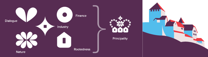
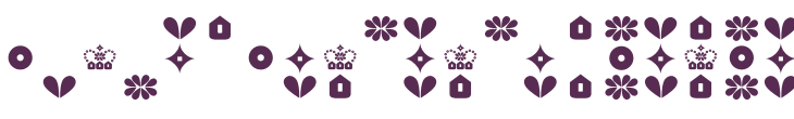
The crown is a nice touch as well, and if I’m honest was what caught my eye at first — one of the perils of using a crown as your own logo I guess. Again, as is apparently unavoidable with country branding, the elements of the crown have particular meaning related to aspects of how Liechtenstein would like you to think it thinks of itself as having (sorry). Made of symbols for nature, dialogue, finance, industry and rootedness the crown works well and forms a recognisable little device when used on its own or with the abbreviated LI mark. The component symbols are used across brochures and other materials as a rather refreshingly retro pattern. I doubt I’m alone in being reminded of 1970s wallpaper, but all in all it works well and compliments the other decorative elements — the flowers, mountains, trees and (especially) that nice illustration of Vaduz Castle.

Alibi

The rebranding of UKTV’s channel lineup has been going on for a while now; every couple of months another of their channels gets a new name and identity, and the original, extraordinarily pleasant and consistent network branding (at right) takes another step closer to oblivion. One of the recent rebrands was for UKTV Style, which got a pretty dreadful implementation of a reasonably nice idea - David Earls wrote more about that on Typographer.org. Next to go is UKTV Food, which will get a logo more suited to a free supermarket magazine (it really reminds me of the old Sainsbury’s one).

I guess you could say I’m not much of a fan of the overall quality of the rebrand, but there are a few good bits in there - Dave, Blighty and Eden are quite pleasant, with some nice ident work. My favourite by far though is Alibi, previously UKTV Drama. They’ve gone for a treatment reminiscent of your fashionable dynamic typography, but incorporated imagery of escape, fear, crime and violence. The typewriter typeface is perhaps a little cliché for the genre, done to death in countless private investigator made-for-tv stuff, but the stylish animation rescues it, keeping the familiar associations while providing some originality and freshness. There’s a montage of the channel idents here, and I’ve a few screenshots below.

Lovely.

Symbol Signs

You can get a wall decal of this from the site - in the ‘Urban’ section. Linked from the image.

I see (via Chris Glass) that AIGA have put the complete set of passenger and pedestrian symbols online, free of charge, apparently for the first time. They can be downloaded from their site here, though beware of the ‘complete set’ zip file, as rather unhelpfully they don’t have file extensions. The story of how the symbols were developed is interesting:

To develop such a system, AIGA and D.O.T. compiled an inventory of symbol systems that had been used in various locations worldwide, from airports and train stations to the Olympic Games. AIGA appointed a committee of five leading designers of environmental graphics, who evaluated the symbols and made recommendations for adapting or redesigning them. Based on their conclusions, a team of AIGA member designers produced the symbols.

The fact we still see (most of) these symbols everywhere speaks of the quality of the design process they employed. The only sign that has changed significantly is the one for ‘shops’ - even without the change in attitudes to smoking, the pipe would appear dated these days anyway. The symbol was also impossibly dense and cluttered. You don’t see the ‘smoking’ sign anywhere these days either (well, not in the UK at least), it’s just that grammatical horror, “It is against the law to smoke in [sic] these premises” on every building, everywhere. It makes me want to vandalise in the name of good English.

Airport, escalator, smoking, shops and restaurant.
Café, heliport, baggage claim and check-in, exit and left luggage.

Hang on a moment. Exit? I truly have never seen that symbol before. I can see the thinking behind it, but clearly it never caught on, and for good reason - it’s far too similar to the ‘no entry’ sign. In an emergency situation you can’t guarantee that either sign would remain perfectly level, just at the time you’d really want people to be able to tell the difference! The Wikipedia page on exit signs (yes, of course there’s one) makes no mention of it either.

Most of the rest of the icons. The one for baby facilities always strikes me as a bit horrid, like the poor child has been dismembered.

London Shop Fronts

I think I saw this one on Coudal Partners, an ongoing photo study of London shop fronts. What fascinates me is the range of type and typography on the shop signs. Some are good, some are strange, some are very strange, and there are quite a lot that are pretty dreadful, all making up what I suppose you could call London Small Shop Vernacular.

Nice bit of signage archaeology on this one.

From time to time I’ve thought of doing this in Brighton, there’s quite a range of shop fronts, and they seem to change quite frequently too. I saw a lovely roundel on the window of a burger takeaway announcing the availability of halal meat, and it got me wondering whether there are any sort of recognised marks for halal and kosher, and it turns out there are. Quite a few of them in fact, and not really very consistent. I guess if you’re sure no-one is actually going to out-and-out lie, these are all consistent enough:

The idea of being ‘consistent enough’ reminds me of other logos for food labelling. There’s the ‘v’ for vegetarian, and sometimes vegan, food - something you see a lot in Brighton. There’s also the Vegetarian Society logo which often gets used by food suppliers whether they have permission to do so or not, but again, no consistent mark for the whole thing. Perhaps with some things there’s no need for consistency because the truth of what the symbol claims can be easily checked, but with other things there definitely is a need. For example, the demand for fairly traded products has led to the development of an official Fair Trade logo. However, there are lots of other ones that imply lovely, fair, environmentally and socially responsible origins, but have so few checks and balances as to be essentially meaningless - greenwashing in other words.

Branding Polaroid

Just saw a link to this site on Coudal about the rebranding of Polaroid, written by Paul Giambarba, who did the rebrand. It’s a fascinating read, and I might post more about it, but the bit about the pre-1957 logo caught my attention. I was looking at the old logo, and wondering why they’d done the ‘a’ like that, and that with the kerning on the other letters it made it look like two words: “Pola roid”. The ‘r’ is a bit odd too. Seems that those weren’t the only problems with the logo identified by Giambarba:

Polaroid is reversed, or dropped-out, from a red patch in a mangled version of a typeface called Memphis. The true Memphis lower case “a” has an upper serif to distinguish it from an “o,” but close inspection will reveal that the upper serif has been removed from the Polaroid “a.” Thus the brand name could be easily misread at quick glance as Poloroid. Of all the counterproductive things one can do in commerce, this was outrageously stupid, especially when spending considerably to launch a new line of products. Paul Giambarba
At top, the pre-1957 Polaroid logo, in the middle, the word typed in Memphis and kerned tightly and at the bottom the same word, but with the upper serif of the ‘a’ removed.

I think that the word looks a load better with the serif. Still, Giambarba had already dismissed the typeface as ‘unreadable’, so the logo was clearly up for bigger changes than the reinstatement of a serif and the demangling of the ‘r’. Go and read the rest of it, it’s worth it.

Steinlager

The FontFeed linked last week to The Dieline’s exclusive on the Pentawards competition results. There are some lovely examples of packaging in there, with some really innovative packaging shapes and structures too, rather than just nice labels on standard packs.

I often wonder when looking at things like this where the incentive came from - it can be hard persuading a client to go with something custom, with all the implications of cost and lead-in times that implies. It (obviously) happens, though I wonder whether any of these agencies might have been simply lucky to have a client bounding in, scattering wads of cash hither and yon, full of enthusiasm for creating something new, exciting and different. I’d like a client like that. Or two. Or three.

Back to the awards: The Gloji bottle at right is lovely, and different, and I imagine it would feel nice in the hand, like a cognac glass. I don’t care for the logo very much though, unlike the Steinlager logo below. More specifically, the ‘S’ in the Steinlager logo. Looking on the company’s site, I see that the version used on their other products is more traditional, and it’s just on this bottle that the blackletter has been pared down, trimmed and shaved to give it that clean, sleek, modern simplicity. I love it. Hard to trace from a picture of a bottle though, but I think I have it about right.

Underappreciated Logos

I came across these two logos recently, the Guild of Food Writers one via NOTCOT, and the Victor one via an Engadget link to this deadly device. The Food Writers one is beautiful; simple, clean and clever - something any organisation would be proud to call its own. The Victor one has a few issues, like the strangely discordant ct, but the V is entertaining and nicely done. So there we go, two nice logos.

So what’s the problem? Well, to look at the websites of these two organisations you’d think they were ashamed of them.

On the Food Writers site I didn’t immediately recognise the logo as being the same one - it’s disguised with that nasty gradient, the cheap glow and the atrocious lettering next to it. I can’t quite reconcile the motivation that commissioned such a great logo from 300million with that of allowing the website to end up looking (and working) like that. Maybe it’s a supplier issue. Maybe they’re working on a new site? Maybe I should pitch a new site to them.

The Victor logo isn’t treated quite as badly, so while it has completely unnecessary bevels and shadows applied at various sizes and angles on the site and other materials, on the product itself it’s used cleanly and simply. If you look closely at the Victor® Multi-Kill™ Electronic Mouse Trap (!) the power indicator is a glowing green version of the V from the logo, so there’s hope. It’s such a shame that in every other application, it’s smothered with cheap, lazy effects.

T-Mobile, Vodafone and Santander

Johnson Banks posted this quick (but effective) re-do of the T-Mobile logo on their Thought for the Week site. Despite a deep and abiding fondness for the colour pink, I’ve never liked the T-Mobile logo - the whole thing looks like something an ’80s financial recruitment firm might have used - changing the typeface to, say, Rotis would only complete the effect.

Before and after, by Johnson Banks.

Now for a thought of my own: I was wondering about the other major (UK) mobile operator logos, and released that I was starting to confuse the Vodafone logo with the Santander one. Maybe it’s because I’ve got a bit of a cold at the moment and my brain is addled but what with Santander advertising heavily (and buying UK banks at rock-bottom prices) and Vodafone not having any strong campaign on at the moment, is the central-white-symbol-on-red-ground space at risk of being usurped?

OK, I’m not being entirely serious, but there is a point where a company gets so large that it is no longer associated in people’s minds with its original economic sector, but more the category known as Huge Multinational Mega-Corporations, and this is where brands can really start to get confused in the marketplace. The logos are of course different, but in this case (in Europe) we’re used to banks bought by Santander having their brand (but not their name) changed to fit the parent company, so the potential for confusion grows, “Oh, it must be another company Santander bought…”

StyleStation

There’s some lovely identity and online design work here. I found it via Graphic Exchange, who commented that the presentation style adds to the visual appeal. I have to agree. Identity work is often about the feel and weight of the physical artifacts - the headed paper, folders, envelopes - and a good way to document them is with good macro photography. You can’t feel the paper, but you can see how it might feel.

Anyway, here are some of my favourites - it’s only a very small sample and they’re scaled down quite a bit, so take a look at the full site. The UI of the site is all flash, but it’s a pretty good example of the genre. I like the way the colours change as you move through the work.

Openfolk

You know when you see something and think, “If only that little bit was like this instead of that”? Well I just had that with the Openfolk Manifesto logo by Steve Jankowksi (bottom of the page), which is really rather attractive, but I think I would have ‘squared off’ a couple of the corners, instead of having them all rounded. So, you know, just to verify that idea, I redrew it. To be honest I’m not entirely convinced my redrawing is an undisputed improvement anyway, but it’s fun to play, no?

Also, on that page, take note of the Listening Party Five logo, which is rather nice too (though the roman numeral implies that this is actually Listening Party Four)