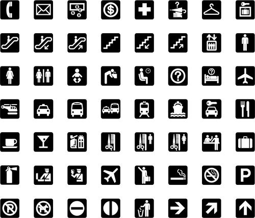
I see (via Chris Glass) that AIGA have put the complete set of passenger and pedestrian symbols online, free of charge, apparently for the first time. They can be downloaded from their site here, though beware of the ‘complete set’ zip file, as rather unhelpfully they don’t have file extensions. The story of how the symbols were developed is interesting:
To develop such a system, AIGA and D.O.T. compiled an inventory of symbol systems that had been used in various locations worldwide, from airports and train stations to the Olympic Games. AIGA appointed a committee of five leading designers of environmental graphics, who evaluated the symbols and made recommendations for adapting or redesigning them. Based on their conclusions, a team of AIGA member designers produced the symbols.
The fact we still see (most of) these symbols everywhere speaks of the quality of the design process they employed. The only sign that has changed significantly is the one for ‘shops’ - even without the change in attitudes to smoking, the pipe would appear dated these days anyway. The symbol was also impossibly dense and cluttered. You don’t see the ‘smoking’ sign anywhere these days either (well, not in the UK at least), it’s just that grammatical horror, “It is against the law to smoke in [sic] these premises” on every building, everywhere. It makes me want to vandalise in the name of good English.


Hang on a moment. Exit? I truly have never seen that symbol before. I can see the thinking behind it, but clearly it never caught on, and for good reason - it’s far too similar to the ‘no entry’ sign. In an emergency situation you can’t guarantee that either sign would remain perfectly level, just at the time you’d really want people to be able to tell the difference! The Wikipedia page on exit signs (yes, of course there’s one) makes no mention of it either.

