The rebranding of UKTV’s channel lineup has been going on for a while now; every couple of months another of their channels gets a new name and identity, and the original, extraordinarily pleasant and consistent network branding (at right) takes another step closer to oblivion. One of the recent rebrands was for UKTV Style, which got a pretty dreadful implementation of a reasonably nice idea - David Earls wrote more about that on Typographer.org. Next to go is UKTV Food, which will get a logo more suited to a free supermarket magazine (it really reminds me of the old Sainsbury’s one).
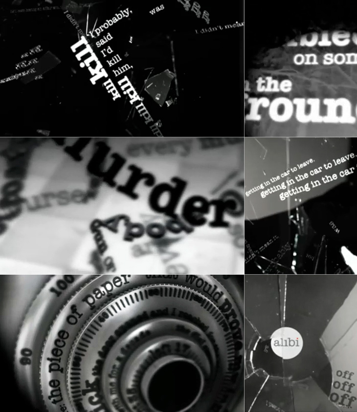
I guess you could say I’m not much of a fan of the overall quality of the rebrand, but there are a few good bits in there - Dave, Blighty and Eden are quite pleasant, with some nice ident work. My favourite by far though is Alibi, previously UKTV Drama. They’ve gone for a treatment reminiscent of your fashionable dynamic typography, but incorporated imagery of escape, fear, crime and violence. The typewriter typeface is perhaps a little cliché for the genre, done to death in countless private investigator made-for-tv stuff, but the stylish animation rescues it, keeping the familiar associations while providing some originality and freshness. There’s a montage of the channel idents here, and I’ve a few screenshots below.