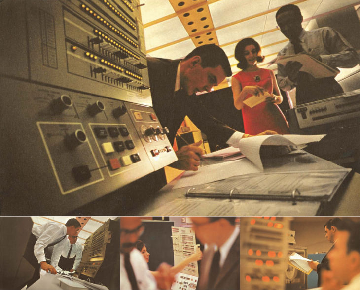
IBM have produced and commissioned some lovely stuff over the years, and their mid-century brochures and advertising are well-admired today. It’s the kind of quality they’re clearly aiming to recapture with their recent hiring and investment in design. There’s some gorgeous photography in this late ’60s brochure of theirs for the System/360 I found via Dinosaur’s Pen (which is a fantastic site for historical UI and product design).
I took these images from the PDF linked here and below
The warm lighting and careful use of a shallow depth of field is more used today for domestic products and holiday advertising, to see it used for a corporate context feels fresh and inviting. Odd, I know, given the age of it. There’s a bit much of the blue-toned high-key stuff around for ‘business’ imagery and I’m wondering whether we’ll see a retro fashion here too.
There’s a bit more info available on IBM’s promotion of the System/360 too. Following the trail of links finds this Flickr set by Colorcubic. They don’t want you downloading the photos they scanned in, but a quick search not only finds a PDF of the brochure but IBM’s own history of the system with more info and photos. To answer Shelby White’s question here, IBM’s designers didn’t overlay the photos with text, the design is quite reserved.
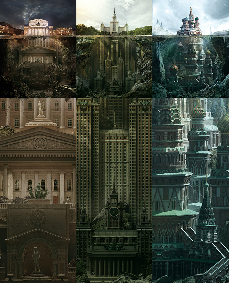
I could look at these illustrations all day. They’re for a press and outdoor campaign promoting the Schusev State Museum of Architecture. Compositionally they remind me of that iceberg image, which seems appropriate given the brief to show the history of architecture going much deeper than the buildings you see. The quality of the modelling and illustration is excellent and are well worth looking at more closely in the larger images. I think the sketch images included on Behance and Design You Trust are nice, but (somewhat unrealistically) I’d love to see all the discarded sketches and roughs they made along the way, I bet there are loads of good, interesting ideas that didn’t make it through. The extended buildings (The Bolshoi Theatre, Moscow State University¹ and St Basil’s Cathedral) look amazingly plausible, if a little reminiscent of something Nicolae Ceaușescu might have actually tried to build². The Moscow State University one is already a high-rise building so perhaps looks the most likely, if rather Gotham-esque. The St Basil’s one is just astounding.
Amazing. I rather like the red, green and blue theming of the images too.
As mentioned above, there’s a load of who-did-what information and bigger images on Behance and Design You Trust (where I first saw them), and a zoomable set of images on Carioca Studio’s site too.
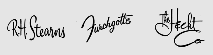
This is something I’ve had open in a browser tab for months, and I’m sure it’s officially ‘old’ in internet parlance, but I’m still drawing inspiration from the images. Christian Annyas has isolated (and traced?) these old department store logos and made quite a collection of them. He makes the point that very few stores today use similar lettered styles to these, and that they go for a logo style that “won’t offend” — I wonder though, if all these logos were created with a similar sentiment in mind? After all, brands in a sector do tend to cluster, so as fashions change, they all change together.
So yes, I’ve been away from the site for, er, way too long. To say, “I’ve been busy” would be a cop-out. I’ve been busy on a few personal projects that have taken up most of my ‘spare’ time and energy, and while they’ve been great fun I’ve definitely missed writing here. I’ve got so many starred “must blog” entries in my RSS reader I’m not sure a lot of them are even relevant anymore. Ho hum.
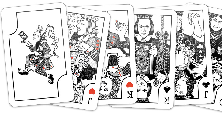
Anyway, those of you who follow my (rather ranty, sweary) personal Twitter account might have already seen these, but the big, huge personal project is nearly done – a set of playing cards. Each of the court cards represents an obsession, with a theme per-suit connecting them, Wealth, Science, Dogma and Pleasure. The joker represents Time and Death, the end of any and all obsessions. I’ve still to design the packaging and (of course) get them printed but when they’re ready I’ll be selling them, probably as some kind of limited edition type affair. They’ve been absolutely enormous fun to do, so here’s a little sneak peek:
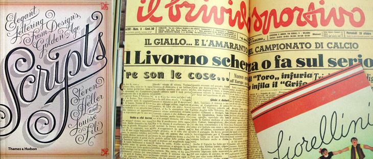
I’ve been sent a book by Thames & Hudson that I think is worth putting on here. The (slightly contentious) title is Scripts: Elegant Lettering from Design’s Golden Age*, and shows the collection by the authors, Steven Heller and Louise Fili, of handbills, flyers, posters, photos of signs, type samples, you name it, as long as it’s got script lettering or type on it. I’ve linked to a few big online collections of ephemera before, but never seen one in book form before. The photos are clear and detailed, and while I regret some (all) of the arty cropping, it’s a pretty good resource if you want to research scripts. The collection is broken down by country of origin (rather than by era or style, say) so there are chapters for French, British, German, Italian and American scripts. Thankfully, each chapter has at the end a listing of the origins of each of the pictured pieces, which provides some much needed context; however, I think I’d prefer to have had each image captioned, even if that might have reduced the impact of some of the spreads. A personal preference, I think; your mileage may vary. It’s definitely a book to enjoy browsing through, which is what I’ve been doing, funnily enough.
Interestingly, the book design is by Jessica Hische — I immediately thought of her lettering when I saw the cover, above left.
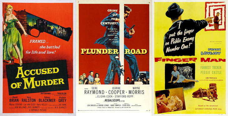
Andy Clarke (aka @malarkey) tweeted a couple of links to Where The Danger Lives, a site on crime films, which has reviews and in-depth info on classic crime and noir films, studios, and recently, a countdown of the best posters used to advertise the films. Each poster has been restored and cleaned up so you can see it clearly (with links to a decent size larger version to look at) and an illuminating analysis of the design and how it fits the film. It’s all pretty impressive stuff so far (I’ve only read a few of the posts as of writing this), so go and take a look.
This caught my eye on the Lovely Ligatures Flickr group — it’s a piece of client work by the talented bunch at Like Minded Studio. So much of their work is just the kind of thing that has me looking closer, perhaps with a touch of chagrin that it wasn’t me that did it, there’s so much incredibly detailed work going on there. Go and take a look at their site to see more of their work.
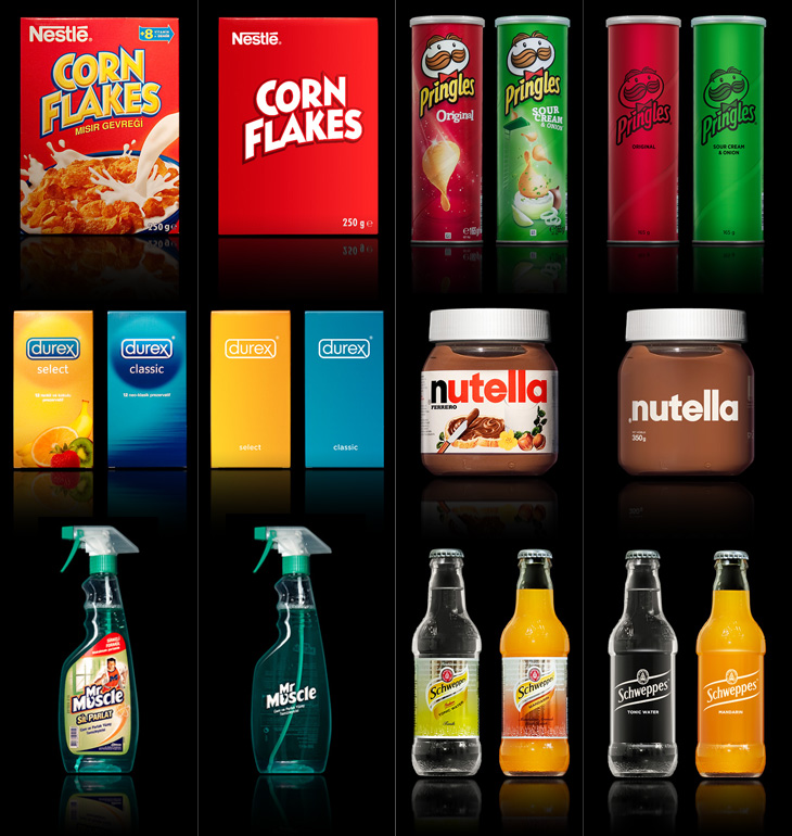
A few people tweeted links to this brilliant collection of packaging redesigns by Antrepo — they’re done as an exercise to illustrate the idea of reducing the design of the labelling to its simplest form, while also showing an intermediary step of a ‘partially simplified’ design. It’s interesting the effect it has on the different products. Some gain a sense of being a premium, high-value product, while others start to resemble economy, basic versions. The Pringles packs look pretty basic; with the full-colour printing gone, the basic nature of the cardboard tube stands out, and with the simple black printing it looks like a supermarket own-brand or something bulk-bought by caterers. On the other end of the scale you have Nutella and the Schweppes drinks — both of them look like the kind of ‘artisanal’ packaging you’d see featured on the Dieline or similar targeted at people who want the same old stuff but to feel a bit special about buying it. And having said that, the Corn Flakes one is just great. It’s absolutely perfect — if I ate cereal then packaging like that would definitely have shelf appeal with that beautifully simple and stark lettering, and how. It reminds me a little of the General Mills Kix packaging, which I also like a lot.
Visit Antrepo’s site for more info and links to the full set.
Of course, packaging for most fast moving consumer goods is brightly coloured and covered in imagery for a reason — it’s to draw the eye and make its purpose, contents or intended use immediately obvious to the shopper. Without going into some kind of pop-psychology analysis of consumer habits, it’s interesting to think what the manufacturers are intending with each package. The simplified Mr Muscle one looks great, but on the original you can easily tell it’s for windows and tiles even without reading any of the words. Similarly for the Durex boxes, I’d hazard a guess and say the orange box contains flavoured ones — the word ‘select’ hardly makes that clear — again, the original packaging wins out.
The food ones all have some kind of serving suggestion (albeit a ridiculous one in the case of the Corn Flakes, I mean, that’s quite a tempest going in the bowl) designed to put the image of the food in your mind, a simple association that makes you more likely to buy it. The only one I think where that doesn’t happen is with the Schweppes bottles. The type is pretty small on the simplified one, but it’s a hell of a lot more legible than the original. Given that you’re likely to see bottles like these in a fridge behind a bar, you’re going to be hard-pressed to read the label and form an idea in your mind that maybe you’d want mandarin as the mixer in your drink, as opposed to orange juice, say. You’re going to look and see confusing labels all done up with sparkles and images of bubbles, and not know if it’s soda and plain old OJ in them or something more special. You’d just end up asking for something generic, and end up (in a lot of British pubs at least) with some rank pre-mix out of a tap on the bar. I could mention at this point that Red Bull might be considered drinkable by some, and therefore a food. It’s not, but it is easily recognisable in a behind-the-bar fridge, which tells you something about British pubs and the drinking culture they encourage, but that’s an entirely different rant.
So yes, beautifully simple packaging is a wonderful idea, but I doubt we’ll see many big manufacturers opting for it, sadly.
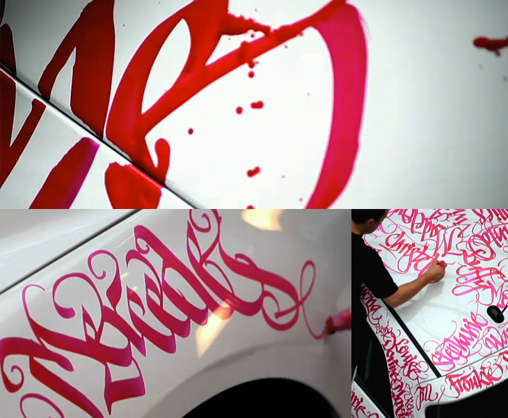
This has been around for a while, but I’ve only just seen it. Niels Meulman of Calligraffiti (AKA Shoe) was commissioned to customise a Mercedes-Benz B-Class by the Pink Ribbon Foundation in the Netherlands. The work consists of hundreds of women’s names, representing the Dutch women the foundation works to help, and is a product of Mercedes’ sponsorship of the foundation. Whatever you think of corporate sponsorship, the end result is pretty spectacular. I especially like the excess ink running down the side of the car, it enriches the flamboyance of the hand lettering and is a welcome contrast to the usual corporate image of Mercedes — and is a badge of honour to confound the cynics, that yes, this was done by hand, live, as it were. Go and look at the video, but I warn you, this is YouTube, so the usual vile trolls have infested the comments.
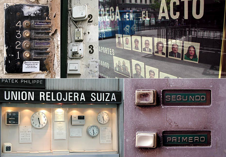
Me Design Magazine highlighted this fascinating project, While Stocks Last by designer Leandro Lattes; a massive collection of photos of Madrid, across two books, documenting the incidental details of the city; shop signs, intercom buzzers, bars, cafés and the like. I’m normally pretty wary of ‘found type’ collections as they tend to lack any kind of context, analysis or insight — or indeed any sense that they are curated, but what makes this different is the restriction to the one city, and the intent to document things that are likely to disappear without record. There’s very much the power of the collection going on with projects like this; individually the objects and scenes may have some interest, but all together like this they draw you in — the similarities and differences become compelling and before you know it you’ve lost an hour or two. Go and take a look.