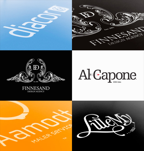
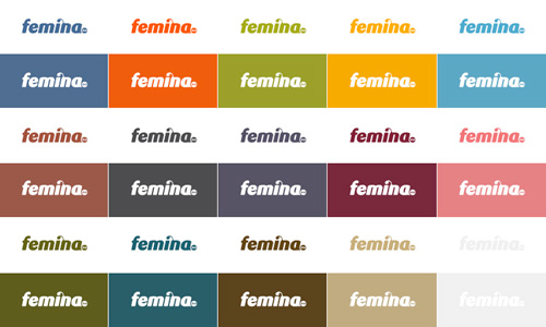
There’s some lovely identity and online design work here. I found it via Graphic Exchange, who commented that the presentation style adds to the visual appeal. I have to agree. Identity work is often about the feel and weight of the physical artifacts - the headed paper, folders, envelopes - and a good way to document them is with good macro photography. You can’t feel the paper, but you can see how it might feel.
Anyway, here are some of my favourites - it’s only a very small sample and they’re scaled down quite a bit, so take a look at the full site. The UI of the site is all flash, but it’s a pretty good example of the genre. I like the way the colours change as you move through the work.


