The FontFeed linked last week to The Dieline’s exclusive on the Pentawards competition results. There are some lovely examples of packaging in there, with some really innovative packaging shapes and structures too, rather than just nice labels on standard packs.
I often wonder when looking at things like this where the incentive came from - it can be hard persuading a client to go with something custom, with all the implications of cost and lead-in times that implies. It (obviously) happens, though I wonder whether any of these agencies might have been simply lucky to have a client bounding in, scattering wads of cash hither and yon, full of enthusiasm for creating something new, exciting and different. I’d like a client like that. Or two. Or three.
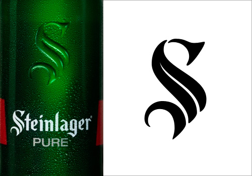
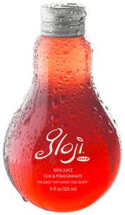
Back to the awards: The Gloji bottle at right is lovely, and different, and I imagine it would feel nice in the hand, like a cognac glass. I don’t care for the logo very much though, unlike the Steinlager logo below. More specifically, the ‘S’ in the Steinlager logo. Looking on the company’s site, I see that the version used on their other products is more traditional, and it’s just on this bottle that the blackletter has been pared down, trimmed and shaved to give it that clean, sleek, modern simplicity. I love it. Hard to trace from a picture of a bottle though, but I think I have it about right.