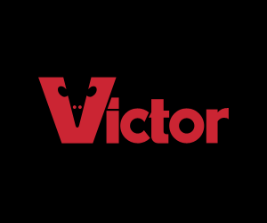
I came across these two logos recently, the Guild of Food Writers one via NOTCOT, and the Victor one via an Engadget link to this deadly device. The Food Writers one is beautiful; simple, clean and clever - something any organisation would be proud to call its own. The Victor one has a few issues, like the strangely discordant ct, but the V is entertaining and nicely done. So there we go, two nice logos.
So what’s the problem? Well, to look at the websites of these two organisations you’d think they were ashamed of them.
On the Food Writers site I didn’t immediately recognise the logo as being the same one - it’s disguised with that nasty gradient, the cheap glow and the atrocious lettering next to it. I can’t quite reconcile the motivation that commissioned such a great logo from 300million with that of allowing the website to end up looking (and working) like that. Maybe it’s a supplier issue. Maybe they’re working on a new site? Maybe I should pitch a new site to them.
The Victor logo isn’t treated quite as badly, so while it has completely unnecessary bevels and shadows applied at various sizes and angles on the site and other materials, on the product itself it’s used cleanly and simply. If you look closely at the Victor® Multi-Kill™ Electronic Mouse Trap (!) the power indicator is a glowing green version of the V from the logo, so there’s hope. It’s such a shame that in every other application, it’s smothered with cheap, lazy effects.