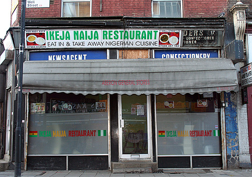
I think I saw this one on Coudal Partners, an ongoing photo study of London shop fronts. What fascinates me is the range of type and typography on the shop signs. Some are good, some are strange, some are very strange, and there are quite a lot that are pretty dreadful, all making up what I suppose you could call London Small Shop Vernacular.
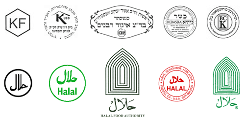
From time to time I’ve thought of doing this in Brighton, there’s quite a range of shop fronts, and they seem to change quite frequently too. I saw a lovely roundel on the window of a burger takeaway announcing the availability of halal meat, and it got me wondering whether there are any sort of recognised marks for halal and kosher, and it turns out there are. Quite a few of them in fact, and not really very consistent. I guess if you’re sure no-one is actually going to out-and-out lie, these are all consistent enough:
The idea of being ‘consistent enough’ reminds me of other logos for food labelling. There’s the ‘v’ for vegetarian, and sometimes vegan, food - something you see a lot in Brighton. There’s also the Vegetarian Society logo which often gets used by food suppliers whether they have permission to do so or not, but again, no consistent mark for the whole thing. Perhaps with some things there’s no need for consistency because the truth of what the symbol claims can be easily checked, but with other things there definitely is a need. For example, the demand for fairly traded products has led to the development of an official Fair Trade logo. However, there are lots of other ones that imply lovely, fair, environmentally and socially responsible origins, but have so few checks and balances as to be essentially meaningless - greenwashing in other words.