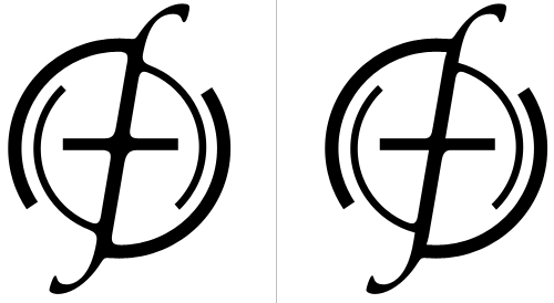
You know when you see something and think, “If only that little bit was like this instead of that”? Well I just had that with the Openfolk Manifesto logo by Steve Jankowksi (bottom of the page), which is really rather attractive, but I think I would have ‘squared off’ a couple of the corners, instead of having them all rounded. So, you know, just to verify that idea, I redrew it. To be honest I’m not entirely convinced my redrawing is an undisputed improvement anyway, but it’s fun to play, no?
Also, on that page, take note of the Listening Party Five logo, which is rather nice too (though the roman numeral implies that this is actually Listening Party Four)