Responsive Logos

This site, Responsive Logos, is something I've had in my bookmarks for a while. I normally browse sites on an iPad and this one really needs a browser you can resize to get the full effect. Most brands (especially the big ones) will have variations on their logos for use in various contexts; logos for giant billboards will be different from those used on tiny black and white guarantee cards, say. Online, the story can be a bit different, with any adjustment to the browser size or context just left to resizing the one logo graphic. Some are done differently, and I've made a few sites that switch to a simpler logo, but it's not that widespread from what I can see.

Just in case you can't resize your browser, these are the Guinness variations

What Joe Harrison has done is take some big-name brands and simply and beautifully show how each can respond to a smaller browser size (or viewport, in the parlance). They all look like the real thing so I'm not sure whether he's created new images or got the smaller and simpler versions direct from the brand guidelines for each. It's a nice little site and a great demo if you ever have to explain it, to a client, say.

Image from Joe Harrison's site

More fun are these Responsive Icons (or Rspnsv Icns) he's done, that you might remember from earlier in 2014.

The Chicago Neighbourhoods

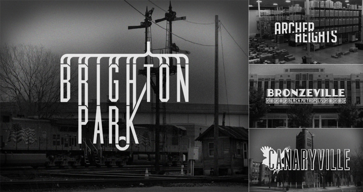
Kelly from Design Crush linked to this last week, a project by designer and Chicagoan Steve Shanabruch to create a logo for each of the Chicago neighbourhoods. Some, he says, are based on personal experience, and others on research. He’s created a lovely set of graphics so far, all of them remind me of old movie title cards (or end cards, like these), some look like they could actually be names of movies set in the neighbourhood.

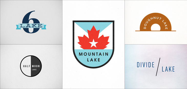
There’s something particularly compelling about design projects like these, they trigger a sort of completist tendency in me, an appreciation of the collection as object. I like sets of things, and interpretations (and reinterpretations) of things particularly so. Thinking of this, I was reminded of the Branding 10,000 Lakes project by Nicole Meyer, to design an identity for each of the lakes in Minnesota (which is indeed known as The Land of 10,000 Lakes). There are some lovely ones in the collection. Some recent ones here:

Lettered Department Store Logos

This is something I’ve had open in a browser tab for months, and I’m sure it’s officially ‘old’ in internet parlance, but I’m still drawing inspiration from the images. Christian Annyas has isolated (and traced?) these old department store logos and made quite a collection of them. He makes the point that very few stores today use similar lettered styles to these, and that they go for a logo style that “won’t offend” — I wonder though, if all these logos were created with a similar sentiment in mind? After all, brands in a sector do tend to cluster, so as fashions change, they all change together.

A Slight Update

Logos from 2007, 2009 and now 2011

You may have noticed a slight change in the design of the site. I didn’t want to make big changes, as I rather like the way it all looks, but wanted to clean up a few things and remove a few things that felt tired — it’s a design iteration if you will. So, the pages are opened up and I’ve lost the dark grey surrounding background. I’ve kept the right hand margin visible though — I like being able to ‘bleed’ images off the edge, and it helps to have an edge there to start with. A more significant change is the new typeface; I’ve switched to Bliss by Jeremy Tankard, provided by Fontdeck. It’s a face I’ve used on a few client projects recently and I’ve really enjoyed working with it, so I found myself playing around with the templates here, and yes, I just had to use it.

Then, there’s a change that I almost forgot I’d made — the logo. I’ve trimmed the black bar, but also simplified the crown yet further.

Lettercult: A Year In Custom Lettering 2010

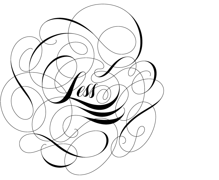
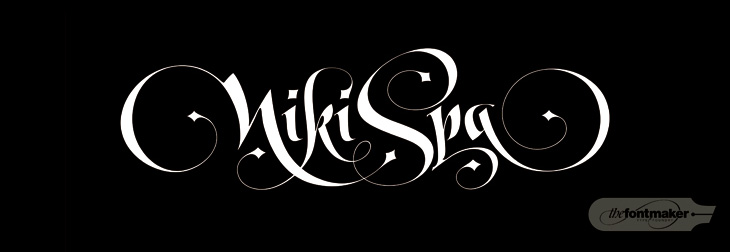
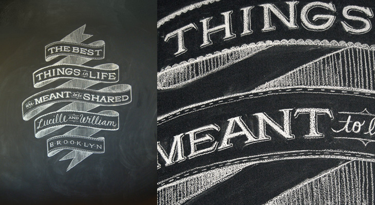
Lettercult has posted an incredible collection of custom lettering projects by hundreds of lettering artists, all completed in 2010. There are so many projects that they’ve split the post across two days, and there are 33 (quite long) pages in each post. I’ve not had a chance to go through all of them yet, but the variety and the quality is remarkable — so much to look at! I’ve posted a few favourites below, one by David Croy, another by Jordan Jelev of The Fontmaker, and I’d be surprised if you’ve not seen her work already (but very worthwhile admiring again), a piece by Dana Tanamachi.

By David Croy

By Jordan Jelev of The Fontmaker

By Dana Tanamachi

Chemical Color Corporation

I wanted to trace this for the fun conceit of the C being used as a retort stand. It’s an interesting way of dealing with the open space created inside the Ch pair — I don’t think it quite works, the horizontal bar is a bit clumsy and the positioning of the retort glass itself could be more balanced, but it is all rather fun. I’ve traced it as best I can, not having any higher resolution example than what you see below, so yes, the script is quite clunky. At a certain point you realise you’re creating rather than copying. Who knows, maybe the original was even more wonky? I’d love to see a high-res example of it though. Originally seen here on CO₂Comics, via Drawn.

The Royal Opera House

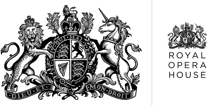
Definitely catching up with old news with this one; I’ve had this Brand New article on the new Royal Opera House identity by Someone bookmarked for a while. If you’ve not seen it already, the new identity centres on a fantastic new cut of the royal crest by Christopher Wormell and is supported by new type and image guidelines. The new typeface is Gotham Light, which is lovely and works wonderfully with the new brand, but I can’t help but feel a little sad to see the Caslon-esque old wordmark go. Still, if it had to go, it had to go, and given how Covent Garden looks and feels nowadays Gotham is a good choice — it’s a fresh clean and light companion to the dense complexity of the crest, and works perfectly with the more modern layouts and imagery they’re using, but was Gill really just too much of a cliché?

The new crest and logo

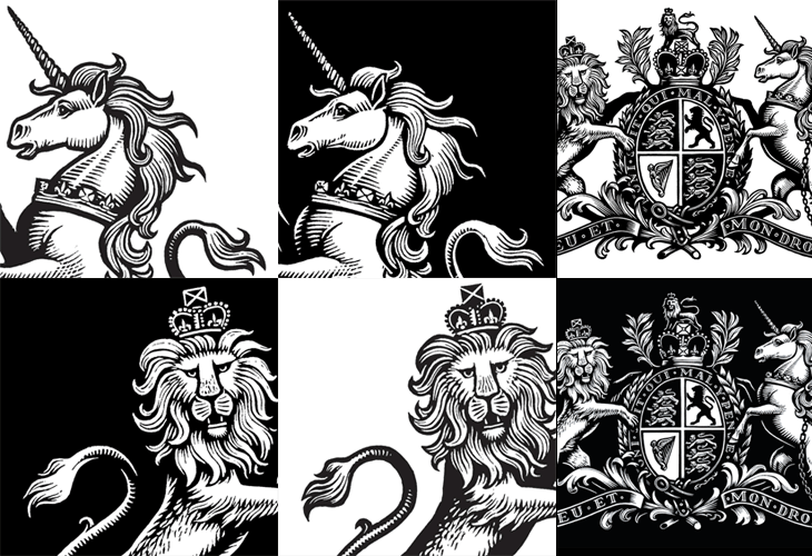
The new crest itself is wonderful. The old one had a certain old-time charm to it, but next to the new one it looks distinctly shabby. Like Armin Vit, I’m especially impressed that they produced two versions for use on light and dark backgrounds, rather than simply inverting the image. The work is so well done that it’s hard to work out what’s actually different between the two images — they’re not just outlined or trimmed, the thickness, detail and density of each image is different, but designed to give the impression they’re the same. Clever and skillful work by a true master of engraving:

Palindrome

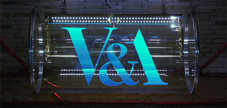
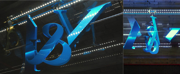
This new sign for the V&A is wonderful. The museum commissioned Troika to make a sign for the tunnel connecting the museum and South Kensington tube station, and it’s bloody gorgeous. It’s a kinetic sculpture, rotating parts of the museum’s logo (in itself a wonderful thing, by Alan Fletcher in 1989) so that it reads at first from one side, and then from the other. I did wonder at first whether the V and A on Fletcher’s original logo were actually rotationally symmetric, and no, of course they aren’t, but for a sculpture like this the alteration to make them work like that isn’t at all noticeable. Go and watch the video (or of course, visit the museum) to see it in action. It’s so simple and yet so clever, whoever came up with the idea must have been quite pleased with themselves, and justifiably so.

Pictures from Troika’s site.

Not symmetric, but close enough for kinetic sculptural fun.

One to Like

John Beohm of Idents.tv posted the six new idents for Australia’s ONE HD tv channel — I don’t have much to say on them other than they’re lovely and simple and I really like the logo. As John points out, it’s good that they avoid the crass overdone clichés of floodlit stadia and huge billboards, generally I don’t find myself watching sports channels but of what I’ve seen their idents (and identities) are all pretty much of a muchness. Lots of glassy, glossy, glittery effects, dramatic perspectives across giant dystopian stadia-cities shrouded in perpetual night; the impression you’re supposed to get is that this is epic, this is a clash of titans, a great battle to end all battles, an extraordinary experience that will resonate through time and space, this is it, and then, just as you’re (theoretically) driven to the very peak of excitement and anticipation, here’s the golf. Woo.

So yes, it’s nice to have a set of idents that have some of the actual sporting action in them. The logo looks to be a very slightly tweaked Helvetica Black — the version I have has a slightly wider aperture in the lowercase e (but it could just be the 3D rendering creating the illusion). The curve cut out of the bottom hints slightly of the epic view-over-the-horizon style of usual sports channel logos, but it’s subtly executed and provides a perfect frame for the HD suffix. Anyway, slightly more than I was intending to write on this one. It’s nice. Go and watch the videos on Idents.tv.

Kineda

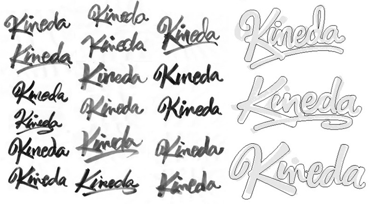
I was reading the latest post on The Art of Hand Lettering earlier and found the stages in the process fascinating, in that I preferred some of the sketches to the end result. I do really like the final logo, but there was something about one of the on-screen workings of the logo that I thought really brought the word alive — it’s the one in the detail I cropped from the article at the bottom right below. There’s something really playful about it, like the rest of the word is being bounced along by the K. Still, that’s my impression and it most likely wasn’t the client’s intention — and that’s the difference between doing stuff for yourself and doing stuff for paying clients!