Just saw a link to this site on Coudal about the rebranding of Polaroid, written by Paul Giambarba, who did the rebrand. It’s a fascinating read, and I might post more about it, but the bit about the pre-1957 logo caught my attention. I was looking at the old logo, and wondering why they’d done the ‘a’ like that, and that with the kerning on the other letters it made it look like two words: “Pola roid”. The ‘r’ is a bit odd too. Seems that those weren’t the only problems with the logo identified by Giambarba:
Polaroid is reversed, or dropped-out, from a red patch in a mangled version of a typeface called Memphis. The true Memphis lower case “a” has an upper serif to distinguish it from an “o,” but close inspection will reveal that the upper serif has been removed from the Polaroid “a.” Thus the brand name could be easily misread at quick glance as Poloroid. Of all the counterproductive things one can do in commerce, this was outrageously stupid, especially when spending considerably to launch a new line of products. Paul Giambarba
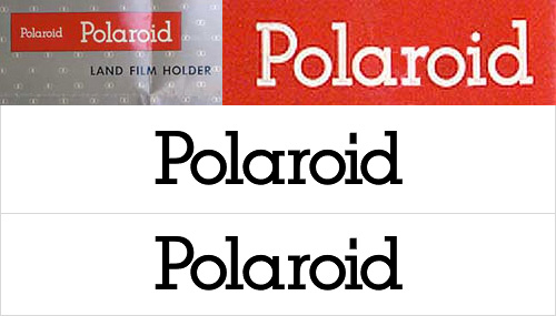
I think that the word looks a load better with the serif. Still, Giambarba had already dismissed the typeface as ‘unreadable’, so the logo was clearly up for bigger changes than the reinstatement of a serif and the demangling of the ‘r’. Go and read the rest of it, it’s worth it.