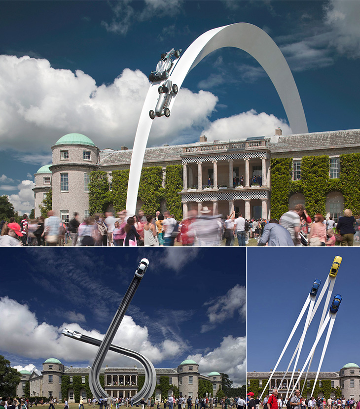
It must be the future already because, look, flying cars! It turns out that there’s been a whole series of these sculptures over the years at Goodwood Festival of Speed by Gerry Judah. I saw the photos of this year’s one on Dezeen and thought it was a nice concept rendering, but no, it’s real. What a thing!
I’ll have to go next year. Goodwood is almost literally round the corner from where I live.
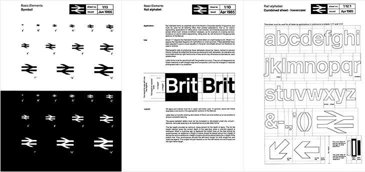
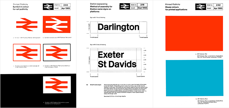
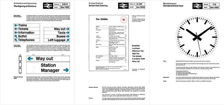
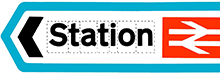
Here’s a glorious bit of design nostalgia for the New Year. It’s hardly a new find on the web; designer Nick Job first started this archive of the British Rail identity manuals in 2011, but I’ve just been reminded of it. Somehow I’ve never written about it either, which is a bit of an oversight given the entirely-unofficial and tongue in cheek name of this site: the British Rail alphabet and signage guidelines were also used by the British Airports Authority and National Health Service, making them as much a government standard as Britain ever usually manages.
The alphabet had two variants, one for dark-on-light type and one for light-on-dark. Light (and illuminated) type on dark backgrounds creates an optical effect known as ‘halation’ - i.e. it develops a halo, a slight sense of the letterforms being thicker than they are. To cope with this, the letterforms are reduced by the width of an outline for the lighter type, shown in the last panel above — while retaining the same spacing and other details of the type. It’s worth pointing out that a revival of the typeface is now available to license and as a web font from FontDeck.
For the non-British (or the very young) British Rail was the nationalised entity that ran the vast majority of railways (and a few ferry routes and other transport-related things) in the UK, beginning in 1948¹. It was rarely out of the news (more so on slow news days) for ‘record losses’, ‘strikes’, ‘failures’, ‘delays’ and so on. Starting in 1994 the network was dismantled and sold off, with the last few bits sold in 1997. Instead of a nationally-owned monopoly, we have regional monopolies owned by a variety of companies and (perhaps amusingly), the nationalised rail corporations of other countries. The headlines are now about ‘record price rises’, ‘record profits’ (also: greedy executives and shareholders), ‘overcrowding’, and yes, ‘delays’. According to the polls², privatisation is generally considered to have been a Very Bad Idea and Can It Go Back To How It Was, Please. Whatever your view or politics on the matter are, running an at-capacity rail network will never make you popular with the people who have to use it. I’m being charitable there.
Despite each of the rail operating companies having their own brands, for most British people the British Rail identity is still a familiar part of the landscape, with the logo being the road sign symbol for any rail station, and much of the signage (especially at smaller stations) unchanged from pre-privatisation days. But what an identity! The whole thing is such a brilliantly consistent and well-designed system, owing much of its strength to its crisp, stark simplicity, to its minimalism and almost-total reliance on typography alone. There’s so little to it that there’s very little (virtually nothing) that can ever really look out of date or old fashioned — sure in the 80s everyone³ had a thing for Rotis (for heaven’s sake) and there was that grunge stuff in the 90s and we’ve had the web and all that⁴, but nothing that was really so outstandingly superior or more modern. What made the identity look bad was the usual thing that ruins most good things: neglect and apathy. A faded peeling sign in a shabby, half-ruined station with leaky roofs and deathtrap toilets is never going to look great, and by the time privatisation came along that was the caricature we were being presented with, and so out it went.
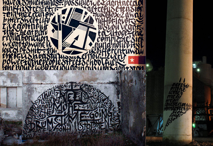
Looking for various calligraphic-related things on image search, on Graffuturism I find the work of Greg Papagrigoriou, a graffiti artist from Athens—or, to use the term, a calligraffiti artist from Athens. He creates densely textured pieces, often collaborating with Simek whose work often acts as a centrepiece or focus. The two artists’ work complements each other perfectly and create striking images that remind me of protest posters or propaganda, but while on these the words flow and possess graphical rhythm, they defy any attempt to be read.
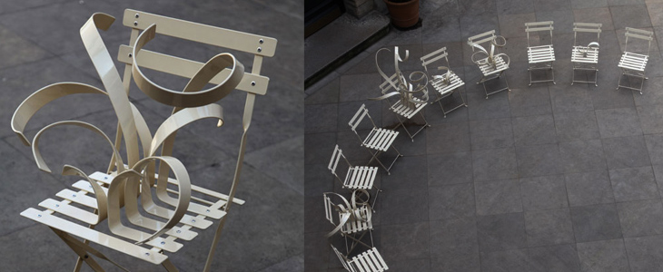
I’ve been buried in bezier-land for the past few weeks these chairs by Suzy Lelièvre, though they’re not type, illustration or lettering, appeal to my appreciation of curves; a physical world instance of beziers. They look like what you get when you try and drag a point in Illustrator and miss, dragging the line itself into some crazed loopy explosion. So yes, noted here for their appeal to all vector designers, and of course their wit.
I love architecture. I love buildings — the art, the engineering, the design, the culture and history of them, and how they form en masse actually places that people recognise and form emotional attachments to; the design of cities, their growth, evolution and (perhaps sadly) eventual decline are all utterly fascinating to me. So I sometimes write about architectural stuff here, as it has a kinship in my mind with the design of type and lettering. I should warn you, this post is a bit of a rant, and because of the subject matter is a tad more political than normal. So, with that out of the way, we can proceed.
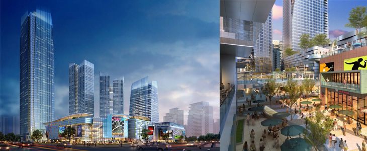
I follow a fair few architecture-related sites, one of which (and the most regularly and rewardingly updated) is Arch Daily. It’s basically a pretty damn fine site if you’re into architecture, featuring thousands of projects, new and old, innovative and traditional, and so on. One important thing I’ve noticed is that most of the larger projects being planned and built have a lot in common with each other, with innovation and traditional technique alike apparently reserved for the smaller projects. I’d actually go further and say these large projects are not merely similar but all subscribe to the same blank, unrelenting anonymity — an utterly uninspiring (if glittering and crystalline) mediocrity. Look at the renders below (from this article on New Chengdu City Center on Arch Daily), they could be anywhere in the world:
We’re not talking about adherence to some new International Style here — these buildings subscribe to no ethos, no design principle, no philosophy. They are the safe, neutral buildings guaranteed to be approved by conservative planning departments wanting the skyline of New York, Chicago or Hong Kong at any cost, ignoring the culture, history and sense of place of the city they’re supposedly ‘improving’, and with little to no apparent understanding of the conditions that gave those cities their skylines. Oh sure, they’ll package up some significant buildings, a monument here, a couple of streets there, and they’ll be prettied up and photographed for the ‘culture’ section of tourist brochures, and meanwhile vast swathes of the city will disappear under motorways (labelled ‘boulevards’), office blocks (sorry, ‘towers’) and shopping malls (or ‘pedestrian-friendly traditional streets’) and dreary dormitory estates (‘upscale residential developments’). Then they stick some thin screed of greenwashing over the top and invoke the holy acronym of LEED and declare themselves satisfied.
At this point I probably sound like some arch-traditionalist, railing against the depredations of the modern world and all it brings, but that’s not my intention, or my point. My problem with these developments is that they’re being sold to rapidly-expanding cities around the world and aren’t being designed with the long-term life of those cities in mind. Cities like Chengdu have ancient histories and in some cases still have some of their original structure and urban fabric intact — architecture firms, planners, and most importantly, citizens need to recognise what’s valuable about the best and even the worst areas of their cities and think long and hard before approving any large-scale improvements. If this sounds like western cultural imperialism, the jumped-up western opinionist telling people desperate for an improvement to their lives that they should keep their barrios, their slums, their favelas and their cramped hutongs then perhaps it is. But then, I’m not the only one to say it and this isn’t to say those slum areas should stay slums, that they can’t improve or change on smaller, community-level scales. There doesn’t have to be an overarching project to demolish and replace them with some glittering arcology, instead, a longer-term effort to support the communities within them and prevent their control by gangs, just like what’s happening in the favelas of Rio de Janeiro, including the infamous City of God itself:
For decades the favelas have been a deadly battleground, where thousands died in the turf wars of rival gangsters and drug lords. But two years ago - in anticipation of the football World Cup in 2014 and the 2016 Summer Olympics, the government launched a new initiative. Since then the Police Pacifying Units (UPP), have moved into 12 favelas, freeing 150,000 people from the control of the gangs and bringing a new calm to embattled neighbourhoods.
While the Chengdu development appears to be built at the edge of the metropolitan area, giving perhaps the possibility of the city’s core remaining intact, there are a whole new set of problems as the city expands into wild areas and farmland. Earlier this year Václav Havel explained some of the problems this kind of expansion can cause, citing his experience of the changes to Prague in recent years:
What was until recently clearly recognisable as the city is now losing its boundaries and with them its identity. It has become a huge overgrown ring of something I can’t find a word for. It is not a city as I understand the term, nor suburbs, let alone a village. Apart from anything else it lacks streets or squares. There is just a random scattering of enormous single-storey warehouses, supermarkets, hypermarkets, car and furniture marts, petrol stations, eateries, gigantic car parks, isolated high-rise blocks to be let as offices, depots of every kind, and collections of family homes that are admittedly close together but are otherwise desperately remote.Václav Havel at Forum 2000, October 2010
You can see the effect of this round many British cities; instead of a boundary, the place tails off with business parks, warehouses, big-box stores, and strange areas of empty land, prevented from becoming wild, not used for agriculture, not built on, just waiting. There is nothing about these hinterlands that gives you any clue to where you are, not just which city, but which region and (road signs aside) even which country. Governments bang on about growth, endless growth, but very few people seem to ask what kind of growth it is we want. The kind of growth that turns our cities into this kind of anonymous emulsion of steel, glass and concrete doesn’t seem to be the growth anyone would choose, but the consequences of any individual action that bring it about are so far removed that effectively our choices are abstracted to boardrooms and cabinet offices, where we have little say. When faced with the Anywhere City, should you just shrug and accept it?
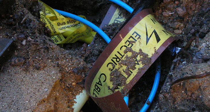
I was going through some old photos I found in a folder and came across this one. I took it in Brighton several years ago, there were some roadworks in the North Laine and I must have wondered at the tape and signage buried in it. I found it amusing when I saw it again and rather like the effect, so I’m putting it up here.
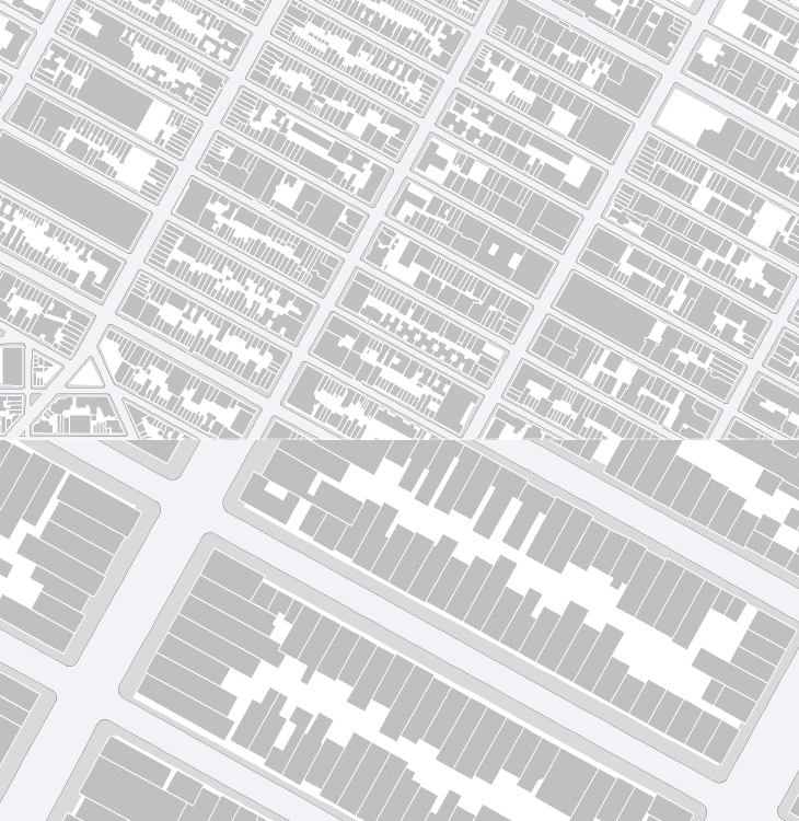
Now I really have been meaning to post about this for ages. So long in fact I really can’t remember where I found it. I don’t even have a link to it anymore and it’s only because it’s easily Googled* that I could find it again. As far as I understand it, OASIS is a map-based system for New Yorkers to see how open space is used in the city - the page about it describes this as enhancing the stewardship of said open space, whatever that means. Still, the new maps they’ve got are really quite lovely, and astonishingly detailed. I know our very own Ordnance Survey has maps this detailed, but the data is jealously guarded and even with recent changes in the right direction, detail at this level is not something for we mere taxpayers (who pay for it) to see and use without paying for it again. I hope the Ordnance Survey will see sense soon and we’ll see some fun applications with UK data like this.
Hey, I just like the maps without anything on them.
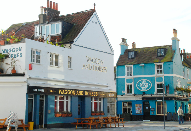
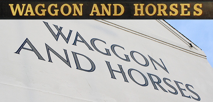
I thought I’d mentioned pub signs before here, but clearly not. For anyone interested in typography and lettering, pub signs are a great source of inspiration and ideas. I remember noticing the lettering on the side of the Waggon and Horses back in 2003 or so - the picture at the bottom was taken about then at least - and thinking how nice it was. Since then we’ve had a smoking ban in the UK, meaning outside seating is a pretty good thing for a pub to have, and there’ve been some great pedestrian-friendly developments here in Brighton, so any pub with one and near the other should be doing quite well. I hope.
So anyway, the Waggon and Horses has recently spruced up their seating area and repainted the outside and the fascia boards, which means new lettering, which I like very much, and which is why I’m putting a picture of it here. I was struggling a little bit to remember what it looked like before but Flickr came to the rescue; this one is probably the prettiest (nicely showing the front of the Brighton Dome there) but this one is probably the clearest. That café in the second Flickr pic is now a Japanese restaurant. Times change…
And no, that’s not a misspelling. Waggon is an older British spelling, but still perfectly fine.
This has nothing to do with type (well, not much) but I found it so remarkable I want to post about it anyway. Alex Roman has created a series of CG images and short films, based on real places, with a remarkable level of realism and beauty. At first I thought they’d been filmed and photographed with some high quality HD SLR, and wondered at the air of hyper-realism some of them have, especially the second one in this set. The sound design and visuals are great, but the use of type in the videos is rather odd and to my eye adds a small, if jarring, discordant note to the whole project: I’ve come across people mixing upper- and lower-case and using extreme kerning before (not so much kerning as tangling in this case) and it’s rarely successful. Still, to harp on about that would seem churlish as the rest of the project is so good. Some stills below to whet your appetite, and the project website is here.
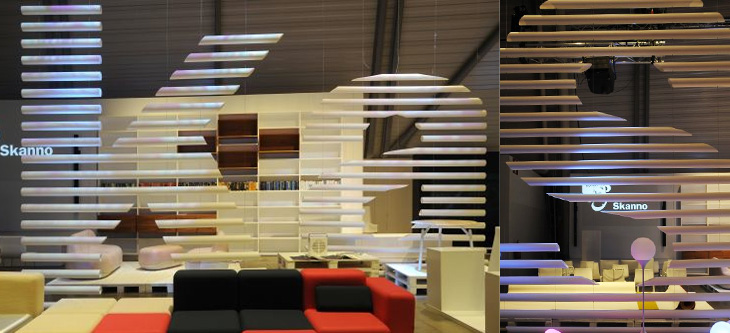
This feels more like a found type entry than anything else, even if I didn’t strictly find it, and that it’s more lettering than type. The Contemporist posted an article and series of photos of Habitare ’09, Finland’s largest furniture and interior design fair. Buried deep in the photos were these two, of Finnish store Skanno‘s stand, showing large letters (presumably spelling the name of the store) made out of plastic tubes and suspended like venetian blinds as dividers. It’s a simple technique, well done. I want some letters like that.