Vintage Logos

This Flickr set of vintage logos has been around a while now, and I looked and didn’t immediately get much inspiration. I mean, anyone else who’s linked to them has done the equivalent of, “Hey look, old logos! Um. Yes. Old logos!” so I guess I’m not alone.

Still, patience rewards the virtuous (or something) and I had a closer look through the ‘Original Size’ of all of them - my, that was a fun exercise, thank you, Flickr - and found some logos that I think are pretty interesting. Unfortunately, most of the ‘logos’ on those pages really don’t deserve the distinction of being called logos. In fact, most of them are pretty poor. I guess that makes the good ones stand out better. Perhaps.

So, enough bad-mouthing. I’ve traced (manually, of course, with lovely beziers) the ones I either like, or think are inspirational and felt quite a bit of ’70s and ’80s nostalgia in the process. You may have a different set of choices of course, and no, I wouldn’t include the Lubalin logo in the ‘crap’ ones. I just don’t like it very much. I know, I know, there’s a space in Design Hell reserved just for me… Below are thumbnails of the ones I’ve traced, and I’ve added notes for most of them too. If you’re reading this on the home page, click “Read the rest…” to see the whole lot.
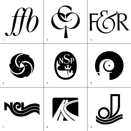
  1. Forening for Boghaandvoerk
    I’ve seen plenty of FF ligatures, but it’s the FB one on this that I like and wanted to keep for reference.
  2. Cumberland Capital Corp.
    Just great. I imagine it’s supposed to imply ‘growth’ with the tree image, but it makes a pleasing image - perfect for a monogram.
  3. Fernandec & Rubin
    This ampersand is wonderful.
  4. New York Aquarium
    Reminds me of Japanese mon, and unlike a lot of the logos that look symmetrical but aren’t, this one is. Perfectly.
  5. National Sea Products Limited
    A fish with a crown? How could I say no? I like the composition and old-timey lettering too.
  6. Oy Finleuy Ab
    This one makes me laugh. It looks like a demented chameleon.
  7. Norwegian Caribbean Lines
    Interesting to keep, just to show any letter can be made to trail off into a wavey line.
  8. Keystone Park
    I did make a slight modification to this - I cleaned up the ‘central reservation’ in the curved road. I’m not entirely sure what a motorway intersection has to do with a parkbut I’m sure it made sense at the time.
  9. Jonneret SA
    Lovely wavey lines… ‘nuff said.
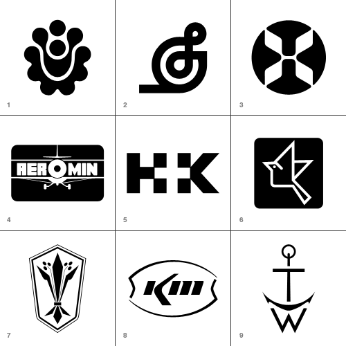
  1. Hillside Townhomes
    It’s an interesting pattern, though not sure how that relates to a housing development though. Maybe it follows the rough plan of the road layout?
  2. Splendix Musical Instruments
    I think this one would be vastly improved by removing the line trailing to the left. Still, it’s an interesting depiction of a treble-clef.
  3. Hawaiian Airlines
    Well, it was fun to trace!
  4. Ciba Geigy Canada Ltd.
    I’m guessing this is a trademark of theirs… This one really does look vintage.
  5. Hill + Knowles Public Relations
    I like it as an example of the type - though I don’t think it readsparticularly well.
  6. Japan Agricultural Co-op Associations
    An iconic little bird - for reference mainly.
  7. Distinctive Designs
    Odd logo for a company with that name… it looks agricultural.
  8. Kerr McGee Chemical Corp
    I like this because it’s so sparse and clean - it looks like someone overexposed a picture of the logo and just drew what was left of the dark bits.
  9. Thomas Walker and Sons
    Well, it’s a monogram that looks like an anchor. What’s not to like?
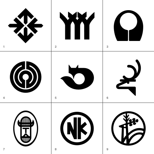
  1. Hillier
      Things to do with arrows, part 295,041
  2. Herman Smith Management
    This one reallyreminds me of another logo…
  3. Acushnet Company
    And thisone reminds me of this.
  4. Arbeitgemeinschaft der Lukal-und
    Bringing to mind a labarynth, without being one.
  5. Kusnierz
    On the Flickr set, someone added a comment that this could be an alternative to the Firefox logo. I quite agree.
  6. Harvey Dodds Limited
    Simple and clever.
  7. Tjernlund Manufacturing Company
    Cute little Viking!
  8. Nikko
    Again, for reference - playing with the letterforms to ensure consistent optical space around them. It can be difficult to make letters work in a circle like this.
  9. Jelen
    This one seems really familiar too! I just can’t place it.
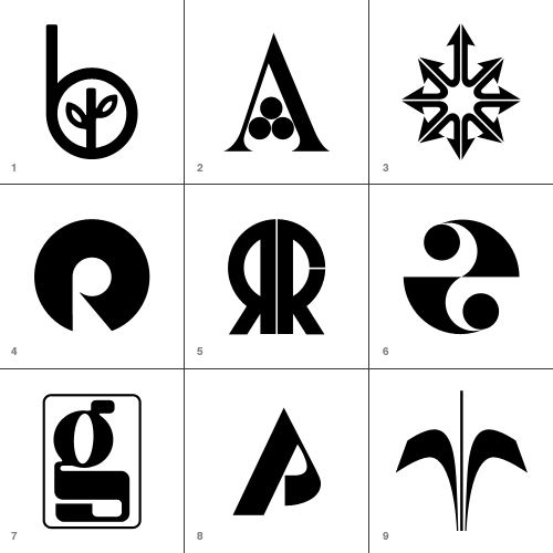
These are perhaps borderline for me, but there was just enough reason for me to keep them.

  1. Beverly Hills Bancorp
    Very simple and attractive - it’s quite sweet.
  2. Amigen
    Presumably a pharmaceutical logo - it certainly looks like one. I like it though.
  3. Montgomery Ross and Partners
    This was fun to draw, but as a logo it’s incredible aggressive. All those phallic arrows…
  4. Franco Ranchetti
    Now, a lot of the logos are simple geometric shapes with a chunk taken out, and they’re as a whole not very good. I think this is one of the few exceptions - the negative space does form a nice R.
  5. Ramon Reig Cabanas
    This would be quite unremarkable if the strip hadn’t been removed from the R. It’s curious.
  6. Health and Comfort Supplies Limited
    Very much of the time. Probably the only one of the op-art logos that I actually like.
  7. Gregson Manufacturing Company
    This is just weird. Combining OCR and traditional forms like that. Maybe they were going for the old "fusion of old and new" schtick.
  8. Pinewood Plantation
    Simple, not entirely satisfying, but I kept it as reference.
  9. Orchard Decor Canada Limited
    Simple and straighforward… a bit borderline for me.

The Typographer Returns

Typographer.org has returned, with a beautiful new design and a single-column format. The infrequent Bald Condensed features will be given their own pages, as in David’s own words:

What happened to Bald Condensed? Nothing, it just appears less frequently, that’s all.  New editions of Bald Condensed will be announced in the news feed from now on.

And for the first time (oddly), I notice that the logo is not just truncated Didot - the serif has been removed from the ‘h’. Subtle!

Two Fat Ladies

There’s a design agency near where I live called Eighth Day, and when they put up their sign I enjoyed the use of the numeral ‘8’ to form a lowercase ‘g’. I’ve seen some hand-drawn examples of it in the past, but not in a logo. I’m sure plenty of examples must exist - it is after all an effective and yet straightforward typographic trick. I thought this example was even more intriguing, with all the letters formed from part of numeral eights. I’m especially loving the neat positioning of the trademark symbol - it’s unusual to see it nicely integrated into a logo.

Imaginary Products

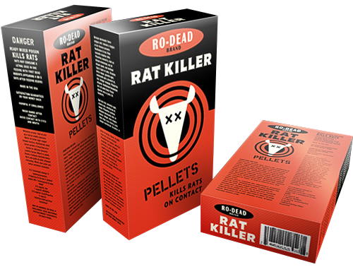
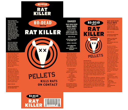
I’m fascinated by imaginary products created for films and games - there’s an art to creating something just similar enough to real products to be recognisable as a brand type, but without actually copying any particular identity. Some films and games come very close to existing brands (RUF in Children of Men; GAP for pets, Tube in GTA 3; Subway) while others work within the conventions of a product type so you know what kind of thing it’s supposed to be (pretty much everything in the Truman Show). I have an article I’m writing on brand conventions, but that’s not for today. The reason for this post is some of the work featured in this interview with Sarah Bradley, graphic designer and typographer at Pixar, and ex-lead title designer at Disney. In the article is a matrix for a box of rat poison shown in Ratatouille, which I just had to make into a fake box shot - I do this a lot at work and it’s fun to do, so I couldn’t resist.

The original matrix:

A Kaleidoscope of Planes

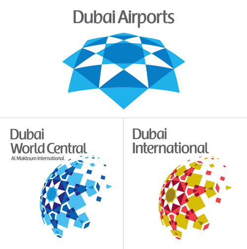
A few weeks ago, I spent a good hour trying to find some background info on the rebrand of Dubai International Airport, without success. I just went back to the Brand New post on it and there it is, a link, courtesy of Ty Wilkins.

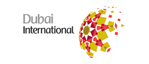
While the airport logos have patterns similar to the tesselations characteristic of islamic art, the main logo pattern is rather reminiscent of a compass rosette, perhaps to imply that Dubai is at the centre of things? I generally agree with the Brand New post (and many of the comments) in that the positioning of the type on the individual airport logos seems clumsy and distracting. Having the type endpoint line up with the apex of the implied sphere is a straightforward solution, and yes, it’s not all that bad, but it’s not all that good either.

There’s something oddly old-fashioned about the choice of typeface and colour too, like something from the late 1980s. I’d prefer to see either the word “Dubai” or the airport identifier in a different weight, or black (instead of grey), or something - anything to give the type some life. I’m not sure about the face - it does look a bit like the Emirates logo, and I’m interested to see that there’s no arabic version of it too. Changing the positioning of the type, as below, focuses attention on that centre of the centre-of-things pattern and would look even better in arabic right-to-left lettering - in my everso humble opinion, naturally:

Mind, when we get some wider applications of the logo to brochures, signage, wayfinding and the like, it could appear quite different, with the odd type integrated and comfortable with the patterned globe.

Oh, and I have to point out the odd language on the logolounge article,

Dubai Airports tapped Cato Purnell Partners in 2007 to develop an identity system that would not only unite the organization’s holdings, but also mark Dubai as an international air hub.

Tapped? How do you tap an agency? I have horrific visions of plumber-surgeons installing chromeware directly into living flesh, a media agency relationship direct from the mind of Guillermo del Toro! Of course, this would hardly be the only linguistic horror inflicted on the language by the media industry, I say over and over again, the word creative is not a noun, no, not even when applied to a person, and especially not when referring to artwork. Rant over.

Animal Planet

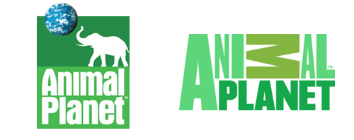
I just saw the new Animal Planet logo here, then after a search, here (of course). My first impressions weren’t too great, immediately I was wondering why the M was on its side - it looks like a reversed sigma, a kind of mathematical AniΣal Planet, if you will - and the mixed of weights and stretched type just seemed confusing and messy. However, after looking at some of the applications on the website (there aren’t many yet, though look at the videos on the home page, and here) I’ve changed my mind. Despite the obvious typographic objections (stretched type - ow!) I actually like it. I still think the sideways M isn’t too great, but overall the logo has a strong identity and fits with the aim of moving the channel from exclusively family friendly fare. They wanted to make the channel more grown up, and I think they’ve done it, simultaneously cutting the apron strings to the main Discovery brand by losing the spinning globe. I often like global ‘over-brands’ like Discovery had but it requires a consistently high standard of application and I think the old Animal Planet logo shows that that wasn’t the case. The new logo has a big advantage in that as it lacks imagery, it has a much wider range of applications for combining it with photography and video - a big strong typographic logo is much easier to apply to transitions, fades and tints than something with an image of an elephant on it, by far. The old one had some nice applications, but I look forward to far more from the new one.

50 years of NASA

I have mixed opinions of this. Even if it is a blindingly obvious thing to use a planet to make the zero, it is NASA and if anyone can use a planet in a logo they surely can, and I think it’s quite nice with the 5. I just wish they’d left it at that, but no. They had to go and stick a big fat lens flare on it. It’s not even a real one even though one thing NASA has, is access to plenty of lens flares. Oh, and I hate the vignetting.

Bunch Munch

This is interesting, the Bunch design agency got a whole bunch (geddit?) of designers and illustrators they admired to ‘respond’ to their identity. As a result they got a whole load of variations on their logo which they’re now using as part of their identity. Very clever indeed, as commissioning all that work conventionally would be very expensive indeed.

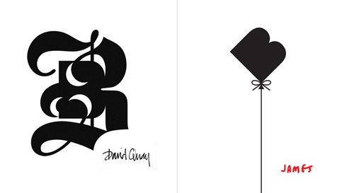
A few of the results are shown on the CR blog page, but I picked my two favourites here. The blackletter style one is very interesting, as the negative spaces aren’t simply a reversed image of the implied continuation of the stroke, but an additional shape on the outer edge of that stroke. Very nice.

The Google Logo Was Designed?

I came across this article and my immediate thought was, “The logo was designed?” I thought it was typed. Add a soft bevel and some colours and hey presto, a logo! But no. They got someone else to design it by typing it into Photoshop, add a soft bevel and some colours and hey presto, a logo! Now, I don’t think it’s necessarily a bad thing, or a bad logo really, but the justification makes me chuckle. How many times as a designer have you been asked to post-justify a piece of work when really you were using your instincts and your eye to produce something that fit the requirements? I’ve lost count.

It was playful and deceptively simple. The design subtle as to look almost non-designed, the reading effortless. The colors evoke memories of child play, but deftly stray from the color wheel strictures so as to hint to the inherent element of serendipity creeping into any search results page and the irreverance and boldness of the “I am feeling lucky” link. The texture and shading of each letter is done in an unobtrusive way resulting in lifting it from the page while giving it both weight and lightness. It is solid but there is also an ethereal quality to it.

Yes. Indeed. Quite. Fortunately for Google, just typing the company name in Catull works just fine too, ethereal quality or no.

Goodbye, Big Red ‘X’

As mentioned elsewhere, it appears that Xerox have rebranded, courtesy of Interbrand. There’s a pretty good critique of the new logo over on Brand New which I mostly agree with, apart from one thing. While the pixellated effect was (and is) rather cliché, Landor’s implementation of it was sophisticated and spoke well of what Xeros did, and still does. Sub-pixel anti-aliasing and high resolution screens notwithstanding, we still produce work in a pixellated environment, and it’s only when we print something that those pixels go away, so the big ‘X’ seemed perfectly appropriate for a company making printers, photocopiers and scanners and the like.

Clearly I’m not party to some vital information here, perhaps Xerox are planning to move into the manufacture of cricket, or petanque balls. Nice wordmark though.