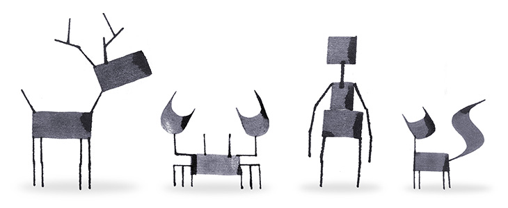
A fun little collection of creatures drawn with a calligraphy pen by Andrew Fox. Simple, fun and attractive. It reminded me of this aspect of Islamic art, featured by BibliOdyssey a few years ago: Zoomorphic Calligraphy.
A fun little collection of creatures drawn with a calligraphy pen by Andrew Fox. Simple, fun and attractive. It reminded me of this aspect of Islamic art, featured by BibliOdyssey a few years ago: Zoomorphic Calligraphy.
It must be the future already because, look, flying cars! It turns out that there’s been a whole series of these sculptures over the years at Goodwood Festival of Speed by Gerry Judah. I saw the photos of this year’s one on Dezeen and thought it was a nice concept rendering, but no, it’s real. What a thing!
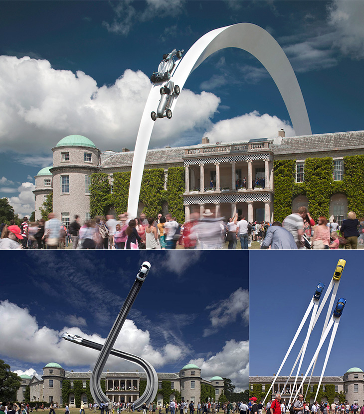
I’ll have to go next year. Goodwood is almost literally round the corner from where I live.
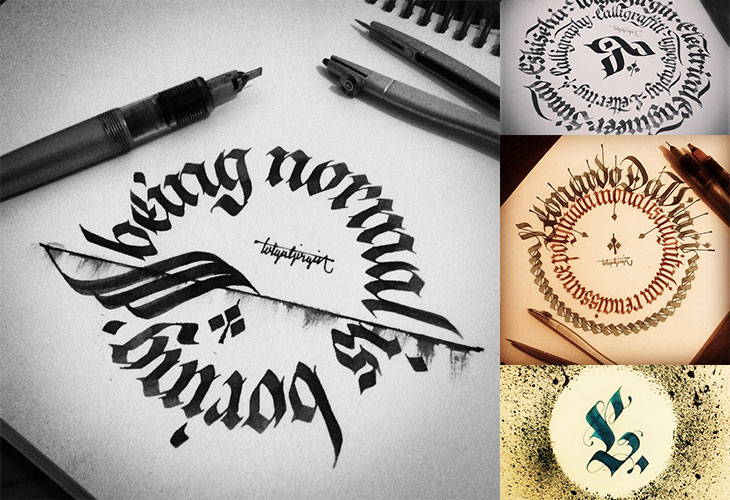
I found Tolga Girgin’s work from a link to his 3D lettering made with cut paper and traditional calligraphy on Behance, and went from there to his Instagram feed where there’s loads more of his work, including these beautiful circular compositions. I think I’m drawn to them because they remind me of coins and banknote patterns (which I am fond of). Go and have a look at the rest of it.
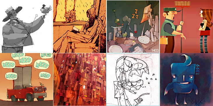
I’ve been enjoying Patricio Betteo’s 365 project for a few years now and somehow never linked to it here. The illustrations are (I think) added daily, though there’ve been a few months where it’s not been updated at all (sounds familiar, can’t think why). It’s a regular source of inspiration for me, with a mix of illustrative styles, with occasional photographs and typographic designs, and always in a square format — the variety and quality are quite brilliant. Patricio Betteo is extraordinarily talented, and if you look through his blog or DeviantART portfolio you’ll probably notice you’ve seen some of his work at some point even if you’ve not heard his name. Well worth a look.
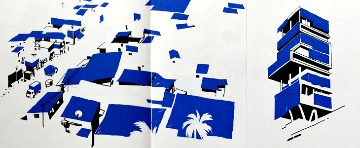
I’m quite fond of illustrations made with restricted palettes (part of the appeal of mid-century printed ephemera, I think) so this project by Sameer Kulavoor (as Bombay Duck Designs) caught my eye when It’s Nice That featured it.
The illustrations highlight the use of basic blue tarpaulins in Indian cities by abstracting all the other elements and leaving just the shadows and the blue colour to define the scene. If in India the blue tarp is ubiquitous, as in Kulavoor’s words, “it makes for excellent sun-proofing, dust-proofing, pigeon-shit proofing, packaging, and temporary refugee camps.” they’re certainly familiar globally; I recall my father’s motorbikes being protected from the rain with them, a neighbour’s shed-rebuilding project shrouded in one (for years) and various festivals and outdoor markets seemingly constructed from them (and thickets of scaffolding poles). The book is available from Tadpole Store.
Created by Bart De Keyzer and Frederik Jacques, This is how I learn my ABC is a beautiful little educational app (or digital book, should you prefer) for the iPad. Clearly aimed at children, the app is delightfully presented with clean, crisp illustrations, bold typography and subtle animations, and therefore will probably get just as many designers as parents buying it (and I’d guess most of the overlap between those). The app is in three sections, the first a tour through the alphabet where you get to admire the big illustrations, hear the sounds of the animals and read a fact or two about each one, and the other two are quizzes that let you match the letter to the animal or vice versa, and keep score on how well you’re doing.
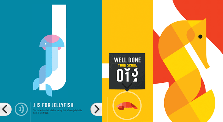
There are some posters available to buy on Society 6 as well (there’s no page listing all of them that I can see, so I’ve linked to D for Dog here). I think the name of the app is a little too dominant on them, if you got a ‘full set’ it’d look pretty strange — I’d rather they be more traditional with the illustration and animal name front and centre with the name of the app much less visible. After all, if you buy these for your home, who are you advertising to?
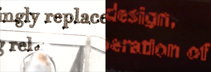
A couple of years ago I wrote about Kuka, the RobotLab project built to write the entire Martin Luther bible onto a long roll of paper. The robot emulates the calligraphic style replicated in the Schwabacher blackletter typeface, writing it using a pen as a (particularly neat and tireless) human might. It’s quite a lovely thing*.
I was reminded of it when I saw this project by Walter Nicolino and Carlo Ratti (of Carlo Ratti Associati). They’ve designed and built a suspended plotter to write the contents of the Open Architecture Manifesto page on Wikipedia onto a wall at the Adhocracy exhibition at the Istanbul Design Biennial. As the text on Wikipedia is updated the robot erases and rewrites the document on the wall at the exhibition.
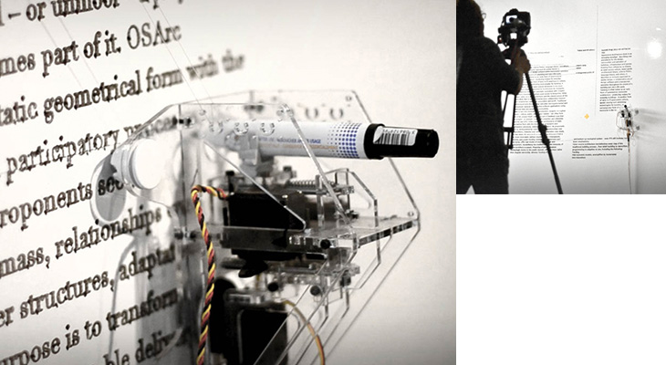
The comparison between the two projects is perhaps obvious, that one is reproducing a historical, unchanging document, while the other reproduces a brand new, constantly-updating and ephemeral one. Indeed until the manifesto was published in Domus magazine (whose editor Joseph Grima is curator of the biennial) the article kept being deleted by Wikipedia editors.
I’m especially interested how the plotter is reproducing the text. The typeface could be Times, but the generous amount of ink the fat nib of the plotter pen puts down, and the way it outlines the characters, makes it hard to tell exactly. Also, looking at the video the output is a serif face but part of the processing (in Processing) looks like it uses something more like Verdana or Tahoma. Could be that different parts of the text are in different faces of course. Curious.
Something I found the other week and caught my eye, a project by Jonathan Puckey to convey some of the aspects of handwriting, namely speed, into typographic weight. I like the idea, I remember having a pub conversation along similar lines many years ago. It was after a fairly difficult day and the old problem of conveying tone or mood in emails came up. A friend suggested a keyboard with pressure-sensitive keys and software that varied the size, weight, and perhaps even the style of the text depending on your typing speed and the force you were typing with.
The possibilities are still interesting (which is why this caught my eye) and might be an entertaining set of dimensions to add to OpenType. I guess you’d have to be careful with the calibration—some people type as if there are bankers hiding under the keys—otherwise you’d be known as “the shouty one” based on nothing but your emails.
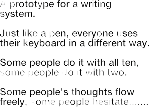
Image via Jonathan Puckey‘s site. Also check out his Lettering Tool. Sadly it’s not available to download.
Looking for various calligraphic-related things on image search, on Graffuturism I find the work of Greg Papagrigoriou, a graffiti artist from Athens—or, to use the term, a calligraffiti artist from Athens. He creates densely textured pieces, often collaborating with Simek whose work often acts as a centrepiece or focus. The two artists’ work complements each other perfectly and create striking images that remind me of protest posters or propaganda, but while on these the words flow and possess graphical rhythm, they defy any attempt to be read.
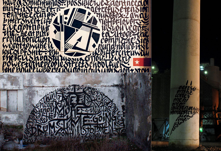
All images via Graffuturism, and presumably before that, Greg Papagrigoriou’s Flickr.
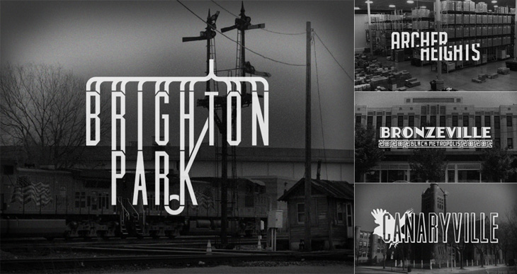
Kelly from Design Crush linked to this last week, a project by designer and Chicagoan Steve Shanabruch to create a logo for each of the Chicago neighbourhoods. Some, he says, are based on personal experience, and others on research. He’s created a lovely set of graphics so far, all of them remind me of old movie title cards (or end cards, like these), some look like they could actually be names of movies set in the neighbourhood.
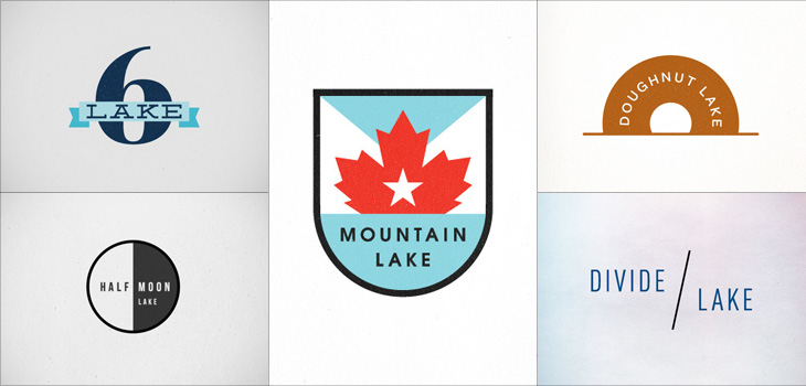
There’s something particularly compelling about design projects like these, they trigger a sort of completist tendency in me, an appreciation of the collection as object. I like sets of things, and interpretations (and reinterpretations) of things particularly so. Thinking of this, I was reminded of the Branding 10,000 Lakes project by Nicole Meyer, to design an identity for each of the lakes in Minnesota (which is indeed known as The Land of 10,000 Lakes). There are some lovely ones in the collection. Some recent ones here: