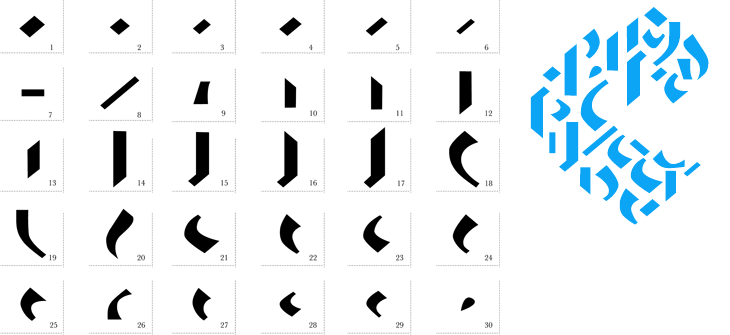
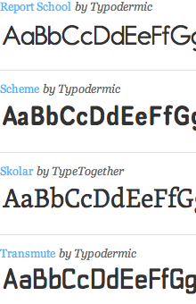
I came across this a week or so ago - another thing found on Behance if I remember correctly, and I’ve had a bit of a play around with it. I like the idea of a Fontstruct-style system for Blackletter, and I can see that Jan Schöttler has created some quite lovely things with it, but without looking at the PDF in Illustrator I would find it far, far easier to draw the letters with a pen and brush than make them with this kit. It reminds me of a Tangram puzzle game in a way. I had a play around with it and created the word below, which is tending a bit too much towards the death-metal band logo for my tastes, but hey, it has a bit of charm. Maybe you will have a better experience with it (warning, Flash site).
Ho hum. It would look more at home scratched in biro on a schoolbag, I think.The parts.The parts, assembled.
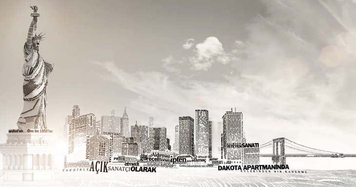
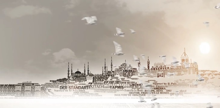
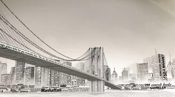
This week sees the launch of a new Turkish-language edition of the New York Times’International Weekly, distributed for free with the Sunday edition of Turkey’s Sabah newspaper. To advertise the launch, the newspapers commissioned this incredible animation - a typographic tour starting from Liberty Island, across various bits of Manhattan, very nearly making it over to Brooklyn before arriving on the Bosphorus with a gorgeous view of Istanbul rendered in type.
I’ve seen a fair few animations of the places-rendered-as-words variety, and more than plenty of the ‘kinetic typography’ kind, but this one is very nicely done — it hangs together beautifully, and the level of subtle detail rewards re-watching. The waves, rippling banners and flags are a lovely touch, just noticeable enough to add to the sense of place without distracting you from the overall theme.
I’d love a desktop-resolution still of this scene. This is taken from the downloadable movie.
There’s one especially lovely bit when the camera turns to show you the Brooklyn Bridge being created from type — definitely go and watch this one. It’s quite lovely, and thanks to @typographerorg (of Typographer.org, naturally) for sending me it.
Not the scene I mention, I won’t spoil that for you.
It seems hardly a week goes by lately without some interesting new development in online typography. For years there has been a constant grumble from many that the web needs more typefaces available to designers to create great online typography, and there’s been a consistent, and entirely correct (but perhaps rather hardline) response from others that great typography doesn’t come from having lots of typefaces. Perhaps you can tell from that which side I come down on, and yes, it is rather hardline, and I freely and happily admit that as a response to the problem it rather misses the point.
You can, of course, create great typography using only one or two typefaces for your entire working career as a designer. I’ve met a few designers who seem to want to do just that, and indeed, I heard a story of a creative director so obsessed with Bembo that he wouldn’t allow any other face to be used on anything, so that none of the designers who worked with him could ever bear to use it ever again. Most of us, like those very designers, would quite reasonably get bored to death with using the same faces all the time. No matter how beautiful, how perfect, how utterly balanced the typeface was, you can have too much of a good thing, eventually - and if the faces you have available are, shall we say, of mixed quality, then you can feel rather stifled, rather quickly.
This is the situation we’re in now. We’ve had the ‘Web Core Fonts’ for seemingly forever, and we’re fed up with them. There are so many excellent screen faces out there, and we want to use them. But how? I won’t seek to repeat some excellent articles on the current state of play (I suggest you read this article on ilovetypography.com), but I fancied including some of the context, the history of how we’ve used non-core faces online until now, and my own opinions one where it’s all going.
Making images of text yourself
Slow and tedious, not very accessible and relatively inflexible, this isn’t really a solution at all, but is certainly the most reliable way of presenting text in your own typeface online. It’s getting less common thanks to the growth of various other methods, but still hangs around for obvious reasons: You can fine-tune everything - the kerning, ligatures, alternates, all sorts of effects, it’s all under your control. Sounds great, until you have to change the text. Then you have to fine tune it all again, save off all the images again, upload all the images again, then try and work out why you’ve got a broken image on your site again until you remember you changed the filename when you were in a hurry that time and you forgot about it…. So, it’s good for things you don’t change often.
Making images of text automatically
For many years this seemed a golden solution, lit by a kind of heavenly light from within, choirs of angels and all that: all the benefits of making images yourself, but without all the fuss and effort! Joy! Well, not quite. There are various methods for creating the images automatically, from using a desktop application like Fireworks to online PHP libraries (and similar), and they all have their limitations. The first, of course, is that you’re creating the images automatically so you don’t have quite so much control over how the type looks, and most of the PHP libraries I’ve seen over the years don’t support kerning, which is a bit of a showstopper if you care about such things, and if you don’t care, why are you doing this anyway? Also, like creating the images yourself, you still end up with folders full of loads of tiny files, and your pages will be slower as a result of the browser having to request each of those files individually. Not ideal in other words.
Live replacement with Flash or SVG
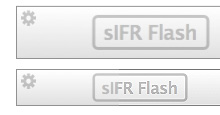
And here we find some very clever solutions, the most widespread being Scalable Inman Flash Replacement, or sIFR (yes, with a small ‘s’). This technique uses a combination of Javascript and CSS to replace text with a Flash movie showing that same text but instead using a font embedded within the movie. When used for small amounts of text, such as a couple of headlines on your page here and there, it can work very well, hence its popularity.
There are some benefits to using sIFR: You can choose a subset of characters to include, which can keep the filesize of the Flash movie fairly low; and as it’s not the actual font file you’re embedding, it adds a barrier of security to people who might want to rip it off (how high a barrier that is remains debatable), and, as with all Flash movies, you can block the file from being reimported back into the Flash editor (again, with debatable efficacy).
There are also some real problems with using sIFR. The main one is speed. If you use it for any amount of text you’ll notice quite a lag while the text is replaced and the Flash movies rendered. Using it for a lot of text, such as the body of an article, and you will most likely notice a significant performance hit on your browser, or a crash. It can also be blocked by ad-blocking software - I use Click2Flash on Safari and I haven’t set it to allow (or disallow) all sIFR, just in case, so I often see placeholders all over pages. The other main problem, and it doesn’t particularly affect users, is that it is a fairly brittle, poorly documented and really annoyingly bitty solution - it’s an absolute pain in the arse to set up, basically.
Another option very much worthy of mention (and I’m not going to cover every single one) is Cufón. This works by using Fontforge to convert a TrueType or OpenType font file to, essentially, a Javascript file. Naturally there’s a little bit more to it, which you can read on the Github page should you wish. The setup is extraordinarily simple, the rendering of the type is extremely fast, even when used on a lot of text, and works with straighforward CSS rules. It’s not absolutely perfect, as there are a few issues with Internet Explorer (no surprises there) and there are some concerns that the font file can be reassembled from the Cufón file - though the technological barrier to that is enough to defeat most people.
Of which questions of licensing and piracy leads nicely onto…
Directly linking to the font file on your server
Basically, you upload a font file to your server and link to it on your web page or stylesheet and when someone views your page, the font gets downloaded, interpreted, and your text is then displayed using it. Simple. Well, kind of. Since version 5, Internet Explorer has supported the font-face rule, allowing you to link to a proprietary file format, Embedded OpenType (EOT), which allows for subsetting (like sIFR does), proprietary compression and a simple form of DRM to limit the file to use on certain domains. This format was never supported by other browser makers, and foundries never explicitly allowed for the use of their typefaces in this format, so it never took off. In many circles, it was viewed as a Bad Thing, another attempt by Microsoft to foist proprietary technologies onto the web, and further evidence of how evil they were. Though perhaps if you subscribe to that view you might want to look up who commissioned the Core Web Fonts in the first place. Verdana and Georgia are bloody great (on screen).
So, we went many years with a partial solution available, but never used. Recently, however, a couple of new proposals have emerged. One is the .webfont proposal by Tal Leming and Erik van Blokland, which seeks to create a format-independent XML wrapper for fonts, with compression for the font data itself. The XML wrapper contains various data, including allowed URLs, the license and origin, and anything else the foundry wants to put in there.
Essentially, the XML wrapper in .webfont is a form of DRM. It contains the license, and if you ignore it and rip off the font file, then you’re open to prosecution. It’s true Digital Rights Management rather than Digital Rights Enforcement.
Interestingly, there isn’t any restrictive DRM (Digital Rights Management), obfuscation or encryption in the format. DRM is a tricky one. I’ve never been entirely against it as a concept, but more against the appallingly greedy, grasping, restrictive, anti-consumer, anti-liberty, anti-fair-use moneygrabbing application of it the music industry employed. I don’t rip off music or movies, and yet my use of my media is limited by these restrictions - it’s insane, so I can see why the idea of adding any form of DRM to font files is now beyond the pale, even though with typefaces it could, arguably, be justified. The only option is to keep educating people that they’re not free, that they take time to design and perfect, and that yes, if caught, you can be prosecuted. Kids and enthusiasts building massive font collections they’ll never use are one thing, but professionals should, and must, know better.
Anyway, I digress. The other proposal getting attention is EOT Lite. This is a resurrection of Microsoft’s original EOT format, but with the DRM-like restrictions and patented compression methods removed. This makes it a reasonably credible addition to the options available as it is already supported by a major browser, but whether it can overcome the poor start (and worse publicity) EOT had is doubtful. While .webfont has the support of most of the larger and important foundries, a couple of big foundries have backed EOT Lite. Well, that is until halfway through me writing this article when Typegirl tweeted that Adobe are backing the .webfont proposal. We shall see, and of course there’s no problem with a foundry supporting multiple solutions. Certainly Linotype have already added EOT to their EULA, which is great news as it signals that one of the biggest barriers to using different faces online, licensing for web use, is actually now being overcome.
And, with that other nice link on licensing, we move to…
Subscription: Using the font file on someone else’s server
Typekit’s list of typefaces. Cropped from this screenshot. Yes, I recoloured it too.
Now this is really exciting, and has implications for font licensing for the desktop as well as online. You pay a subscription, and you get access to a variety of typefaces you can use on your site. With Typekit, the process is handled using Javascript to enable the font in the browser, which you then refer to in your stylesheet using standard CSS rules. Other services, whether from foundries, resellers or dedicated service providers, will no doubt develop their own systems, but I imagine they’re be all along similar lines. The question for me is one of performance. I don’t know about you, but I’ve occasionally been left waiting for a page to load while the browser waits for a response from, say, google-analytics.com - there’s no question Google’s main analytics web servers are down (not this often anyway), but just that sometimes this happens on the web. How would this affect a page using Typekit? Is there any option for local server caching for example? If so, how would that be handled?
I’ve often thought that a subscription model for typefaces would be ideal for agencies, designers and printers - people who need access at short notice, and for short periods to a wide range of faces. At the moment, there’s a lot of dodgy emailing of font files about, and you can bet that no matter how scrupulous at licensing everyone concerned may be, that a lot of these font files stay installed and end up being used beyond their licenses. Foundries, and for agencies, etc. concerned about their liabilities to prosecution (and of course, for doing the right thing) would welcome a system that allows you to get access to a face for a week, or a month, or whatever, and, most importantly, to change what they have access to whenever they need to. To make it work you’d have to be paying less per font (or even per face) than for a full license, but for the foundries this would represent a consistent income, rather than no income at all. It’s a thought. I’d certainly use it.
The Future
The whole push to develop practical ways using typefaces online is inevitable given how many applications are now moving into ‘the cloud’. We’ve word processors and photo editing applications online now, and it’ll only be a matter of time before professional creative tools go online too. We want to be able to access our documents from anywhere, and for them to use the same faces as we created them with, and for these documents, the web core fonts aren’t going to do the job.
With the online subscription model, there is a cautionary note to keep in mind - you don’t have control over what’s available. As Kindle users who thought they’d bought Orwell’s 1984 recently found out, if your service provider doesn’t want you to have it anymore, you have no say in the matter. At least if you have the font file on your own machine or your own server, you can keep using it even if the company you bought it from no longer wants to sell it. We’ll no doubt see both honourable and dis-honourable business practices, some scandals, some interesting legal actions, and probably new primary legislation on the matter, but until then, as ever, caveat emptor.
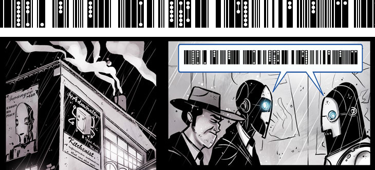
I’ve been following Penny Arcade for quite some time now - they run commentary and opinion on games with short articles and webcomics, expertly written and drawn by Gabe and Tycho. They’ve recently been running a series of webcomics exploring various short stories (not strictly on gaming, but perhaps in universes shared with many games), one of which is Automata. It’s all rather good and worth following (part 1 here, 2 onwards from here), but one thing that got my attention was the representation of speech between the automata characters, shown below.
I like the addition of the dots to the barcode pattern, hinting at multiple tones and levels of sound - something interesting to add to a script - and as the character in the comic refers to it as ‘clickwise’ I got to wondering how languages with clicks were transcribed in the real world. Unsurprisingly, there are various forms of dots, circles and exclamation points, forming a kind of visual onomatopœia for clicks, ‘tsks’ and ‘tuts’.
Comics of course have a rich vocabulary of such things, and I find myself sometimes wishing for a bit more symbolic depth to the Latin alphabet - new forms of punctuation perhaps, maybe even a whole new script, or scripts. To illustrate and explain further, I think everyone has come across the problem of misinterpreting or being misinterpreted when using email - you thought you were making an oh-so-clever dry witticism and it comes across as scouring contemptuous sarcasm (say), so usually the only recourse is to pick up the phone so that your tone of voice can be heard. However, since we’re increasingly using text to communicate, especially in the social, rather than business or technical, arena, and even more importantly in the plain text and short form media such as SMS, we may need to expand our symbolic vocabulary to indicate things such as tone of voice, humour, sarcasm and sincerity. We have emoticons of course, and in time some of them (beyond 263A, 263B and so on) may find their way into Unicode, but they’re pretty blunt things and as it’s subtlety we need, we’ll need something a bit more flexible and, well, more like language.
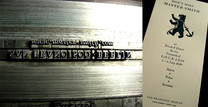
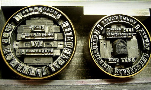
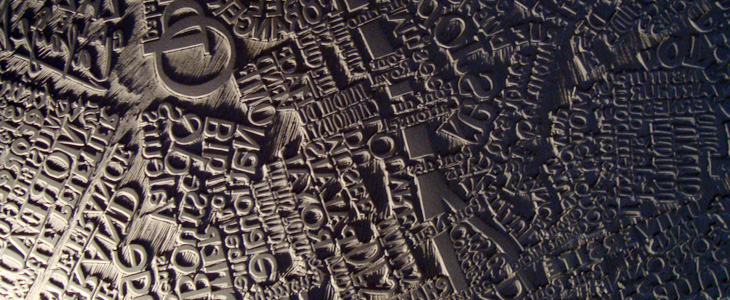
I’ve been following the RSS Feed of Martin Schröder’s blog for a while now; he’s a printer using traditional letterpress techniques in Berlin and posts a lot of interesting and beautiful work on his site. Mostly, I will admit, I just look at the pictures as Schröder usually includes a good set that tells the story of the process quite well. Sometimes though, despite my rusty German, I will work my way through the text as (of course) there’s a lot more interesting detail there. Well worth a look, even if you do just look at the pictures. I love these:
Adrian Giddings just linked to this on Twitter, a linocut map of Paris by Mark Andrew Webber. It reminds me a little bit of these typographic maps of London and Portsmouth, and of course the ORK ones of various places, but because it’s hand-done (and a linocut at that) when it’s printed it’ll have a very different effect. There’s one of Amsterdam (and London, and New York) on Webber’s site which shows how it might look.
The Paris one looks to be made of a combination of face and lettering styles, I assume to reflect the character of each place being represented, and from that I was wondering at the idea of doing that for whole cities, if you could. It could never be a perfect representation for everyone - I’m sure that for many people a typographic representation of London would involve Johnston Sans, whereas I tend to think of Caslon types. For others, who knows?
The linocut itself has a gorgeous sculptural quality, shown up beautifully in Webber’s photos; I would quite fancy a copy of that rather than a print (oh, OK, as well as a print) - to run your fingers over it would be a real pleasure. Lovely stuff:
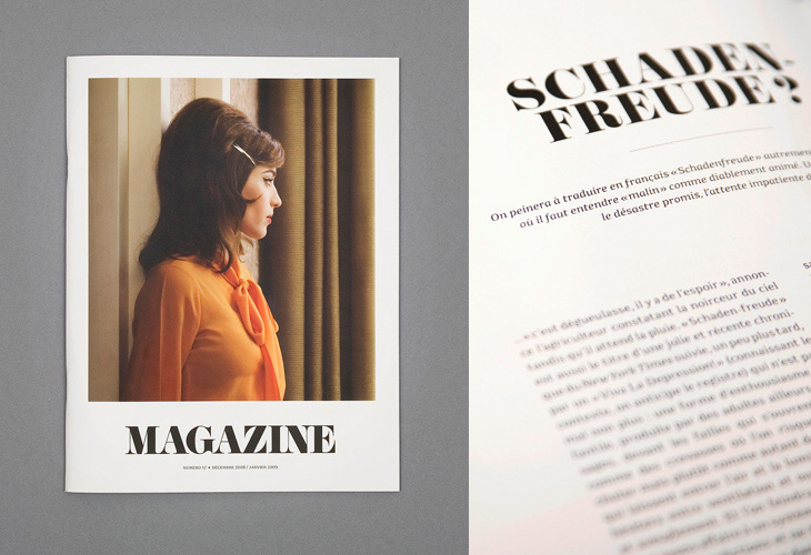
I saw the cover of this magazine, designed by Ill Studio, on ISO 50 and immediately saved the link; I love the type, the photo, the composition, everything. The rest of the magazine is beautiful, but it’s the cover I love - go and take a look at the rest of it. Now if only there was a link to the magazine’s site - with such a generic name it hardly pops right up on Google.
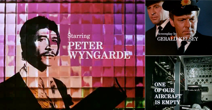
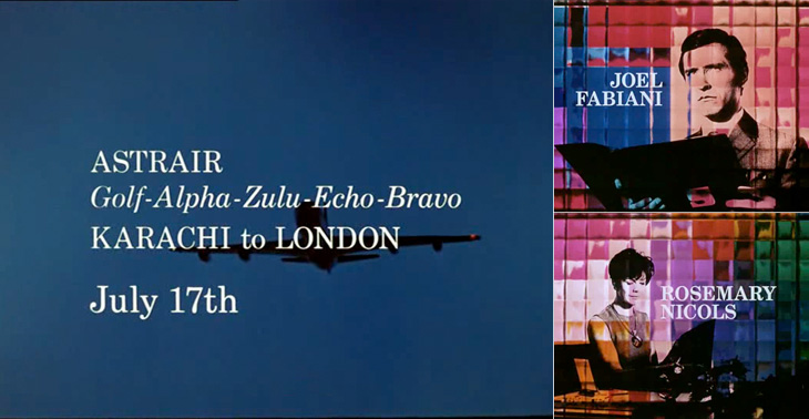
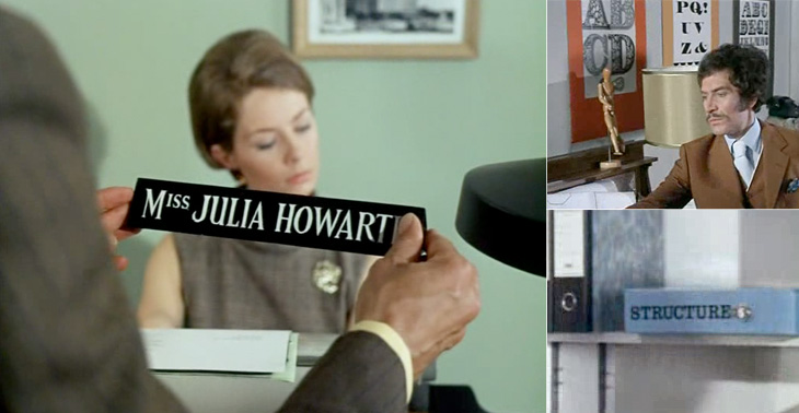
I first watched some episodes of Department S on the UK channel Bravo a few years ago, and I remember thinking at the time how great it was - the Jason King character is ace (there was a spinoff series based just on him). However, what really got my attention and had me making screenshots from the DVDs is the typography of the titles and scene-setting panels. They’re very nicely done, and highly unusually are set in a fairly fine and delicate (for low-resolution TV!) serif face - in this case Century Schoolbook. The titles were done by Chambers and Partners, who did a lot of the titles for TV series in the 1960s, and I wonder whether this was a bit of an experiment for them, an attempt to break the mould somewhat. Their experience shows though; it’s all very well done and brings a lovely printerly quality to the screen. I’m glad they did it.
There are other nice bits of lettering in the series too - lots of traditional signwriting, some big typeface samplers used as decoration, and the odd bit of Letraset. Overall the show seems designed, there’s a real touch of quality to the whole thing - I guess that’s why it’s one of those cult classics. If you ever see any of it, pay attention to the cuts between scenes, there’s a very nice alternating set in Six Days especially (the bit with the phone calls and the photos being taken of secret documents, if you want to know). Very nice.
Some of the titles and scene-setting panels.A few other bits of lettering and type in the show.
The rebranding of UKTV’s channel lineup has been going on for a while now; every couple of months another of their channels gets a new name and identity, and the original, extraordinarily pleasant and consistent network branding (at right) takes another step closer to oblivion. One of the recent rebrands was for UKTV Style, which got a pretty dreadful implementation of a reasonably nice idea - David Earls wrote more about that on Typographer.org. Next to go is UKTV Food, which will get a logo more suited to a free supermarket magazine (it really reminds me of the old Sainsbury’s one).
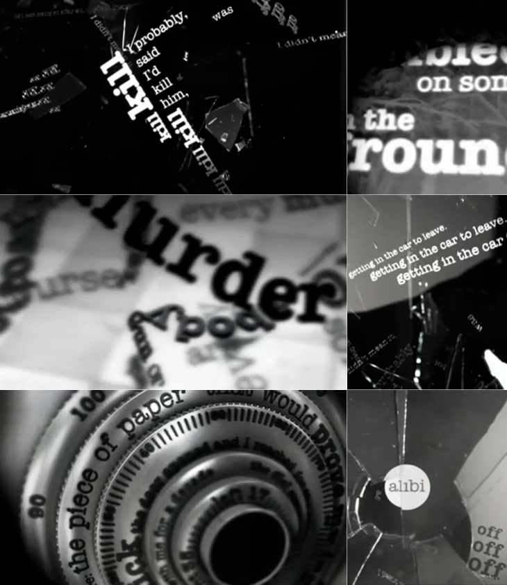
I guess you could say I’m not much of a fan of the overall quality of the rebrand, but there are a few good bits in there - Dave, Blighty and Eden are quite pleasant, with some nice ident work. My favourite by far though is Alibi, previously UKTV Drama. They’ve gone for a treatment reminiscent of your fashionable dynamic typography, but incorporated imagery of escape, fear, crime and violence. The typewriter typeface is perhaps a little cliché for the genre, done to death in countless private investigator made-for-tv stuff, but the stylish animation rescues it, keeping the familiar associations while providing some originality and freshness. There’s a montage of the channel idents here, and I’ve a few screenshots below.
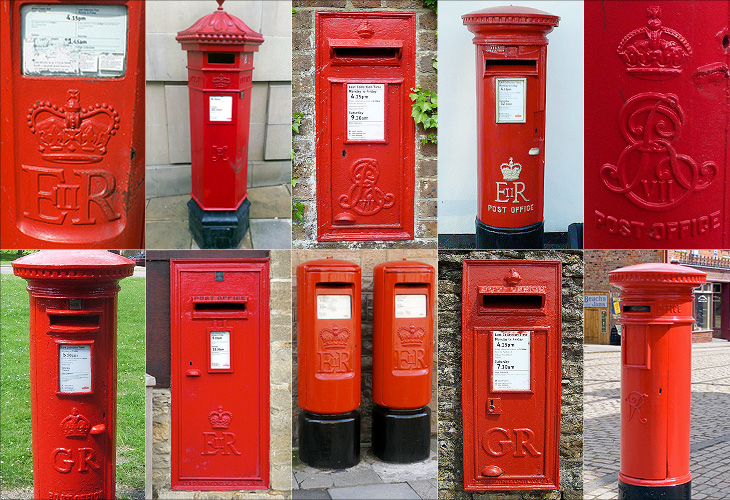
I love projects like this, a Flickr group purely for Royal Mail postboxes identified by postcode. There are currently 5679 photos in the group, so is getting to be a pretty good catalogue of the postboxes in the UK - though with 115,000 in total there’s still a way to go. One of the first ones I clicked was pretty close to where I’m from, and lo, a quick search reveals the one very close to where I grew up. Ah, memories.
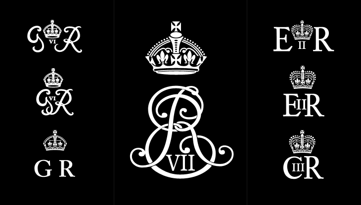
One of the interesting things about all these postboxes is the variety in the emblems of the reigning monarch - from Victoria to Elizabeth, they range from the florid and calligraphic to the frankly rather austere. Naturally, I’ve had a play around recreating some of the emblems, below. I wonder at the unnumbered George ones though; I’d guess they must be from during the Second World War, or directly afterwards - they suggest the Austerity period to me, but why no number? The extra metal and work required would be minimal, after all. As for the other later ones, the lettering looks to be inspired by Caslon types, though with plenty of variation from the hand-carved moulds, which has given them various profile styles from soft to sharp-edged, strengthening and highlighting the symbols - a kind of 3D hinting, if you like. I hope the effect was intentional, as it’s rather nice.
Some of the emblems - which I rather freely recreated rather than tracing them accurately. Show here are the rare Edward VII, variants on George VI, Elizabeth II and my very own wild speculation at Charles III (if that is indeed what he takes as his regnal name).
Perhaps controversially, I also had a bit of a play at creating a symbol for Prince Charles when (or if?) he becomes king. He may choose to reign as George VII, though from a design point of view I hope not - if he keeps his current first name he can have that ‘III’ fitting into the counter of the C, which I rather like the look of.