Adrian Giddings just linked to this on Twitter, a linocut map of Paris by Mark Andrew Webber. It reminds me a little bit of these typographic maps of London and Portsmouth, and of course the ORK ones of various places, but because it’s hand-done (and a linocut at that) when it’s printed it’ll have a very different effect. There’s one of Amsterdam (and London, and New York) on Webber’s site which shows how it might look.
The Paris one looks to be made of a combination of face and lettering styles, I assume to reflect the character of each place being represented, and from that I was wondering at the idea of doing that for whole cities, if you could. It could never be a perfect representation for everyone - I’m sure that for many people a typographic representation of London would involve Johnston Sans, whereas I tend to think of Caslon types. For others, who knows?
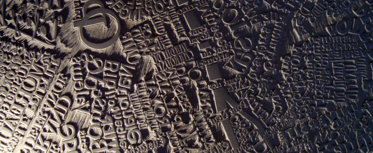
The linocut itself has a gorgeous sculptural quality, shown up beautifully in Webber’s photos; I would quite fancy a copy of that rather than a print (oh, OK, as well as a print) - to run your fingers over it would be a real pleasure. Lovely stuff: