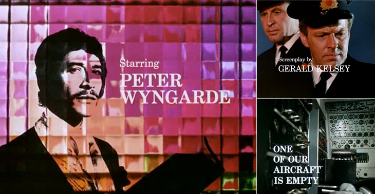
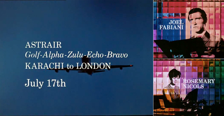
I first watched some episodes of Department S on the UK channel Bravo a few years ago, and I remember thinking at the time how great it was - the Jason King character is ace (there was a spinoff series based just on him). However, what really got my attention and had me making screenshots from the DVDs is the typography of the titles and scene-setting panels. They’re very nicely done, and highly unusually are set in a fairly fine and delicate (for low-resolution TV!) serif face - in this case Century Schoolbook. The titles were done by Chambers and Partners, who did a lot of the titles for TV series in the 1960s, and I wonder whether this was a bit of an experiment for them, an attempt to break the mould somewhat. Their experience shows though; it’s all very well done and brings a lovely printerly quality to the screen. I’m glad they did it.
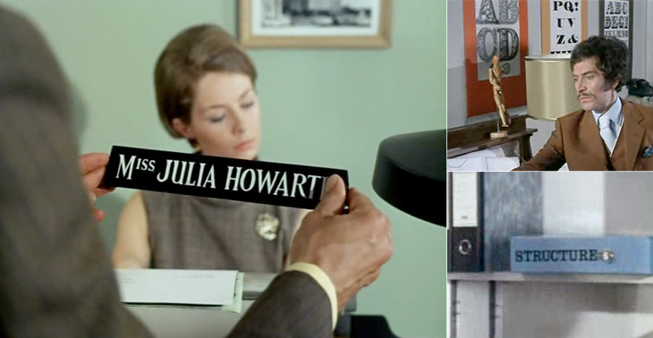
There are other nice bits of lettering in the series too - lots of traditional signwriting, some big typeface samplers used as decoration, and the odd bit of Letraset. Overall the show seems designed, there’s a real touch of quality to the whole thing - I guess that’s why it’s one of those cult classics. If you ever see any of it, pay attention to the cuts between scenes, there’s a very nice alternating set in Six Days especially (the bit with the phone calls and the photos being taken of secret documents, if you want to know). Very nice.