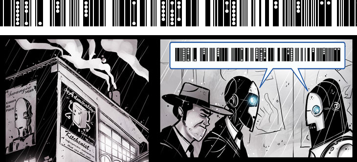
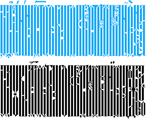
I’ve been following Penny Arcade for quite some time now - they run commentary and opinion on games with short articles and webcomics, expertly written and drawn by Gabe and Tycho. They’ve recently been running a series of webcomics exploring various short stories (not strictly on gaming, but perhaps in universes shared with many games), one of which is Automata. It’s all rather good and worth following (part 1 here, 2 onwards from here), but one thing that got my attention was the representation of speech between the automata characters, shown below.
I like the addition of the dots to the barcode pattern, hinting at multiple tones and levels of sound - something interesting to add to a script - and as the character in the comic refers to it as ‘clickwise’ I got to wondering how languages with clicks were transcribed in the real world. Unsurprisingly, there are various forms of dots, circles and exclamation points, forming a kind of visual onomatopœia for clicks, ‘tsks’ and ‘tuts’.
Comics of course have a rich vocabulary of such things, and I find myself sometimes wishing for a bit more symbolic depth to the Latin alphabet - new forms of punctuation perhaps, maybe even a whole new script, or scripts. To illustrate and explain further, I think everyone has come across the problem of misinterpreting or being misinterpreted when using email - you thought you were making an oh-so-clever dry witticism and it comes across as scouring contemptuous sarcasm (say), so usually the only recourse is to pick up the phone so that your tone of voice can be heard. However, since we’re increasingly using text to communicate, especially in the social, rather than business or technical, arena, and even more importantly in the plain text and short form media such as SMS, we may need to expand our symbolic vocabulary to indicate things such as tone of voice, humour, sarcasm and sincerity. We have emoticons of course, and in time some of them (beyond 263A, 263B and so on) may find their way into Unicode, but they’re pretty blunt things and as it’s subtlety we need, we’ll need something a bit more flexible and, well, more like language.
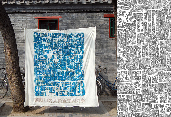
Only yesterday I posted about cities, maps and dense architecture, and I find this on NOTCOT - Instant Hutong. It’s an art project to both record and to bring to people’s attention the traditional patterns of neighbourhoods, courtyards and lanes in Beijing - under threat from development (of course). When I saw the small picture on NOTCOT, I thought it was actually close-set lettering as the main streets appear to form natural ‘baselines’ in the dense pattern of buildings. Interestingly, one of the pieces in the project is a collection of name stamps, set with small chunks of the street pattern - bringing to mind the idea of the built environment as being part of people’s identity, a kind of language they use in interacting with the city and the world. To lose that language, the structures of the city, the place where you grew up, is to lose a part of your identity - not a particularly controversial or new idea, but definitely worth reminding ourselves of from time to time.
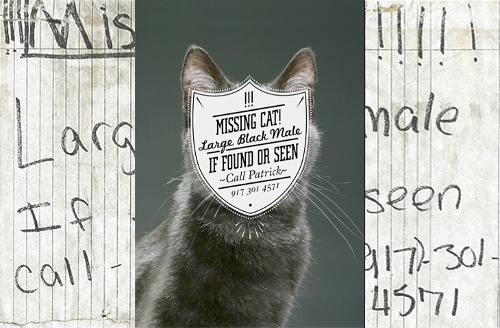
One for the ‘what a nice idea’ pile, this. Cardon Webb goes round upgrading notices pinned up in the streets - you know the ones, ‘Lost Cat’ and the like. There’s one I saw the other day near me that was pleading for the return of a lost plush bunny. I hope they found it; the tone of desperation told a whole story in itself, a wailing inconsolable child, pushchair left unfolded in the hall, coat fallen to the floor, scattered attempts to make-it-all-better: a melted bowl of ice cream, other toys, the Teletubbies DVD and so on, and still the sobbing.
Anyway, back to the nice things. I found this on idsgn, who had created a nice header graphic out of the ‘before’ and ‘after’ images of one of them, and I found that such an appealing presentation I’ve recreated it myself. Still, the original works are the stars of the show, so have a look round on Cardon Copy at the others. I initially thought that the idea was to simply improve the original notices but found a few of them rather hard to read, reading the Cardon Mission reveals all:
Cardon copy takes the vernacular of self-distributed fliers and tear-offs we have all seen in our neighborhoods. It involves hijacking these unconsidered fliers and redesigning them, overpowering their message with a new visual language. I then replace the original with the redesign in its authentic environment.Cardon Copy
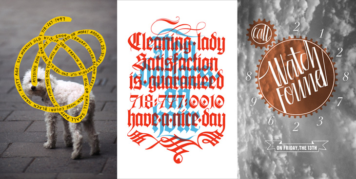
So there you go, the key phrase is ‘overpowering their message’. Explains some of them. The others, like the one below, are far more appealing. You’d keep an eye out for that cat:
This is my favourite one.Harder to read at a glance, but probably more likely to make you stop and look than the originals.
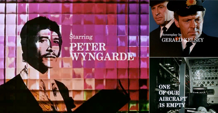
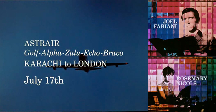
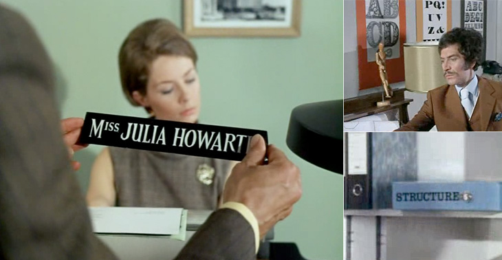
I first watched some episodes of Department S on the UK channel Bravo a few years ago, and I remember thinking at the time how great it was - the Jason King character is ace (there was a spinoff series based just on him). However, what really got my attention and had me making screenshots from the DVDs is the typography of the titles and scene-setting panels. They’re very nicely done, and highly unusually are set in a fairly fine and delicate (for low-resolution TV!) serif face - in this case Century Schoolbook. The titles were done by Chambers and Partners, who did a lot of the titles for TV series in the 1960s, and I wonder whether this was a bit of an experiment for them, an attempt to break the mould somewhat. Their experience shows though; it’s all very well done and brings a lovely printerly quality to the screen. I’m glad they did it.
There are other nice bits of lettering in the series too - lots of traditional signwriting, some big typeface samplers used as decoration, and the odd bit of Letraset. Overall the show seems designed, there’s a real touch of quality to the whole thing - I guess that’s why it’s one of those cult classics. If you ever see any of it, pay attention to the cuts between scenes, there’s a very nice alternating set in Six Days especially (the bit with the phone calls and the photos being taken of secret documents, if you want to know). Very nice.
Some of the titles and scene-setting panels.A few other bits of lettering and type in the show.
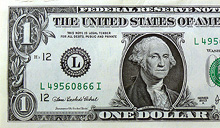
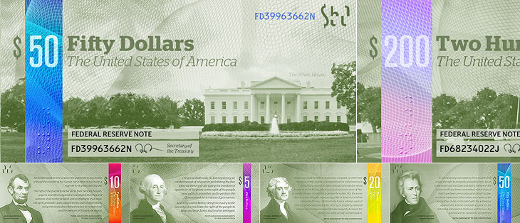
I saw this linked from ISO50 this morning: The Dollar Redesign Project is a competition (Campaign? Bit of fun?) to promote the idea of fully redesigning the US banknotes, possibly on a regular basis, like many banknotes the world over:
The American Dollar has not truly been redesigned since about the 1930s. The Dollar ReDe$ign Project is your opportunity to theoretically ‘change’ that. Yes, technically there are many limitations and complications when it comes to bank note design, but if the Swiss can do it on a regular basis, why can’t we North Americans too?The Dollar Redesign Project
There are only a few designs on there at the moment, some a bit jokey, but of the serious ideas I quite like the ones in the first set below. I can’t see any notes that deviate too far from the originals being successful, as there are so many cultural and linguistic associations with the ol’ greenback; it may seem tediously conservative, but notes that aren’t predominantly green just won’t feel like dollars. I hope the designs go further than the ‘stick a guilloche on it and call it a banknote’ idea - guilloches are beautiful things - I wrote about them before, here - but it takes more than a few of those to make a successful banknote.
Perhaps a little too reliant on that colour bar to tell them apart, but I like these.I like the return of the original US motto, translated and updated as 'E pluribus unum' on this one.Relative sizes of UK notes
One usability feature common to many banknote systems, and I’m surprised the designs so far haven’t addressed it, is to have different denominations in different sizes. UK banknotes do this (see right) and it’s reasonably easy to feel whether you’ve a £5 or a $20 note in your pocket because of it. £50 notes, while far from the tablecloth-sized notes of old, seem positively enormous compared to a fiver. I wonder how many mistakes are made every year from having all the notes the same size?
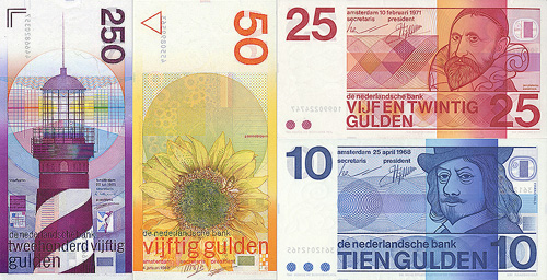
Of course, no article about banknote design would be complete without a mention of Ootje Oxenaar’s designs for the banknotes of the Netherlands below, now sadly replaced by the rather dull Euro notes. At the risk of seemingly terribly shallow for a moment, to my mind the design of the Euro is a pretty good reason for the UK to keep the pound. Banknotes are like little works of art, and to squander the opportunity to produce a remarkable and beautiful design for them is a sad thing. I shall be watching what comes out of the Dollar Redesign Project with interest. I may even have a go myself.
A few of Ootje Oxenaar’s designs for the Netherlands banknotes. More here.
Well that was fun. BibliOdyssey posted these images of manuscripts from the National Library of Serbia last week, and I wasn’t sure if I wanted to trace vyaz script lettering, or redraw it. The urge to redraw won out, and as I was doing it I remembered this post from Tiffany on Flickr, which led me to this thread on Typophile, where Ivan Gulkov shows some virtuoso skills with the style. I can understand the decision not to create a font and instead create a vector file of parts - I ended up creating a set of parts myself for my redrawing below. Creating a font would be a mammoth task, and besides, creating lettering like this is fun. You can see more of Ivan’s work and his portfolio on his personal site. Go take a look.
Top, redrawn from this. Bottom, redrawn from this.
The lettering I’ve redrawn differs a bit from the vyaz script in the Typophile thread, which makes me wonder how much regional variation there was in the script, or whether it was just down to the styles and whims of the individual scribes. In my redrawing I’ve tried to keep to the original lettering, but have straightened the verticals and made the spacing more regular, which I think still keeps to the spirit of the original. I’m also interested in this one, which seems to have some kind of transitional form going on. As the style appears to be more about creating an image rather than being easy to read, it reminds me of the patterning and illustration possible with Arabic calligraphy, which I’ve posted about before.
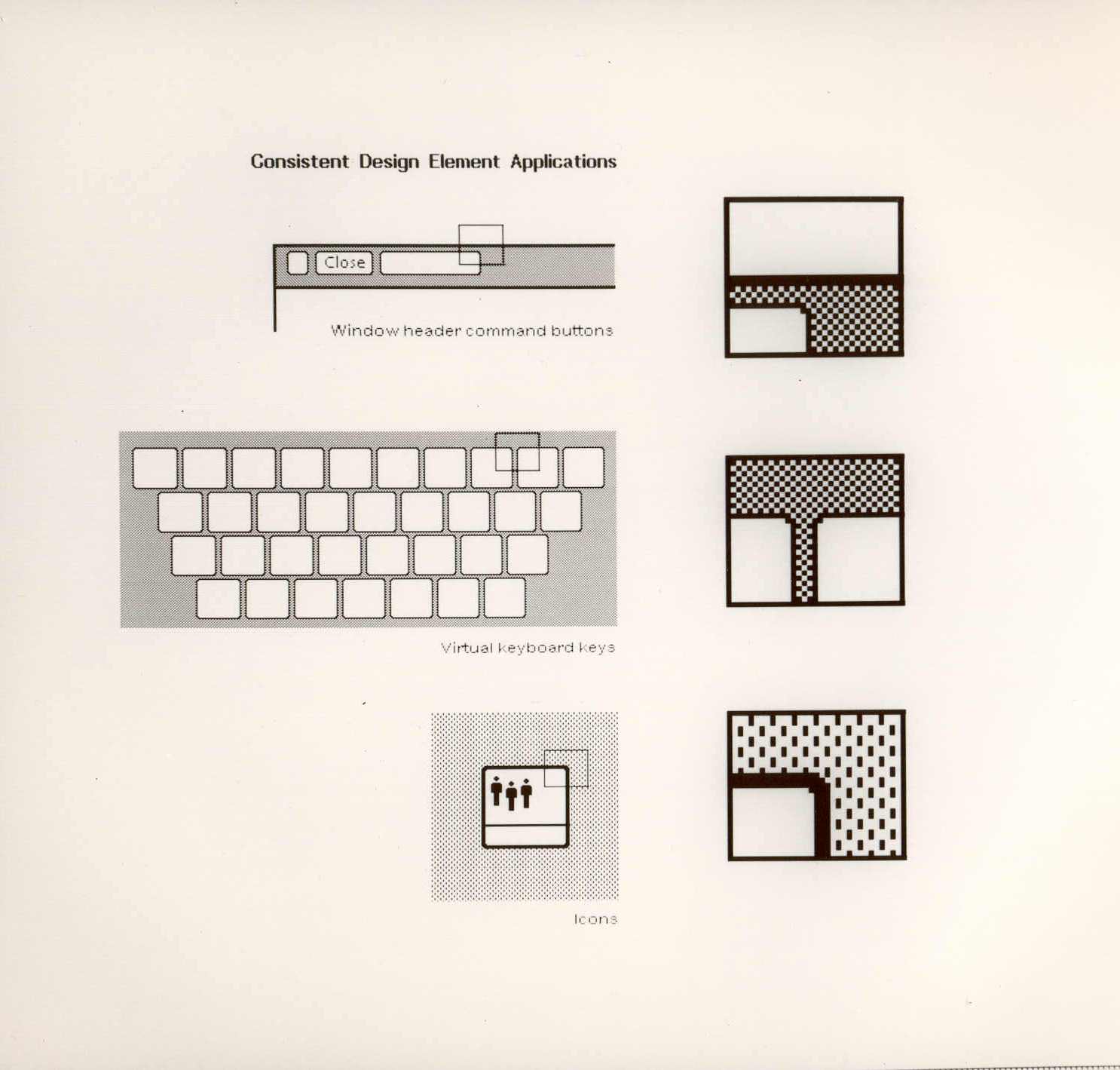
A couple of weeks ago ISO50 linked to this set of polaroids of the Xerox Star user interface on Digibarn, and I’ve been looking back at them on and off since. The UI has some interesting little details; it was designed for a two-colour display, so used a couple of dithered patterns to create the grey shading on the desktop background and window titles, which in turn created a few problems for the designers. To get a neat, crisp interface, icons and windows have to be sized and positioned on the background so that the black and white dots don’t interfere with the outlines and create a kind of blur or eye dirt effect. The polaroids show some of the design notes and instructions for doing this; it’s a lovely illustration of the attention to detail they employed to make the best of a technological limitation. Rather than recreate them directly (you can see the originals here, and here) I’ve redrawn a bit of the UI here, with ideal alignment on the left and detail top right:
The difference a pixel makes.
If I’m to get preachy (and ranty) for a moment, I think it’s a task any designer should attempt as part of their education - what you learn from designing for such a restricted display helps with all sorts of design tasks later; you learn what causes a lot of those visual disruptions and artifacts that you catch from a quick glance or out of the corner of your eye. It may be subtle, but it’s the kind of thing that reduces the overall apparent quality of your work, the stuff that marks out your work as being standard (read: mediocre) or exceptional. If you feel you shouldn’t get precious about such things, perhaps graphic design isn’t your thing.
How the icons are laid out on the desktop. The big flaw I see in this design, still not fully solved in desktop UIs today, is the display of longer filenames when displaying icons in a grid. They’re either truncated or hideously force-wrapped. Ouch.
As others have noted, the UI at first seems remarkable for its apparent modernity, the conventions it uses are still ones we use today; with a graphical update to it you’d get a reasonable facsimile of any windowed GUI of the past few decades. The designers at Xerox clearly did a remarkable job, addressing so many design problems at once, with solutions so good that almost three decades of development haven’t significantly improved on them. We could throw up our hands as a result and say that this is clearly it, that nothing new can be done, but apart from being depressing, this would miss a couple of important (to me) points:
The hardware configuration of a desktop computer has barely changed - we still use a mouse (or equivalent), a keyboard (however fancy and bristling with hotkeys it is) and a screen (whatever the technology, it’s still a 2D array of pixels)
We haven’t changed - we’re still human beings.
Essentially, we are still the same configuration of limbs and sensory organs using the same configuration of display and input devices. It’s when we change either of those configurations that we see where all the real innovation has been. Adaptive and assistive technologies are developing faster and faster as component prices fall and previously isolated innovators are connected and share information online, and in tandem with this we see the spread of input technologies that enable methods such as touch, voice and gesture. We can hope that these technologies become widespread enough to change the design of the traditional desktop, or even make it obsolete, and that leads me nicely onto…
A futurist digression
Heading off into the realms of the futurist for a moment, I think a lot of attention has been given to display-related technologies such as 3D/holograms, but not even sci-fi has come up with anything really remarkable with the idea - oh sure, you can create a hologram of a keyboard, or a touch screen, but those merely address matters of convenience: you don’t have to store the thing when it’s switched off. The interfaces we see in films are mostly still all about manipulating pictograms. What I’m really interested in are the kinds of interface that use our other senses, interfaces that seem less flashy and appear almost mundane such as vibration (as in mobile phones), things like the sleep indicator on Apple computers and potentially most importantly, speech.
Forget flying cars, we’ll know it’s the future when we can talk to our computers, just like in Star Trek, but hopefully not quite like in 2001: A Space Odyssey.
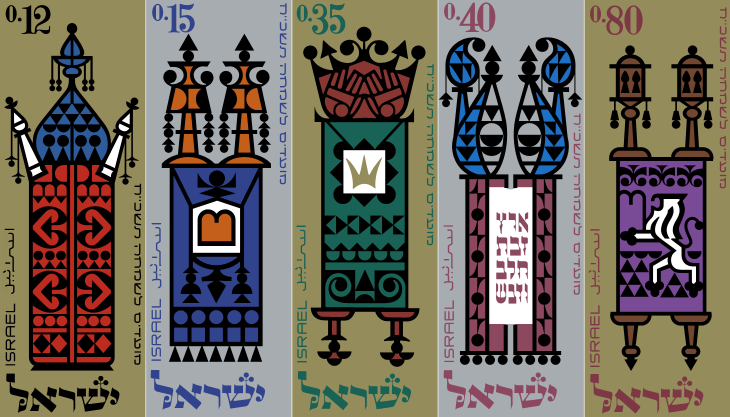
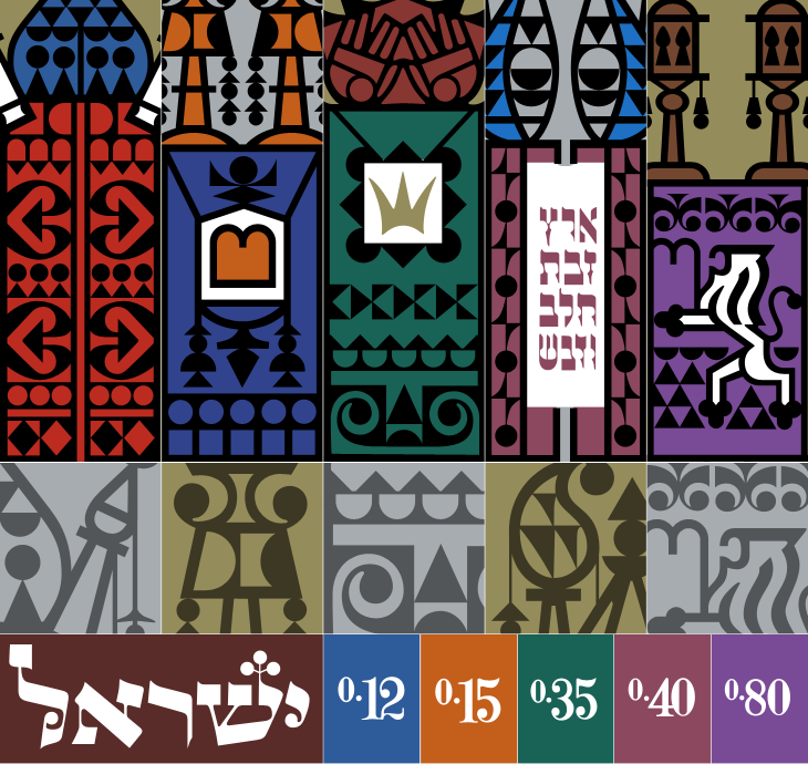
Ffffound is a dangerous site. I try not to visit unless I’ve got a couple of hours to spare as before I know it it’s dark outside and I’ve got a couple of hundred tabs open all with amazing things in. On my last bout of browsing the site I found a couple of links to So Much Pileup, specifically these two posts, Philately Fridays: Israel 1967 and Israel 1976. I’ve traced both, but I’m just going to post the one set for now as I’m not entirely satisfied with how the 1976 ones came out. Some things just need gold ink.
The set of stamps was called “Joyous Festivals 5728”, released in that year (1967) and commemorate five festivals with illustrations of decorated Torah scrolls. Each of the stamps originally had a tab showing an illustration of an open scroll and a biblical sentence, which unfortunately I don’t have decent pictures of. There’s a tiny bit of information here, courtesy of Israel Philatelic Federation’s stamp catalogue (another strangely hard to use website). I’ve included my tracing here. The patterns are beautiful:
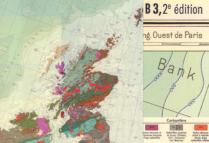
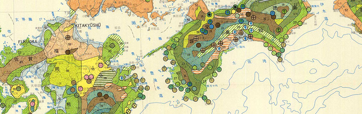
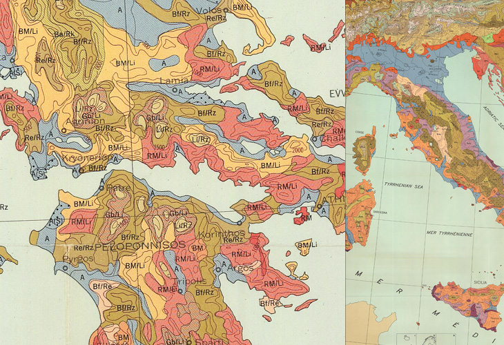
I found some maps from this site in a Google Images search quite some time ago, and kept a few links to some of the prettier ones. The maps show a variety of things, mostly soil types, but some show other environmental information such as bioclimates, soil erosion and watersheds, all in bright colours and fantastic textures and patterns. Some of the compositions are quite beautiful; bright splashes of colour for the regions of interest and stark outlines and clean white paper for everything else - a nice source of inspiration for graphic and information designers.
If you’re interested in site usability, then this might be a (another) good example of a site with great content but bizarrely inconsistent and difficult information architecture and user journeys. The home page is (I think) here, but to save you a few clicks on mostly pointless splash screens, here are the pages for Europe, Africa, Central and South America, Asia, The United States and Canada. Australia, New Zealand and the Pacific Islands don’t appear for some reason, unless I’m missing a link somewhere.
Mostly Scotland, and a nice big chunk of Atlantic Ocean.The forests of southern JapanTwo crops from the same map of a large swathe of Europe.
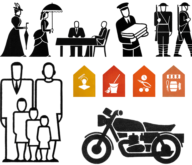
A couple of weeks ago I linked to the AIGA set of passenger and pedestrian symbols, and I find today (again, via Chris Glass) this set of icons by Gerd Arntz. These ones were created much earlier in the 20th Century; as part of the Isotype project set up by Otto Neurath to provide information to the often-illiterate proletariat, newly empancipated by socialism:
This knowledge should not be shrined in opaque scientific language, but directly illustrated in straightforward images and a clear structure, also for people who could not, or hardly, read. Another outspoken goal of this method of visual statistics was to overcome barriers of language and culture, and to be universally understood.gerdarntz.org
The set is worth having a look through, especially if you read this detailed essay on Isotype as well (thanks to Sasha for the link). Gerd Arntz’s earlier work, strongly informed by Otto Neurath, is near the top of the list, while his later work is near the bottom. A few of my favourites from the set here - some of them remind me of the opening titles of the TV series Jeeves and Wooster (set in the same decade most of these were designed):
Some symbols from the Isotype set. There’s much more information on Gerd Arntz, his other works and more about Isotype and Otto Neurath here.
Looking at these, seeing the symbols that were once universal, and those that still are, I can’t help but wonder which of today’s universal symbols will be understood in 50, 100, or 150 years time. Some will of course require updating as technology develops - for example you can see how the shape of cars (and therefore the related symbol) has changed from this vintage one, to this more modern one. Others, such as the family one (above) are still perfectly recognisable today and we can imagine will continue to work perfectly for centuries yet. However, could societal changes mean that future ‘family grouping’ symbols will need to be less gender specific or specify one adult, two, three or more; will extended families or multi-family groups be the norm? How can we design symbols that last when we don’t know what will change? Should we even try? It’s certainly something that occupies the minds of people trying to come up with an effective symbol for nuclear waste. If symbols can become out of date in 50 years, how to design one that still works for 10,000 years ahead?
All the news that’s fit to have yet another icon for.
It’s these changes to what we regard as universal and unchangable that interest me, along with this idea of developing a consistent visual language for a wide range of things. Using a personal example for a moment: like anyone who’s had to design a website or any kind of user interface in the past 10-15 years I’ve designed a fair few icons, and even in that short time there’ve been a lot of changes to once common symbols. There was a time when the prevailing wisdom for corporate websites, intranets and e-learning applications was icons with everything and if you can click it, icon it which meant vast libraries of confusingly similar icons for similar concepts - ones where words would be better. Think how to differentiate (on a small icon) between reloading a file, sending a file, moving a file, receiving a file, copying a file, downloading a file, uploading a file, and so on. Would you use arrows? Pointing which way? Left, right, down, up? Maybe you need curved arrows too. Colours?
Fortunately we’ve moved beyond that (mostly), but I remember that you just had to have an icon for ‘news’, which, so that you wouldn’t confuse it with any ‘documents’ icons, was for a while represented not by a newspaper but by an RKO-style radio mast - indeed, if you remember Pointcast, you may remember the application icon for that was that very thing. Now, our visual language of online icons is part of a rapidly maturing set of design patterns - we see icons, but only for a very small set of functions that are common across sites and often across devices; things such as shopping basket/cart, info, and the audio control icons such as play and pause. It seems that for online applications the idea of a universal visual language is at least seriously out of fashion, and I wonder how much of an influence that will have on the offline world.
Will airports of the future only have symbols for one or two things? I guess that depends less on fashion and more on the growth of literacy in the world, and the decline in the number of languages people will use.
