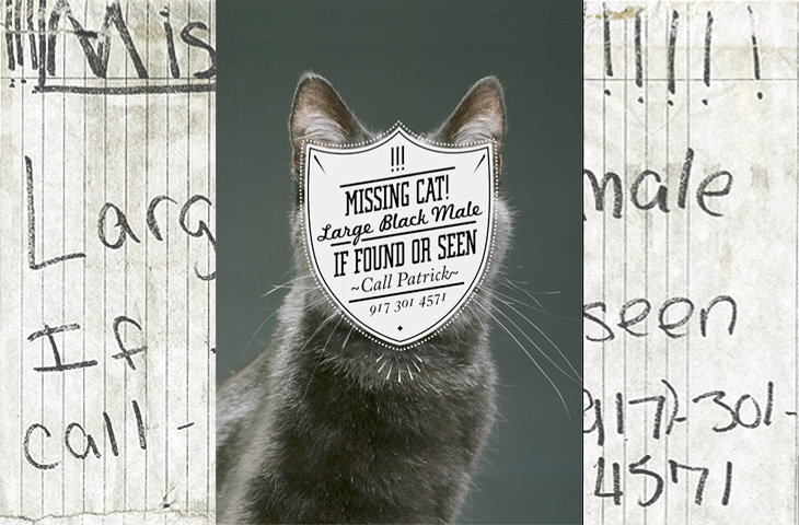
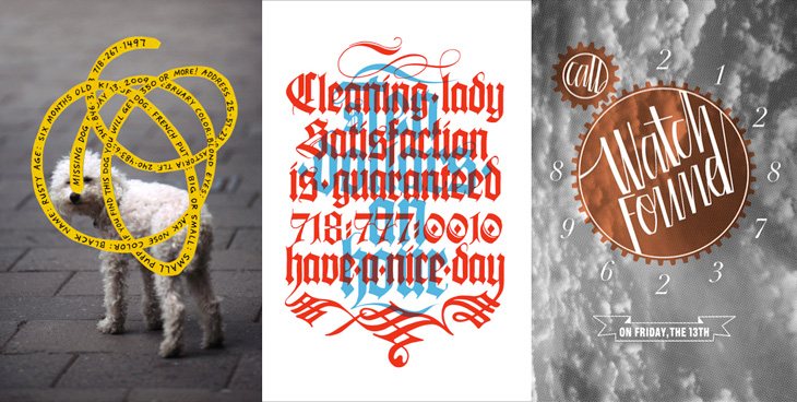
One for the ‘what a nice idea’ pile, this. Cardon Webb goes round upgrading notices pinned up in the streets - you know the ones, ‘Lost Cat’ and the like. There’s one I saw the other day near me that was pleading for the return of a lost plush bunny. I hope they found it; the tone of desperation told a whole story in itself, a wailing inconsolable child, pushchair left unfolded in the hall, coat fallen to the floor, scattered attempts to make-it-all-better: a melted bowl of ice cream, other toys, the Teletubbies DVD and so on, and still the sobbing.
Anyway, back to the nice things. I found this on idsgn, who had created a nice header graphic out of the ‘before’ and ‘after’ images of one of them, and I found that such an appealing presentation I’ve recreated it myself. Still, the original works are the stars of the show, so have a look round on Cardon Copy at the others. I initially thought that the idea was to simply improve the original notices but found a few of them rather hard to read, reading the Cardon Mission reveals all:
Cardon copy takes the vernacular of self-distributed fliers and tear-offs we have all seen in our neighborhoods. It involves hijacking these unconsidered fliers and redesigning them, overpowering their message with a new visual language. I then replace the original with the redesign in its authentic environment.Cardon Copy
So there you go, the key phrase is ‘overpowering their message’. Explains some of them. The others, like the one below, are far more appealing. You’d keep an eye out for that cat: