Mid Century Modern Stickers, Labels and Stamps

Browsing Grain Edit earlier I saw a sidebar link to the Mid Century Modern - Sticker, Label + Stamp Club on Flickr. The title describes it pretty well, but with 1804 items (as of writing) the scope of the collection is pretty breathtaking. I sometimes wonder at all the collections of mid-century stuff online, there’s a hell of a lot of it out there and I enjoy finding new collections like this, but will I tire of it at some point? Perhaps it’s old enough now so that most of the crap to have been edited out — long composted in landfills or left to crumble in attics and the backs of garages — and what we’re seeing is genuinely timeless, quality design. I certainly hope that’s what it is. For now, I’m happy to have found this collection, and even happier to have the time to spend tracing a few things, like this Israeli stamp illustrating the story of Jonah and The Whale:

The pattern of buildings reminds me of the illustrations from books of biblical stories I was given to read as a kid. The pink whale on the right is from the detachable tab that comes with the stamp.

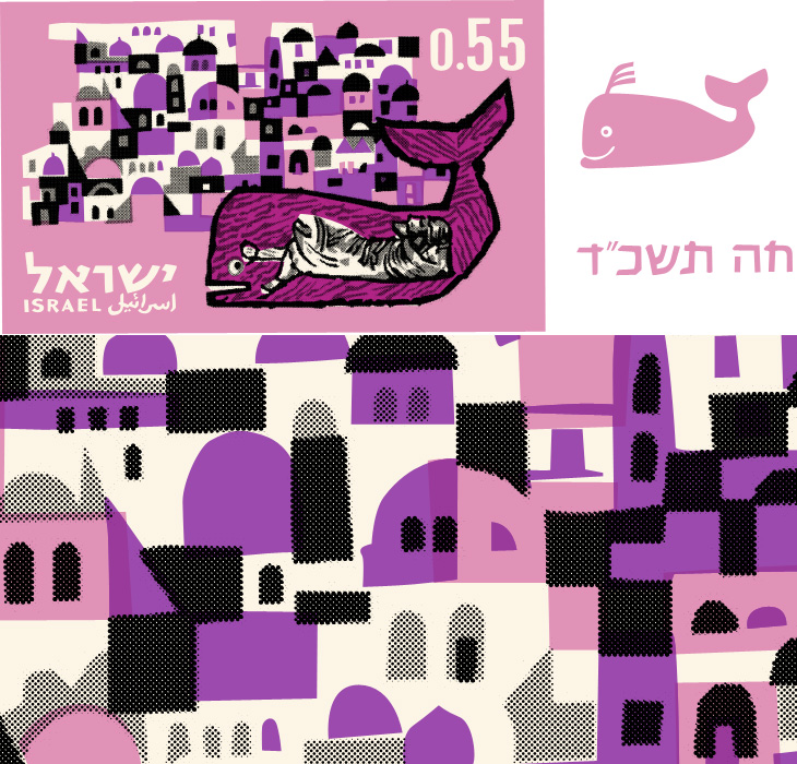
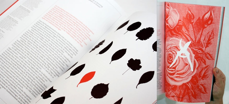
I didn’t fancy leaving it all as flat colour — much of the appeal here comes from the simplicity of the printing, especially the visible halftoning — so I took the shapes I’d made for the two tones of black and used Vectoraster* to create the halftones, and I’m quite pleased with the result. Illustrator wasn’t though; my attempt at doing halftones for the pinks crashed it pretty comprehensively.

Under The Milky Way

These posters by Ross Berens are beautiful. I’d love to see them higher resolution, and on nice paper, printed with archival inks, and yes, pretty much on my wall. They’re of all nine of the planets and their moons we knew before 2006*, with various details of their atmospheres, orbits and other features displayed using a range of infographic styles. They remind me of the posters and books I had as a child, but of far higher quality — these look like something you’d get from NASA itself, or today, the Science Museum. Lovely things.

Small Caps

I just read this post by Joe Clark, linked from Daring Fireball, about why you shouldn’t use small caps for acronyms. In it, Clark provides some examples which at first glance seem to support his argument, but a little thought reveals them to be mere examples of ill-considered typography rather than a crushing blow on the use of small caps.

I’m well aware the whole article may well be trolling, but there is one particularly egregious argument I’ve heard many times when the subject of typographic style comes up - though normally about apostrophes:

This nonsense, promulgated by snobs like that bore Bringhurst who have not read anything written after Jane Austen croaked, ostensibly improves typographic colour. What it actually does is inhibit reading.

Of course, anyone who has actually read ‘that bore’ Bringhurst would know that he is far from a bore and that he is all about promoting typography that aids reading. Setting acronyms in small caps does work well in a large number of cases, and it does indeed improve page colour, thereby reducing distractions to the reader, but as in anything there are no universal solutions. From the very section in The Elements of Typographic Style on the use of small caps for acronyms, Bringhurst states, ‘Refer typographic disputes to the higher courts of speech and thinking’. In other words, if you’re not sure, remind yourself how you’d say it or think of it — think of the meaning first and the style should follow.

I feel a little dirty responding to stuff like this, but I have a point to make. Articles like this promote a dichotomy, an idea that this way is right and that way is wrong, this way is snobbish and that way is proletarian — but when applied to typography it boils down to utter nonsense. The goal here is to allow the meaning of words to shine through. If you use small caps and it makes something hard to read, you should stop using small caps for that thing, and vice-versa.

Making a typographic decision based on some political or class motivation is fine if it’s appropriate for the text, but beyond that vanishingly rare case it’s a mere affectation. Don’t be swayed by trash-talking and accusations of ‘snobbery’, please.

Oh, and on the subject of apostrophes (amongst other things), read The Complete Plain Words by Sir Ernest Gowers. It’s a good read, and full of good sense.

Measuring Type

I’ve just seen this project on Swiss Miss and I really like the idea. Matt Robinson and Tom Wrigglesworth compared how much ink different common typefaces use at the same point size by drawing them out on a wall using biros. It’s not a scientific analysis or anything but it is a gloriously fun thing to do. I like the way they ended up with a graph made out of biros at the end of it, showing how much ink is left — the resulting evidence is its own data. It’s a great way of explaining typographic colour too. Love it.

Parking by Numbers

One of the sites I visit regularly (or at least, read the RSS feed of) is Arch Daily. I’ve always had a strong interest in architecture and I enjoy looking through the pictures of new building designs — even if they do often look unrealistically neat and perfect. It’s nice, then, to find actual photos of an actual built structure, and this one caught my eye for the rather predictable reason that it’s got giant floor numbers painted in bright pink Helvetica Neue on it. As so often happens I was reminded of something, this time another set of car park numbers that also caught my eye, the Futura-esque ones on the Brighton Marina car park just down the road from me. I also think I have a bit of a thing for the number 5.

Photo by David Schreyer, from this article on Arch Daily.

Picture taken near here by me. Still there on my old photoblog.

OASIS New York

Now I really have been meaning to post about this for ages. So long in fact I really can’t remember where I found it. I don’t even have a link to it anymore and it’s only because it’s easily Googled* that I could find it again. As far as I understand it, OASIS is a map-based system for New Yorkers to see how open space is used in the city - the page about it describes this as enhancing the stewardship of said open space, whatever that means. Still, the new maps they’ve got are really quite lovely, and astonishingly detailed. I know our very own Ordnance Survey has maps this detailed, but the data is jealously guarded and even with recent changes in the right direction, detail at this level is not something for we mere taxpayers (who pay for it) to see and use without paying for it again. I hope the Ordnance Survey will see sense soon and we’ll see some fun applications with UK data like this.

Hey, I just like the maps without anything on them.

Red and Black

I’ve been marking so many things in my RSS feed either to read later or ‘post about this’ lately, and yet it seems I’ve had no time to do either of these things. This is one I’ve had marked for a while, from the ever-inspiring For Print Only, and perfectly demonstrates why red and black is such a great combination in print. I love the spreads in this report, and I’ll definitely be referring to this as inspiration for a while. Lovely stuff, go and take a look at the other images — a couple of my favourites are below.

Visual Miscellaneum

A quick heads-up on a book project I had the honour of being involved with. If you’re a regular visitor to Information is Beautiful you’ll of course already be aware of this, but just in case you aren’t, The Visual Miscellaneum by David McCandless is available for pre-order on Amazon. Sadly, I only had time to do one image for the project, but I see from the back that it looks like it made it into the book, so hurrah! Pre-order on Amazon UK here, and Amazon US here. It’ll most likely be available elsewhere too.

No, these aren’t mine. I just like them. I’m worried mine isn’t colourful enough now I’ve seen these.

Shenzhen International Energy Mansion

At first glance, The Shenzhen International Energy Mansion looks worth posting about only for the name alone, it sounds like some Metropolis-style sci-fi update of a concierge-equipped apartment block of the early 20th century. It looks, however, like any other office tower found anywhere in the world. Its rather standard shape is in fact deliberate and it does have some interesting features, explained in a way by these remarkable infographics on this Arch Daily article. I say in a way because they’re clearly made to be as much decorative as informational - with that huge pixellated type and simple iconography they bring to mind 8-bit game interfaces and thanks to the West/East labelling, recent revivals of the style like that in DEFCON. Anyway, have a closer look, and you can see how the building is designed to at least try and reduce energy use.

Les Animaux en Hiéroglyphe

This is a great little instruction book on drawing animals - Les Animaux Tels Qu’ils Sont, full of beautiful little illustrations and diagrams - you can see it on this Flickr set, posted by Agence Eureka. The illustrations are all great, but I find that for most of them I prefer the intermediate stages in the instructions, they’re constructed from spare, sinuous lines and create a beautiful abstraction of the animal - capturing something of the spirit of it rather than an explicit diagram of what it looks like. The ‘final’ drawings seem a bit too obvious, perhaps. So once I’d drawn copies of my favourites, I noticed that they reminded me of hieroglyphs, hence my choice of title - judge for yourself below.

How to draw a cricket, or modern hieroglyphs?

As an aside, I was interested by the authors listed on the book, R & L Lambry. The ‘R’ would be Robert Lambry and, well, there’s nothing definitive on who the ‘L’ is, but I suspect it might be Leon Lambry. That’s the only ‘L Lambry’ that I could find involved with illustration from around the right time. Anyone know for sure?