Well that was fun. BibliOdyssey posted these images of manuscripts from the National Library of Serbia last week, and I wasn’t sure if I wanted to trace vyaz script lettering, or redraw it. The urge to redraw won out, and as I was doing it I remembered this post from Tiffany on Flickr, which led me to this thread on Typophile, where Ivan Gulkov shows some virtuoso skills with the style. I can understand the decision not to create a font and instead create a vector file of parts - I ended up creating a set of parts myself for my redrawing below. Creating a font would be a mammoth task, and besides, creating lettering like this is fun. You can see more of Ivan’s work and his portfolio on his personal site. Go take a look.
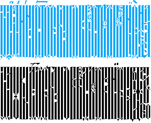
Top, redrawn from this. Bottom, redrawn from this.
The lettering I’ve redrawn differs a bit from the vyaz script in the Typophile thread, which makes me wonder how much regional variation there was in the script, or whether it was just down to the styles and whims of the individual scribes. In my redrawing I’ve tried to keep to the original lettering, but have straightened the verticals and made the spacing more regular, which I think still keeps to the spirit of the original. I’m also interested in this one, which seems to have some kind of transitional form going on. As the style appears to be more about creating an image rather than being easy to read, it reminds me of the patterning and illustration possible with Arabic calligraphy, which I’ve posted about before.