I saw this linked from ISO50 this morning: The Dollar Redesign Project is a competition (Campaign? Bit of fun?) to promote the idea of fully redesigning the US banknotes, possibly on a regular basis, like many banknotes the world over:
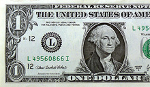
The American Dollar has not truly been redesigned since about the 1930s. The Dollar ReDe$ign Project is your opportunity to theoretically ‘change’ that. Yes, technically there are many limitations and complications when it comes to bank note design, but if the Swiss can do it on a regular basis, why can’t we North Americans too?The Dollar Redesign Project
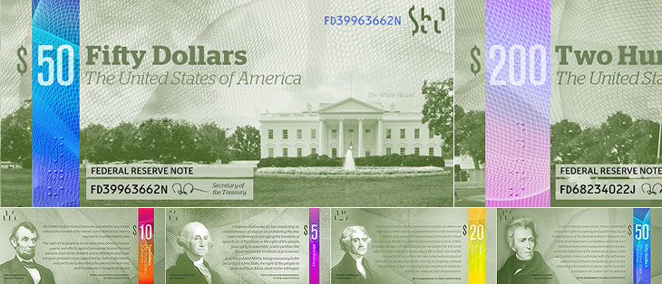
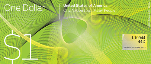
There are only a few designs on there at the moment, some a bit jokey, but of the serious ideas I quite like the ones in the first set below. I can’t see any notes that deviate too far from the originals being successful, as there are so many cultural and linguistic associations with the ol’ greenback; it may seem tediously conservative, but notes that aren’t predominantly green just won’t feel like dollars. I hope the designs go further than the ‘stick a guilloche on it and call it a banknote’ idea - guilloches are beautiful things - I wrote about them before, here - but it takes more than a few of those to make a successful banknote.

One usability feature common to many banknote systems, and I’m surprised the designs so far haven’t addressed it, is to have different denominations in different sizes. UK banknotes do this (see right) and it’s reasonably easy to feel whether you’ve a £5 or a $20 note in your pocket because of it. £50 notes, while far from the tablecloth-sized notes of old, seem positively enormous compared to a fiver. I wonder how many mistakes are made every year from having all the notes the same size?
Of course, no article about banknote design would be complete without a mention of Ootje Oxenaar’s designs for the banknotes of the Netherlands below, now sadly replaced by the rather dull Euro notes. At the risk of seemingly terribly shallow for a moment, to my mind the design of the Euro is a pretty good reason for the UK to keep the pound. Banknotes are like little works of art, and to squander the opportunity to produce a remarkable and beautiful design for them is a sad thing. I shall be watching what comes out of the Dollar Redesign Project with interest. I may even have a go myself.
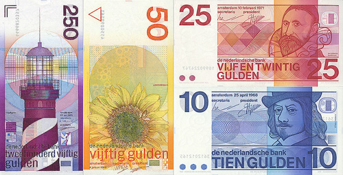
A few of Ootje Oxenaar’s designs for the Netherlands banknotes. More here.