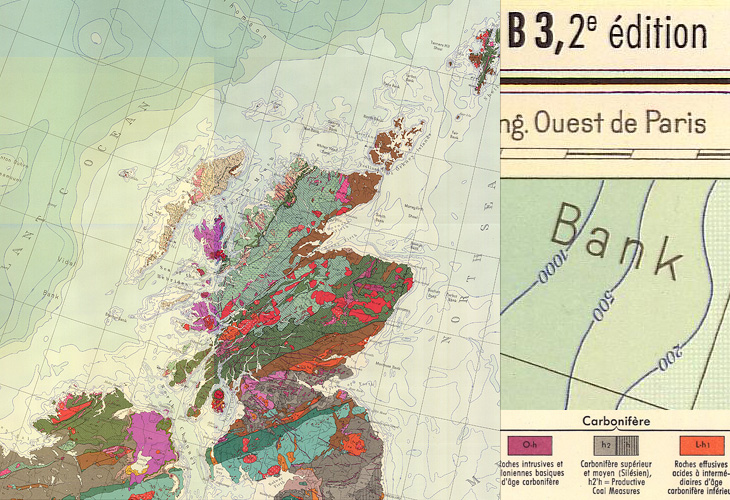
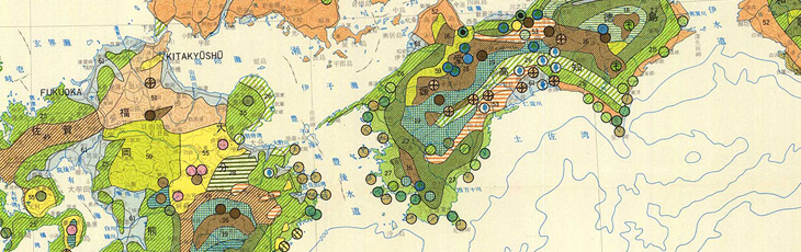
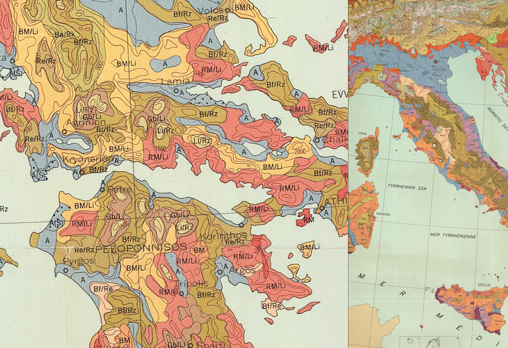
I found some maps from this site in a Google Images search quite some time ago, and kept a few links to some of the prettier ones. The maps show a variety of things, mostly soil types, but some show other environmental information such as bioclimates, soil erosion and watersheds, all in bright colours and fantastic textures and patterns. Some of the compositions are quite beautiful; bright splashes of colour for the regions of interest and stark outlines and clean white paper for everything else - a nice source of inspiration for graphic and information designers.
If you’re interested in site usability, then this might be a (another) good example of a site with great content but bizarrely inconsistent and difficult information architecture and user journeys. The home page is (I think) here, but to save you a few clicks on mostly pointless splash screens, here are the pages for Europe, Africa, Central and South America, Asia, The United States and Canada. Australia, New Zealand and the Pacific Islands don’t appear for some reason, unless I’m missing a link somewhere.