A couple of weeks ago I linked to the AIGA set of passenger and pedestrian symbols, and I find today (again, via Chris Glass) this set of icons by Gerd Arntz. These ones were created much earlier in the 20th Century; as part of the Isotype project set up by Otto Neurath to provide information to the often-illiterate proletariat, newly empancipated by socialism:
This knowledge should not be shrined in opaque scientific language, but directly illustrated in straightforward images and a clear structure, also for people who could not, or hardly, read. Another outspoken goal of this method of visual statistics was to overcome barriers of language and culture, and to be universally understood.gerdarntz.org
The set is worth having a look through, especially if you read this detailed essay on Isotype as well (thanks to Sasha for the link). Gerd Arntz’s earlier work, strongly informed by Otto Neurath, is near the top of the list, while his later work is near the bottom. A few of my favourites from the set here - some of them remind me of the opening titles of the TV series Jeeves and Wooster (set in the same decade most of these were designed):
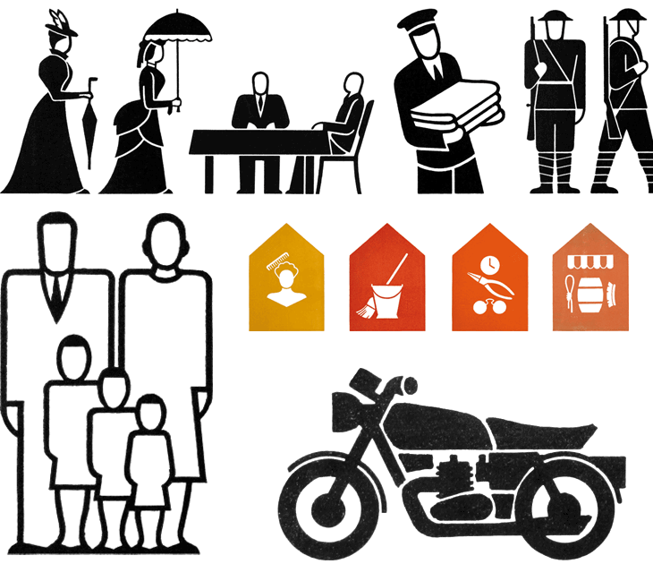
Some symbols from the Isotype set. There’s much more information on Gerd Arntz, his other works and more about Isotype and Otto Neurath here.
Looking at these, seeing the symbols that were once universal, and those that still are, I can’t help but wonder which of today’s universal symbols will be understood in 50, 100, or 150 years time. Some will of course require updating as technology develops - for example you can see how the shape of cars (and therefore the related symbol) has changed from this vintage one, to this more modern one. Others, such as the family one (above) are still perfectly recognisable today and we can imagine will continue to work perfectly for centuries yet. However, could societal changes mean that future ‘family grouping’ symbols will need to be less gender specific or specify one adult, two, three or more; will extended families or multi-family groups be the norm? How can we design symbols that last when we don’t know what will change? Should we even try? It’s certainly something that occupies the minds of people trying to come up with an effective symbol for nuclear waste. If symbols can become out of date in 50 years, how to design one that still works for 10,000 years ahead?
It’s these changes to what we regard as universal and unchangable that interest me, along with this idea of developing a consistent visual language for a wide range of things. Using a personal example for a moment: like anyone who’s had to design a website or any kind of user interface in the past 10-15 years I’ve designed a fair few icons, and even in that short time there’ve been a lot of changes to once common symbols. There was a time when the prevailing wisdom for corporate websites, intranets and e-learning applications was icons with everything and if you can click it, icon it which meant vast libraries of confusingly similar icons for similar concepts - ones where words would be better. Think how to differentiate (on a small icon) between reloading a file, sending a file, moving a file, receiving a file, copying a file, downloading a file, uploading a file, and so on. Would you use arrows? Pointing which way? Left, right, down, up? Maybe you need curved arrows too. Colours?
Fortunately we’ve moved beyond that (mostly), but I remember that you just had to have an icon for ‘news’, which, so that you wouldn’t confuse it with any ‘documents’ icons, was for a while represented not by a newspaper but by an RKO-style radio mast - indeed, if you remember Pointcast, you may remember the application icon for that was that very thing. Now, our visual language of online icons is part of a rapidly maturing set of design patterns - we see icons, but only for a very small set of functions that are common across sites and often across devices; things such as shopping basket/cart, info, and the audio control icons such as play and pause. It seems that for online applications the idea of a universal visual language is at least seriously out of fashion, and I wonder how much of an influence that will have on the offline world.
Will airports of the future only have symbols for one or two things? I guess that depends less on fashion and more on the growth of literacy in the world, and the decline in the number of languages people will use.