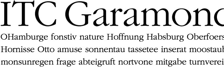
Michael Bierut hates ITC Garamond. I wouldn’t normally link to something like this, but unusually for Design Observer there are a couple of actual laugh-out-loud moments in the article, including this gem:
The most distinctive element of the typeface is its enormous lower-case x-height. In theory this improves its legibilty, but only in the same way that dog poop’s creamy consistency in theory should make it more edible.Michael Bierut
Go and have a read of the whole thing. It’s good to see an actual taste-based critique on something for a change. I’m a big supporter of backing up your statements with facts or reasoned arguments, but from time to time we’re all entitled to a bit of plain old raw opinion. And if you’d like to make up your own mind (why wouldn’t you?), here’s a sample of ITC Garamond Light:
It’s been around for millennia, but concrete is a building material that pretty much defines the architecture of the modern era. The reconstruction efforts after the second world war really got the world interested in concrete in a big way — it allowed for rapid, economical construction of vast numbers of apartments, factories, malls, roads and more, and made tall buildings commonplace.
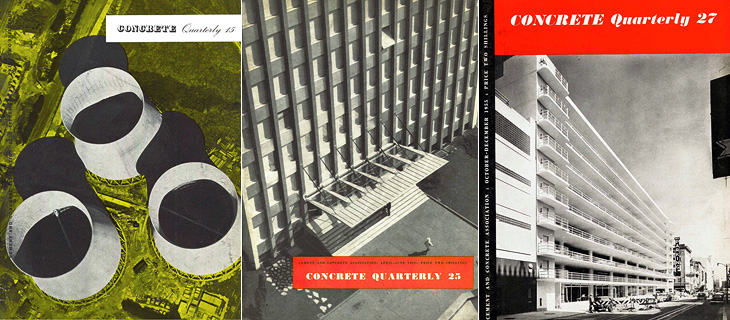
Of course, while not exactly a new building material, the uses we put it to often were. We know all too well the grey, crumbling monoliths, the remains of ill-conceived and badly built projects blighting our cities and towns, but too rarely do people celebrate the truly wonderful concrete buildings we have — from cathedrals to offices, shops and homes to soaring bridges, roads and basic utilitarian buildings, it’s an incredibly flexible and often beautiful building material. This is, I guess, what the Concrete Quarterly was designed to highlight. I’ve only read some of the earlier editions, but right from the first issue it talks of the diversity of uses of concrete; bridges, home developments and motorways all built with the stuff. Perhaps this variety is what’s influenced the design of the magazine over the years. Not until the 60s does it gain any kind of design consistency — in the 50s barely three or four editions are alike. Not that that’s really a bad thing, as some of the early covers are just gorgeous:
Incredibly lovely
I was browsing through wondering if I could spot any familiar projects, and lo, in the Winter 1962 issue there’s a cover article on Coventry Cathedral, one of my favourite buildings, which I’ve written about before here.
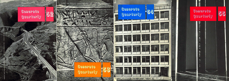
I think this was the first year with all four issues alike. That’s Coventry Cathedral on Issue 55.
Even within the same issue the headline styles vary considerably, and sometimes even the body type too. It makes for a slightly odd effect, but on the whole I think it works — it all ends up being rather charming. This one is wonderful on so many levels. Belgian Roads! What a subject!
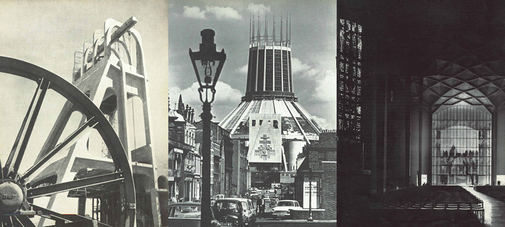
It’s worth having a look through the archives as there are many beautiful photos in there. I was delighted to see some photos of Liverpool Cathedral, which I visited many years ago and loved right away — I gather it’s not really all that popular locally but I think it’s great. Perhaps I just like anything with lots of stained glass in it.
The Stilfontein Mine in 1952, Liverpool Cathedral in 1967; and Coventry Cathedral in 1962
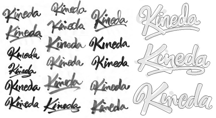
I was reading the latest post on The Art of Hand Lettering earlier and found the stages in the process fascinating, in that I preferred some of the sketches to the end result. I do really like the final logo, but there was something about one of the on-screen workings of the logo that I thought really brought the word alive — it’s the one in the detail I cropped from the article at the bottom right below. There’s something really playful about it, like the rest of the word is being bounced along by the K. Still, that’s my impression and it most likely wasn’t the client’s intention — and that’s the difference between doing stuff for yourself and doing stuff for paying clients!
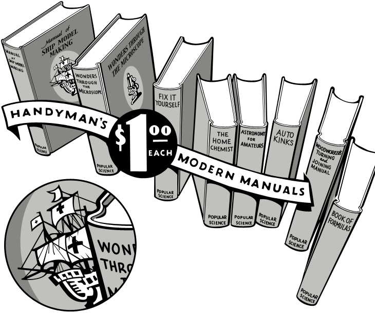
I was having a look through this collection of Popular Science editions on Google Books, and saw this beautiful advertising illustration. Naturally I’ve traced it, but the original ticks so many boxes — it’s hand-drawn, it has a strong sense of dimension, leaping out of the page at you, and the lettering on the banner and especially the price roundel is, like the illustration as a whole, beautifully composed.
My tracing — the detail circle is my own addition, I’d love to see the front of this book properly.
The arrangement of books creates a lovely dance across the page — it’s a shame the type composition of the rest of the advert, while competently done, doesn’t have as much flair. I’d like to know who the illustrator was, and what the front of the books really looked like — I’m fascinated by that little ship illustration and would love to see the whole thing properly. In fact, what are the books like? In an earlier advert there was a hint at some of the cover illustrations, but I’d like to see the ‘real thing’. Anyone out there got some?
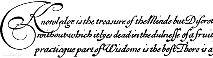
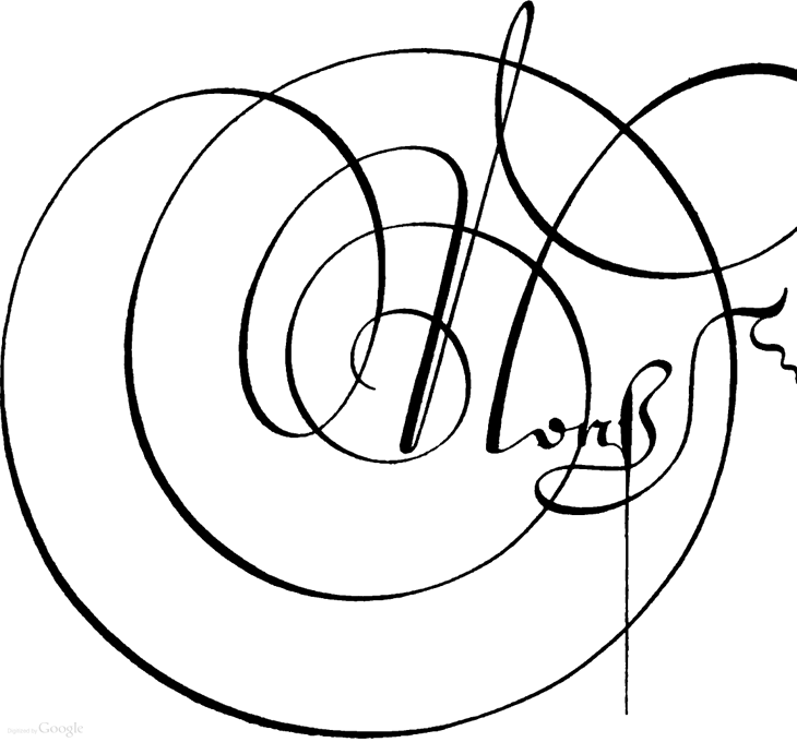
I’m sure this set of Google Books scans has gone round the design sites and twitter before, but I’ve only just recently come across it. Pretty much everything in here is beautiful and wonderful to just browse through, but if you’re a student of lettering and calligraphy (and of course, of type) then you’ll find it pretty useful too.
Personally I’ve mixed feelings about swashes and decorative initials, they look gorgeous but rarely seem appropriate to anything except for, well, historical contexts like the ones in this book. Often when I see them I think they look forced — shoved in there because they exist rather than because they add to the design or layout — It’s a real shame because I guess I’m not alone in really wanting to have a project that just calls out for a damn good swash, and yet when I do I start to fret that it’s just starry-eyed wishful thinking overruling good sense (and taste). It could be that I worry too much and should just get the pen out and start slashing away at the page with ink for the hell of it. Well, maybe not slashing as such, but when you look at some of these you get a real sense of the possibilities of drama and enthusiasm; the chance to create some really playful and exciting stuff. Wonderful:
I was looking through this particularly linkbaity article and found the beautiful piece below, Alphabet, by Irina Vinnik. It really reminds me of a couple of books of fables and fairytales I had as a kid — they all had beautifully ornamented capitals at the start of each story and I was completely fascinated by them. I did trace quite a few and spent rather a lot of time trying to draw my own. Sadly I’ve not got any of those early attempts so I can’t see if they were any good or not, but it did get me into a long and happy habit of tracing and redrawing letters and lettering which has been incredibly useful throughout my career. Funny thing with kids, I’ve noticed with friends of mine who have children that shovelling tons and tons of information at them and seeing what sticks seems to be a pretty good strategy. Your mileage may vary, of course.
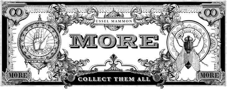
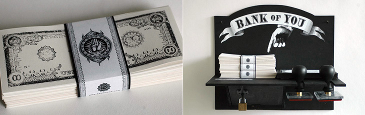
I saw this a couple of weeks ago and I reminded myself of it with my look-at-me post, then didn’t get around to finish writing about it. I really like Kenn Munk‘s designs, they’ve got a real historical feel to them, and remind me of Civil War-era state and privately-issued money in the US. I like the idea of using stamps to print money yourself — I’d love to have a go. I think the only thing I’d suggest adding is a bit of red somewhere, like a serial number or something, but that might just be because I like black and red in print.
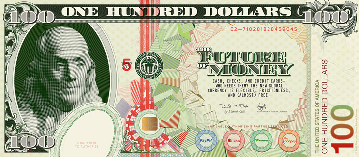
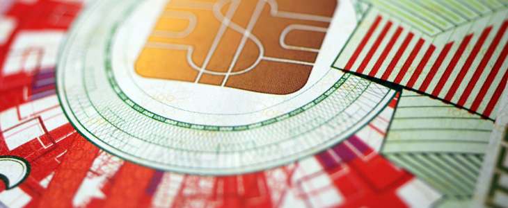
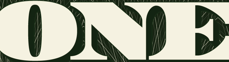
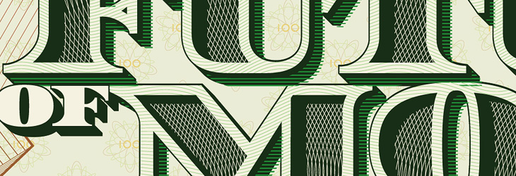
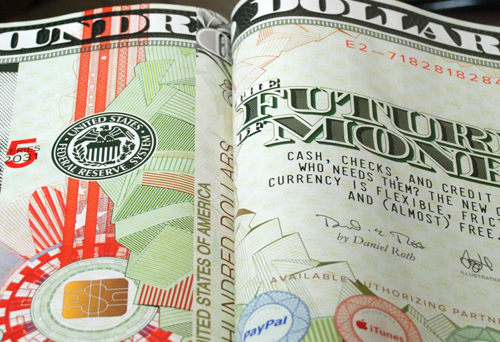
I guess now and again I can promote some of my own work — hey, it’s what keeps me from writing articles for Ministry of Type all the time, and this piece draws together a number of themes I’ve written about before here so it feels pretty relevant. This is an illustration piece I did for Wired Magazine for their US edition’s cover story, The Future of Money. It’s also appeared in the UK and Italian editions and in GQ magazine in Mexico and South Africa, which I’m pretty thrilled about.
The full illustration.
When creating, or even looking at, a banknote design, one of the first things you realise is their inherent and very deliberate imperfections. There’ll be an apparent mis-registration of colour, a strangely ragged line, a discontinuity in a pattern or an odd serif or ligature on a piece of lettering, but it’s exactly how it was designed. Without it, it wouldn’t be right. The design of banknotes represent something I find gloriously poetic — imperfect perfection — if it was perfect by our usual standards, it would be imperfect. Wonderful. So tried to capture some of that in my design, overlaying colours with an offset, adjusting the lettering a little bit to reflect the kind of oddities on real dollar notes and creating the odd layer of extra guilloche-work barely fine enough to see. I’m glad Wired is well printed and that it all came through.
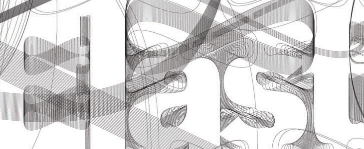
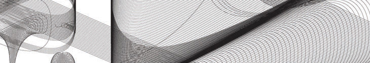
First off, my favourite, guilloches! Guilloches have an irresistable fascination for me, the finely detailed patterning building on top of itself, over and over, to create anything from complex shaded illustrations or subtle fields of colour, and all you need to do is to look a little closer to get drawn in… wonderful. Fractals have a similar kind of appeal, but there’s more of a craft to creating guilloche patterns, some idea of I made this rather than I discovered this. A subtle distinction for some, but it just gives one an edge over the other in my mind.
The lettering was actually the most time consuming part of the piece. The denomination took some time, but the big bit of work was the multi-layered title. The faces of the letters themselves are shaded with two sets of guilloche patterns, and the 3D effect was done mostly by hand — adjusting for optical clarity and to bring in a few of those all-so-important errors. I toyed with the offsetting on the faces (to create the pale outlines and shadowed cuts) especially as the “R” came out a little strange, with that square cut-off on the inner edge of the outline. I left that for a while and when I came back to it I decided I actually liked it, so it stayed.
The cropping out of the guilloche patterns to create the shading took time to set up and then quite a lot of time for the computer to do the necessary intersections. Anyone who was following my Twitter personal account at the time may have noticed a fair bit of bitching about Illustrator’s pathfinder tools, often spitting out “The filter produced no results” after 10 or so minutes of thinking, which generally drives me to use Photoshop’s vector tools for stuff: they have their deficiences, but they do the job without Illustrator’s tedious whining errors. It took 30 minutes of it thinking about it, but it got there in the end. It seemed a bit easier the second time around, when I did the localised title for Wired Italy, though sadly no quicker.
The circular pattern of cubes I did using Google Sketchup, which I’ve been using a fair bit to create another piece (which may be a poster one day), outputting it as an EPS and then going over it in Illustrator changing all the outlines to the right thicknesses and colours, then doing it again for the offset colour overlays. Fun times.
It was great to be able to use many of the ideas I’d explored before and have to make them work together in a full commercial piece. It’s fun when you’re given a brief like this, and pretty exciting seeing your work printed in a magazine.
I’ve been thinking for a little while that the text on Ministry of Type is maybe a tad too small, making me guilty (perhaps) of that terrible designers’ conceit, small type syndrome. I’ve been designing sites for clients lately with much larger text, around the 13-15pt range, and coming back to my own site with its small text gives me a bit of a jolt. So here goes, bigger text, and a switch to FF Dagny Web Pro from FontFont, delivered via Typekit. I like FF Dagny a lot for its own characteristics, but I have to admit I’m fond of it too because it reminds me of Univers and Folio. Of course, if either of those two Linotype faces were ever to be available for online embedding (ice-skating through Hades, anyone?) there’s no guarantee they’d actually work well in the browser anyway. Perhaps right now type designers at Linotype are working on web versions of their entire back catalogue?
Oh, and yes, I was thinking of this when I wrote the title.
I was browsing through the AIGA Design Archives and was attracted right away to this book cover for Design and the Elastic Mind. Irma Boom designed the cover and the beautiful lettering was done by Daniël Maarleveld, you can see more of his lettering and some background info here (thanks to Sean Kelly for the info). I’ve been experimenting with creating letters from guilloches, so I wanted to look a bit closer at how the designer had done these. It’s pretty interesting, though I’m guessing it’s software filling paths with a basic guilloche than any kind of mathematical derivation of the letters themselves. It’s still very attractive and effective, and I’m wondering what software was used to make it — exploring Excentro I’ve not seen any path-filling options — so I shall ask.
I had a look round for more info on the book, and found that it’s supporting an exhibition of the same name at MOMA. There’s a website devoted to it including this Flash ‘interactive’thing, which grandly introduces itself thus:
The exhibition highlights designers’ ability to grasp momentous changes in technology, science, and history—changes that demand or reflect major adjustments in human behavior—and translate them into objects that people can actually understand and use.
Now, after a while poking around on the site I can say that it’s somewhat lacking in that regard. The typography is unremittingly dreary; a set of very long lists set in microscopic low-contrast text with odd arrows that imply function but give none, bullets all over the place and thoroughly opaque labelling of everything. There’s an animated overlay that briefly shows images from the extended info for each of the list entries (which of course obscures the title and brief intro to it), and traces lines to other things that it’s apparently related to. You can click each of the things and find some actual interesting information in there, and some really nice imagery, but the sense of confusion never really goes away, you’re left with questions — where am I in the site, what is this, what are these connections for and about? If the intention is to show that there’s loads of stuff out there, that it’s hard to read and that finding out about any of it is an onerous task and that following the connections between things is baffling and involves you having to do work to even find out what it is and is connected to, then the site is a blinding success. And what is it with those arrows?
Shame really, because the book cover is quite lovely.