I guess now and again I can promote some of my own work — hey, it’s what keeps me from writing articles for Ministry of Type all the time, and this piece draws together a number of themes I’ve written about before here so it feels pretty relevant. This is an illustration piece I did for Wired Magazine for their US edition’s cover story, The Future of Money. It’s also appeared in the UK and Italian editions and in GQ magazine in Mexico and South Africa, which I’m pretty thrilled about.
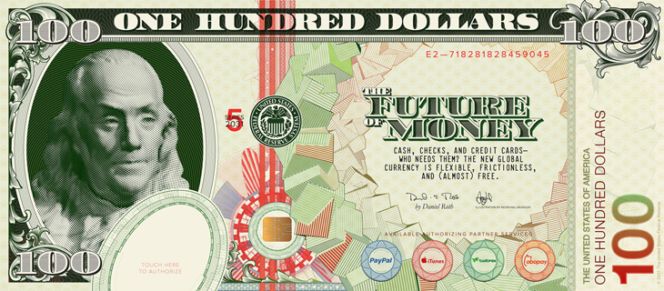
When creating, or even looking at, a banknote design, one of the first things you realise is their inherent and very deliberate imperfections. There’ll be an apparent mis-registration of colour, a strangely ragged line, a discontinuity in a pattern or an odd serif or ligature on a piece of lettering, but it’s exactly how it was designed. Without it, it wouldn’t be right. The design of banknotes represent something I find gloriously poetic — imperfect perfection — if it was perfect by our usual standards, it would be imperfect. Wonderful. So tried to capture some of that in my design, overlaying colours with an offset, adjusting the lettering a little bit to reflect the kind of oddities on real dollar notes and creating the odd layer of extra guilloche-work barely fine enough to see. I’m glad Wired is well printed and that it all came through.
First off, my favourite, guilloches! Guilloches have an irresistable fascination for me, the finely detailed patterning building on top of itself, over and over, to create anything from complex shaded illustrations or subtle fields of colour, and all you need to do is to look a little closer to get drawn in… wonderful. Fractals have a similar kind of appeal, but there’s more of a craft to creating guilloche patterns, some idea of I made this rather than I discovered this. A subtle distinction for some, but it just gives one an edge over the other in my mind.
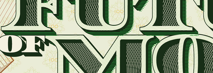
The lettering was actually the most time consuming part of the piece. The denomination took some time, but the big bit of work was the multi-layered title. The faces of the letters themselves are shaded with two sets of guilloche patterns, and the 3D effect was done mostly by hand — adjusting for optical clarity and to bring in a few of those all-so-important errors. I toyed with the offsetting on the faces (to create the pale outlines and shadowed cuts) especially as the “R” came out a little strange, with that square cut-off on the inner edge of the outline. I left that for a while and when I came back to it I decided I actually liked it, so it stayed.
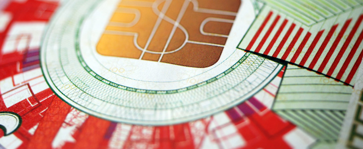
The cropping out of the guilloche patterns to create the shading took time to set up and then quite a lot of time for the computer to do the necessary intersections. Anyone who was following my Twitter personal account at the time may have noticed a fair bit of bitching about Illustrator’s pathfinder tools, often spitting out “The filter produced no results” after 10 or so minutes of thinking, which generally drives me to use Photoshop’s vector tools for stuff: they have their deficiences, but they do the job without Illustrator’s tedious whining errors. It took 30 minutes of it thinking about it, but it got there in the end. It seemed a bit easier the second time around, when I did the localised title for Wired Italy, though sadly no quicker.
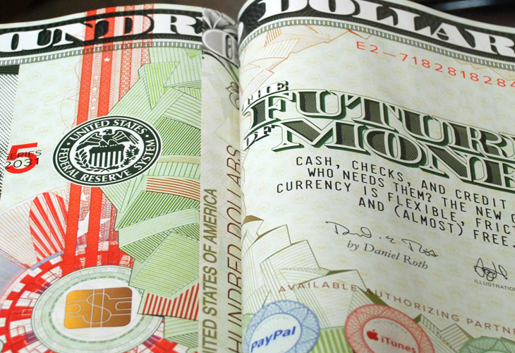
The circular pattern of cubes I did using Google Sketchup, which I’ve been using a fair bit to create another piece (which may be a poster one day), outputting it as an EPS and then going over it in Illustrator changing all the outlines to the right thicknesses and colours, then doing it again for the offset colour overlays. Fun times.
It was great to be able to use many of the ideas I’d explored before and have to make them work together in a full commercial piece. It’s fun when you’re given a brief like this, and pretty exciting seeing your work printed in a magazine.
More, please.