Server Mechanics

While I've been quiet I've been rebuilding the site in preparation for moving it to a new server. I managed to break it all several times and have made the air blue with oaths and curses against the modern world and all the technology in it. Still, turns out most of the time to have been a typo or me not reading the manual, in a sense. The rest of the time it's because things genuinely are awful with this stuff.

I changed a few aesthetic details and replaced a few functional doodads, but apart from that the site should be just the same. If you do spot a problem, please do let me know.

Return

So yes, I’ve been away from the site for, er, way too long. To say, “I’ve been busy” would be a cop-out. I’ve been busy on a few personal projects that have taken up most of my ‘spare’ time and energy, and while they’ve been great fun I’ve definitely missed writing here. I’ve got so many starred “must blog” entries in my RSS reader I’m not sure a lot of them are even relevant anymore. Ho hum.

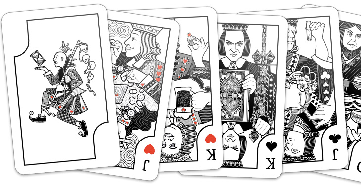
Anyway, those of you who follow my (rather ranty, sweary) personal Twitter account might have already seen these, but the big, huge personal project is nearly done – a set of playing cards. Each of the court cards represents an obsession, with a theme per-suit connecting them, Wealth, Science, Dogma and Pleasure. The joker represents Time and Death, the end of any and all obsessions. I’ve still to design the packaging and (of course) get them printed but when they’re ready I’ll be selling them, probably as some kind of limited edition type affair. They’ve been absolutely enormous fun to do, so here’s a little sneak peek:

A Slight Update

Logos from 2007, 2009 and now 2011

You may have noticed a slight change in the design of the site. I didn’t want to make big changes, as I rather like the way it all looks, but wanted to clean up a few things and remove a few things that felt tired — it’s a design iteration if you will. So, the pages are opened up and I’ve lost the dark grey surrounding background. I’ve kept the right hand margin visible though — I like being able to ‘bleed’ images off the edge, and it helps to have an edge there to start with. A more significant change is the new typeface; I’ve switched to Bliss by Jeremy Tankard, provided by Fontdeck. It’s a face I’ve used on a few client projects recently and I’ve really enjoyed working with it, so I found myself playing around with the templates here, and yes, I just had to use it.

Then, there’s a change that I almost forgot I’d made — the logo. I’ve trimmed the black bar, but also simplified the crown yet further.

Make The Type Bigger

I’ve been thinking for a little while that the text on Ministry of Type is maybe a tad too small, making me guilty (perhaps) of that terrible designers’ conceit, small type syndrome. I’ve been designing sites for clients lately with much larger text, around the 13-15pt range, and coming back to my own site with its small text gives me a bit of a jolt. So here goes, bigger text, and a switch to FF Dagny Web Pro from FontFont, delivered via Typekit. I like FF Dagny a lot for its own characteristics, but I have to admit I’m fond of it too because it reminds me of Univers and Folio. Of course, if either of those two Linotype faces were ever to be available for online embedding (ice-skating through Hades, anyone?) there’s no guarantee they’d actually work well in the browser anyway. Perhaps right now type designers at Linotype are working on web versions of their entire back catalogue?

Oh, and yes, I was thinking of this when I wrote the title.

Twitter

Yes, the Ministry of Type is now on Twitter! I’ve been using Twitter personally for a while now for a mixture of ranting, stream of consciousness ramblings, conversation and announcements of new Ministry things, so if you’ve been following me there and would like just the announcements, then follow ministryoftype. It’s not going to be a high volume feed, just announcements of new articles and various things related to the site itself.


Me, Me, Me

I dislike ‘meta’ posts, posts about posting, or posts about not posting, for that matter, and I’d rather keep my day-to-day work separate from what I write here. However, just this once I’m going to break that rule.

I’ve been busy this week getting my online portfolio up to date with a shiny new design; rather different from the clean spaces of the Ministry I’ll admit, and in a very different tone of voice, but it’s all about being appropriate I guess. Still, I finally got to use some of those guilloches I made!

If anyone needs a rather good (and oh so modest) art director, creative director-designer type hanging about their offices drinking litres of coffee, then do get in touch. The portfolio is here, and the usual LinkedIn profile is here.