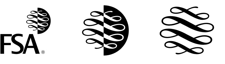
It looks like the UK’s Financial Services Authority, theoretically responsible for making sure financial institutions (like banks) stick to the law, don’t do stupid things and don’t rip people off, is to be shut down, or merged into the Bank of England, presumably because it didn’t do enough of those things well enough and often enough. This will make everything OK again, we are led to assume. Such is life. I guess this is the beginning of the end for the FSA logo though, which is a bit of a shame. The lettering is crushingly dull, but the scroll-and-circle device is lovely — a real I wish I’d done that kind of thing. It’s drawn to resemble a continuous scroll such as you’d find on a certificate or banknote, but is just cleverly constructed to look like that. It’s just so beautifully and simply done it’d be a shame for it to disappear altogether.
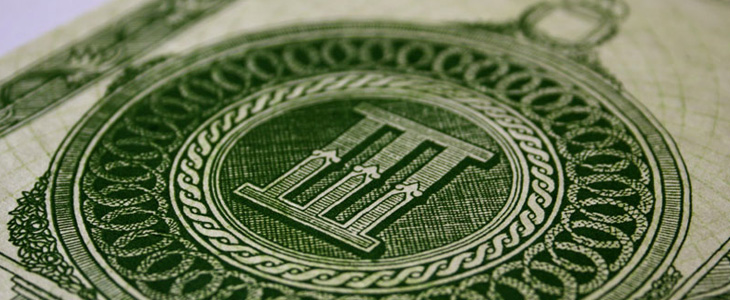
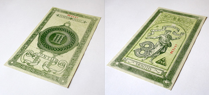
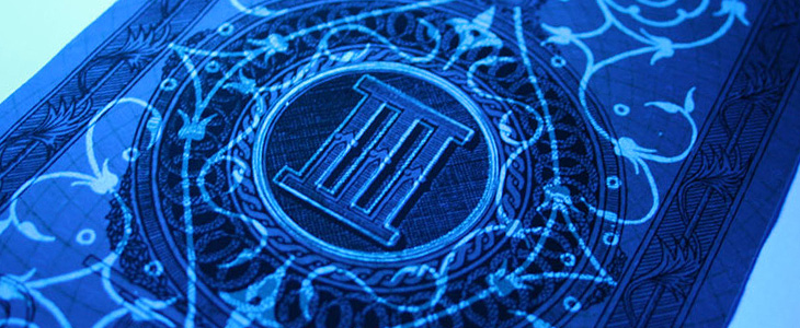
Xavi García is a student at Central St. Martins, and recently produced this banknote-inspired piece, which I find quite beautiful. It’s entirely hand-drawn and has an impressive array of security features: watermarks, UV-responsive inks and see-through images — the attention to detail here is absolutely perfect. There’s a few images here, but go and look at Xavi’s site for more. Interestingly, he’s also a student of Kenn Munk, who I wrote about before here.
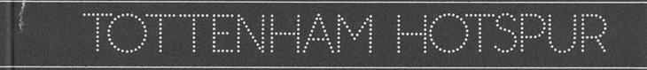
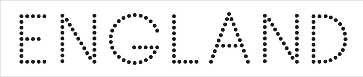
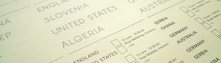
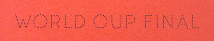
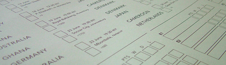
I wasn’t expecting to have anything to write about that was football-related, even during such a big event as the World Cup, but wonders never cease. When Benjamin Prescott mailed me about a personal project to create and sell limited edition World Cup wall charts he’d designed I had a big of trouble thinking what it was for — I’m so out of touch with such things. I mean, yes, I’ve a theoretical knowledge of the offside rule (something that’s talked about as if it’s one of the Great Mysteries of the Ancients) and yes, I played it at school, but the whole yelling-at-the-tv, wearing team colours and flying the flag kind of thing always passed me by. Still, I know enough people who like it all (so I can ask), and as it turned out I was just re-reading the email when I noticed I was sat right next to one of the wall charts, and a lovely thing it is too! What really interested me in it was the recreation of the typeface from Subbuteo scoreboard references — I like lettering and illustrations made from dots anyway so this was a nice find, and it works well with the Avenir used on the rest of the chart too. The wallcharts are limited edition, so I hope I’m not too late in writing about them and you can still get one if you want one.
An original Subbuteo reference and a sample of Prescott’s redrawing.
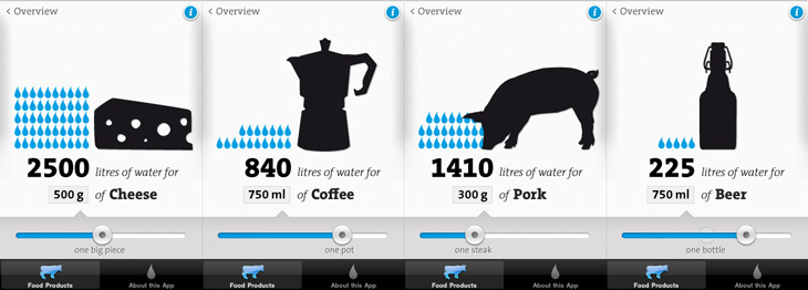
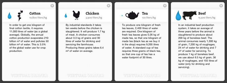
I remember seeing, and liking, the first edition of the Virtual Water poster, and I see now there’s not only a new version but an iPhone app, which has even more information in it. I particularly like the visual style of the project — the simple black silhouettes and the blue accent colour work beautifully (a combo you may notice I rather like already), and the bold, slab-serif typeface (see below) just looks perfect. The little info cards behind each item are nicely laid out too, reminding me of classic recipe cards (or cocktail bar cards), and the short sharp explanations and consistent use of units back up the infographics nicely.
Some screens from the app. I like the indicator of the ‘usual’ amounts on the slider.The background info cards.
I’m guessing the face is TheSerif Classic by Luc de Groot), though for unknown reasons I’ve never used it, it looks so incredibly familiar that I was convinced I must have. But, I hadn’t. How very odd! I may have to remedy the situation soon.
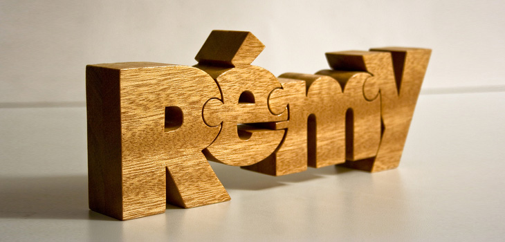
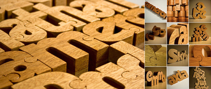
These wooden name puzzles by John Christenson are great. Grain Edit posted about them recently and I kept the link — one part of me really wants one of my own name, but the sensible part of me warns that I’ve got more than enough stuff and I’m supposed to be minimising clutter, but still, they are very nice. Seeing the photo of a number of them together makes me wonder whether a poem or short piece of prose would be a good subject, then it’d go on the wall and it’d be art and it wouldn’t be clutter at all, oh no. Rationalisations, rationalisations…
I’ve been following with some interest (especially after my e-reader post) the reaction to Wired’s iPad app. To say that it’s polarised opinion is an understatement and a half, and there have been a hell of a lot of confident-sounding assertions and assumptions about all aspects of how to take a magazine from print to screen, a few of which have got me thinking. The first of those things is:
Print designers vs. screen designers
There is this idea that there are print designers and screen designers — you are one or the other, you can’t be both, or neither, or some hybrid. This is a false dichotomy. I am a designer. I design for print, and I design for screen. I’ve also designed for ink on paper that wasn’t printed at all but applied with a pen. I’ve designed for paint on canvas (in a sense, it’s still designing). I design for a number of media, but it doesn’t mean my having skills with one precludes my having skills with another, and this is what gets me about this taking-magazines-online argument — it’s a form of ad hominem attack to begin with a dismissal of a piece of work for screen because the designer normally works in print. Ad hominem is a dreadful and ultimately sterile way to attempt to win an argument or ‘score points’. Focus on what has been made, first.
Some single pages from the Wired app.
You can’t bring print conventions to screen
I’m generalising with that title somewhat, as no-one is saying quite that. Oliver Reichenstein wrote an excellent piece on some of the print conventions that have been used in the Wired (and other) apps and how they don’t work. I agree with what he’s said, but perhaps not to the same degree. He presents many assertions as hard fact, as absolute truth, and I simply can’t accept them as such. Generally, yes, multi-column layouts can make a piece harder to read, and in the Wired app they rapidly become tiresome and distracting, but that’s not an effect limited to on-screen reading — I’ve found some newspapers and printed magazines hard to read for exactly this reason, but I’ve read stuff on screen just fine too, and the opposite (and conventional understanding) is true too. Wired’s use of multiple columns feels jarring, and in most cases throughout the magazine I’d like to just read the page as a single column of text. His other points on signalling, ornamentation and mixing fonts are largely true, but again, they’re not the entirety of the truth. It’s a matter of how skilled you are as a designer whether you make each thing work or not. Hard rules are true until you discover all the exceptions, and when dealing with human behaviour and preference I think it’s pretty much all exceptions.
Remember which magazine we’re talking about here
This is the kicker for me. I’ve read a lot of comments recently expressing the fear that the Wired app will not only start a trend for how they do things, but establish conventions. Possibly, but as pretty as it was, and as much of a wow-factor it had, the web today doesn’t look like Praystation (if you can remember that far back). Wired’s print magazine has always experimented with new ideas, from printing articles in spot varnishes, metallic and fluorescent inks, setting all the type on spiral paths and all sorts of fun, crazy things that make the damn thing impossible to read, but it was Wired. That’s a big part of what it’s always been about. To complain that the Wired app isn’t a paragon of usability is to complain about bears’ lavatorial habits spoiling your walk in the woods.
The future of magazines
I don’t know how magazines are going to develop and change for on-screen reading. The production values (and costs) of the Wired app are incredibly high — video, animations, complex interactive illustrations all cost a lot of money to make but don’t provide much ‘body’ to a magazine — you still have to produce a lot of editorial content as well. Most magazines will find such a high cost with such a low apparent return unsustainable, just as most print magazines aren’t full of expensive paper stocks and printing techniques. So don’t expect that to become a trend, instead they’ll be special features, just as a CD on the cover or a pull-out section is in the print world. No, I think most on-screen magazines will be dominated by long articles of fairly plain text interrupted with advertising, just as print ones are now. I’d like to see some better means of delivering advertising on-screen than we have now though — I find flickering and flashing adverts unbearably distracting and can’t imagine paying for any magazine that uses them in its articles, so I’d hope for something more respectful and dignified.
Whatever happens, and whatever conventions we end up with, I suspect that the reality will be at once quite wonderful if you stop to think about it, but disappointingly dull and prosaic on first impressions. I doubt we’ll have a wow moment from it, which is, I think, kind of the point.
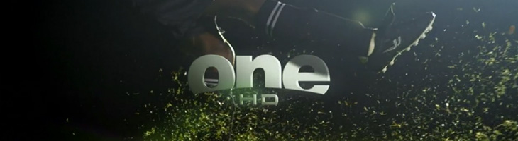
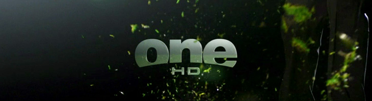
John Beohm of Idents.tv posted the six new idents for Australia’s ONE HD tv channel — I don’t have much to say on them other than they’re lovely and simple and I really like the logo. As John points out, it’s good that they avoid the crass overdone clichés of floodlit stadia and huge billboards, generally I don’t find myself watching sports channels but of what I’ve seen their idents (and identities) are all pretty much of a muchness. Lots of glassy, glossy, glittery effects, dramatic perspectives across giant dystopian stadia-cities shrouded in perpetual night; the impression you’re supposed to get is that this is epic, this is a clash of titans, a great battle to end all battles, an extraordinary experience that will resonate through time and space, this is it, and then, just as you’re (theoretically) driven to the very peak of excitement and anticipation, here’s the golf. Woo.
So yes, it’s nice to have a set of idents that have some of the actual sporting action in them. The logo looks to be a very slightly tweaked Helvetica Black — the version I have has a slightly wider aperture in the lowercase e (but it could just be the 3D rendering creating the illusion). The curve cut out of the bottom hints slightly of the epic view-over-the-horizon style of usual sports channel logos, but it’s subtly executed and provides a perfect frame for the HD suffix. Anyway, slightly more than I was intending to write on this one. It’s nice. Go and watch the videos on Idents.tv.
Up There is one of those things that’s been linked to like crazy across Twitter and most of the sites I read, but I’d not got around to watching it. I find that with a lot of online video, I mark it to watch later when I’ve a bit of time to devote to it and then, well, don’t get around to it. So, if you’re like me and haven’t seen this yet, I do recommend watching it. It’s only 12 minutes, very well composed and edited and really gives you an insight into the work of people who hand paint signs and adverts on the sides of buildings. It’s a craft that (not surprisingly) is dying out, but one that can be kept alive by commissions from a few enlightened companies and agencies. The film was sponsored by Stella Artois who, as JJ from Graphicology points out, are producing more narrative-based advertising lately. Kudos to them for this, I’ve a lot more respect for Stella Artois the company now. Less said about the lager.
Another link to the ever-inspiring The Art of Hand Lettering, this script is beautiful. I love the composition and the flow of the letterforms, the even colour across the lettering takes my breath away, and it was all done by hand, late at night. I guess that’s the sign of an expert, no? Lovely. Go and take a look at more of his work.
I’ve been thinking about pages, print and scrolling for a while, mainly because I’m a designer and it’s part of my job, but also (I have to admit) because I quite fancy getting an e-reader of some kind. I’ll say right now I’m not going to write about any particular gadget, nor do I care which is best, which is more open, which is morally better, which one is approved by the People’s Front of Judea or the Judean People’s Front or whatever, right now I’m just thinking about one particular aspect of the technology: the page metaphor.
I’m writing this with full knowledge that there are some truly excellent articles out there about this very subject, this one in particular, which you might want to read too. Thing is, while people are talking about digital books, the talk is about the printing, transport and warehousing costs and trees it’ll save, and there’ve only been a few scant mentions of how the form of your everyday novel or reference book could change. Any discussion on form has been about the premium-quality books, the Alice for iPad style remakings, the ones that make new and playful uses of the page-as-screen, and there will be some truly wonderful digital books made, we know there will. However, it’s just taken as read that for all the other books that a bunch of text will be squeezed into an arbitrary set of pages of arbitrary size, like making sausages out of text. We’re not doing these books justice with this tired old page metaphor.
What’s so good about pages?
There are some functional and aesthetic reasons we might like to use pages for a long text. The main functional one that I can see is that we get a handy idea from pages where we are — they are numbered. To return to the book later we need only remember a single number and we can find that page again and carry on where we left off. That’s a great idea, but it breaks, and breaks badly if you were to change the text size, or to carry on reading on one device from where you left off on another. I think as these are two big advantages of digital books, we can’t easily ignore them. Fortunately placeholding is pretty easy on a digital book. It simply remembers where you were and loads the book up at that point.
Yes, I know my metaphor has holes in it, like a huge Hampton Court Palace shaped one. Just bear with me, OK?
So, what about aesthetic reasons? Well, here I like to compare it to architecture, specifically building materials. In years past, and here I’ll emphasise I’m assuming quite an early sensibility, if you built your house with cut and dressed stone, it marked you out as being a pretty wealthy and (presumably) classy individual. If you built your house out of brick, it just said you had a house made of brick. It might be a nice house, but it’s a house made of brick. Nothing wrong with that, you understand, but hey, it’s not stone, and brick was something associated with industry, with commerce and with houses built on a massive scale for factory workers. So houses were built out of brick and then given a coating of render which was then scored and moulded to look like stone. It didn’t really fool anyone, so while it didn’t mark you out as wealthy, you could at least appear to be classy, and that’s important to a lot of people.
And so to books. The equivalent in my metaphor of a stone house is an actual professionally set, printed and bound dead-tree book. They’re the kind of book that is made to store Great Works; the dictionaries, philosophies, histories, plays, religious texts, the physical manifestation of all human knowledge that can be set on a page. No wonder people place great store in the idea of a printed book, for the past couple of centuries they’ve been the acme of Stuff That’s Worth Keeping. Of course, now we have perfect-bound (ha!) books produced in the millions and I don’t think even I could be accused of snobbery in saying that most of them are from the category of Tedious Drivel than Great Work, but there you go, we still have this idea that printed books are so very special, better than any other medium.
So, what of the brick house in my belaboured Victorian metaphor? This, to me, is a scrolling page of text on a screen — pretty much the kind you’re reading right now, and do on any website. Yes, it’s called a web page but it is at least a true digital page in that it can be any length, any width and be as static or dynamic as you want. It is a product of the digital age, and while the code we use to describe its content may still be inadequate and subject to billion-dollar playground fights it does the job pretty well. The reason I liken it to the brick house is that there’s nothing really wrong with it but it hasn’t the cachet, it’s associated with the mass-produced red brick terraced house in some mill town somewhere — it’s commercial, it hasn’t the sense of permanence, it’s just a this’ll do commercial pragmatism about it. Of course, just as there are astoundingly beautiful brick buildings there are beautiful web pages, but it’s all about how these things are commonly associated in people’s minds.
And so to our prettified house. The brick one with the rendering on the outside made to look like stone. It can be built nearly as cheaply and quickly as a plain brick house, but it just looks so much better (well, more fashionable) and will sell for a load more cash. It’s got the association of quality in people’s minds but very little of the cost. And here we find the metaphorical equivalent of nearly every damn e-reader on the market right now. Loaded with serif fonts because printed books use serif fonts, sepia-toned backgrounds because printed books go a bit brown with age, with justified text because… and yes, here we get to it. Justified text! For crying out loud. They’re justifying text on a small screen with such an appallingly crap set of algorithms that sometimes it’s like looking at two lists of words against opposite margins — sometimes there might be a few words floating about in the middle somewhere but in all cases the reading experience is dreadful. I’ve only heard of one app that has a decent algorithm for hyphenation and justification, but even so I think the easiest (and given the size of the screen, the best) option for justification is a setting called OFF. For a particular erudite complaint about all this, check out Stephen Coles’ article for the FontFeed.
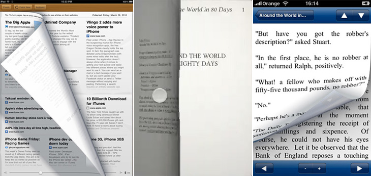
Then we get to the real fake-Georgian pediment over the front door, the overly-shiny brassy door furniture, the PVC window frames, something that infests reading software rather than dedicated e-reader hardware (but is no less annoying for it): yes, it’s the page turn animation. Oh how these software producers love their page turn animations. They might not make a big deal about their font selection, their crappy justification algorithms or even the number of books you can buy through their store, but they will always make a great big bloody feature of their sodding page turns, even the app I pointed to above. Even if an app doesn’t have these damn things, you get the impression they’re working on adding them. In a book, an actual dead-tree book, you don’t notice turning the page because it’s just part of what a book is. That’s how you get to the next bit of text. The whole idea of pages bound like that is an artifact of a particular printing technology — it’s the nature of the delivery medium, not the message. So when we have a digital book, we’re using technology that has its own set of conventions, its own restrictions and its own freedoms, and every bit of digital technology has some means of moving through any arbitrary content: a keyboard has cursor keys, page up and page down keys, a mouse has a scroll wheel, laptops have trackpads with scroll areas, and smartphones have touchscreens, joysticks or D-pads. But no. Those aren’t good enough. They’re not booky enough. You’re going to be reading Ullysses on this thing, War and Peace, The Illiad with this thing for crying out loud! You can’t sully things like that with a scroll wheel! You’re supposed to be imagining reverentially turning the thick, musty, ancient pages in some great national library somewhere, worshipping at the altar of Knowledge! Never mind the story! Never mind leaving you free to just read! No, every 250 words, perform the gesture, watch the animation!
Just let me scroll, please? I’ve been reading stuff off the screen seriously for what, 15 years? More? Scrolling is fine, you know.
I guess you could assume I’m not a fan of the current state of e-reading software. I hold out a lot of hope for it though. I think if the Instapaper (say) people went and made a full e-book reader I’d be very happy indeed. Of course, there may well be an absolutely blindingly-good bit of software out there that was made by someone who cares about simply reading but I don’t know of it — I assume someone will write one eventually. For iPad/iPhone please. If you know of one, please do let me know.