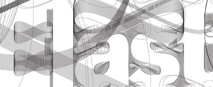
I was browsing through the AIGA Design Archives and was attracted right away to this book cover for Design and the Elastic Mind. Irma Boom designed the cover and the beautiful lettering was done by Daniël Maarleveld, you can see more of his lettering and some background info here (thanks to Sean Kelly for the info). I’ve been experimenting with creating letters from guilloches, so I wanted to look a bit closer at how the designer had done these. It’s pretty interesting, though I’m guessing it’s software filling paths with a basic guilloche than any kind of mathematical derivation of the letters themselves. It’s still very attractive and effective, and I’m wondering what software was used to make it — exploring Excentro I’ve not seen any path-filling options — so I shall ask.


I had a look round for more info on the book, and found that it’s supporting an exhibition of the same name at MOMA. There’s a website devoted to it including this Flash ‘interactive’ thing, which grandly introduces itself thus:
The exhibition highlights designers’ ability to grasp momentous changes in technology, science, and history—changes that demand or reflect major adjustments in human behavior—and translate them into objects that people can actually understand and use.
Now, after a while poking around on the site I can say that it’s somewhat lacking in that regard. The typography is unremittingly dreary; a set of very long lists set in microscopic low-contrast text with odd arrows that imply function but give none, bullets all over the place and thoroughly opaque labelling of everything. There’s an animated overlay that briefly shows images from the extended info for each of the list entries (which of course obscures the title and brief intro to it), and traces lines to other things that it’s apparently related to. You can click each of the things and find some actual interesting information in there, and some really nice imagery, but the sense of confusion never really goes away, you’re left with questions — where am I in the site, what is this, what are these connections for and about? If the intention is to show that there’s loads of stuff out there, that it’s hard to read and that finding out about any of it is an onerous task and that following the connections between things is baffling and involves you having to do work to even find out what it is and is connected to, then the site is a blinding success. And what is it with those arrows?
Shame really, because the book cover is quite lovely.
