Michael Bierut hates ITC Garamond. I wouldn’t normally link to something like this, but unusually for Design Observer there are a couple of actual laugh-out-loud moments in the article, including this gem:
The most distinctive element of the typeface is its enormous lower-case x-height. In theory this improves its legibilty, but only in the same way that dog poop’s creamy consistency in theory should make it more edible.Michael Bierut
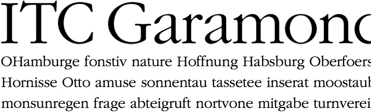
Go and have a read of the whole thing. It’s good to see an actual taste-based critique on something for a change. I’m a big supporter of backing up your statements with facts or reasoned arguments, but from time to time we’re all entitled to a bit of plain old raw opinion. And if you’d like to make up your own mind (why wouldn’t you?), here’s a sample of ITC Garamond Light: