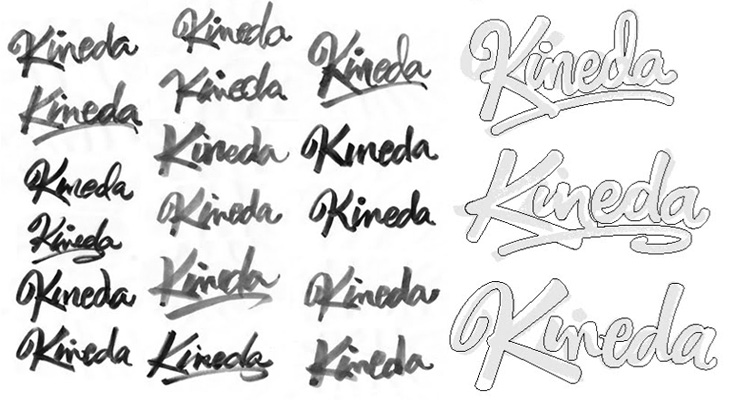
I was reading the latest post on The Art of Hand Lettering earlier and found the stages in the process fascinating, in that I preferred some of the sketches to the end result. I do really like the final logo, but there was something about one of the on-screen workings of the logo that I thought really brought the word alive — it’s the one in the detail I cropped from the article at the bottom right below. There’s something really playful about it, like the rest of the word is being bounced along by the K. Still, that’s my impression and it most likely wasn’t the client’s intention — and that’s the difference between doing stuff for yourself and doing stuff for paying clients!