Richard of AceJet 170 posted some great pictures of Pencil Talk’s collection of Routemaster-inspired pencils. I’ve nabbed one of them below, but go and have a look at the article for more, and a link to the source - for the real pencil lover.
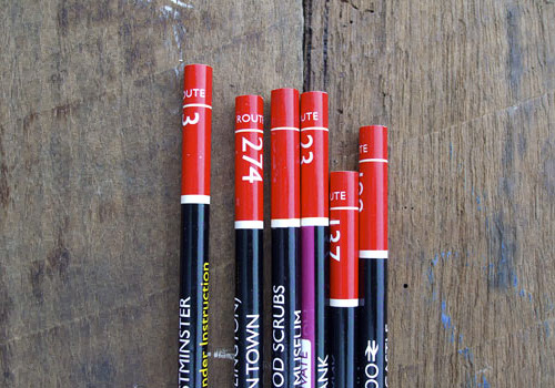
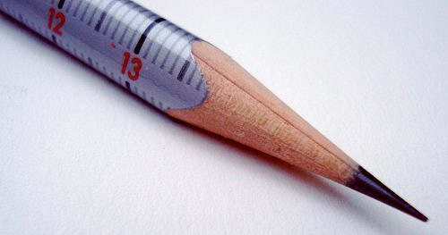
Richard of AceJet 170 posted some great pictures of Pencil Talk’s collection of Routemaster-inspired pencils. I’ve nabbed one of them below, but go and have a look at the article for more, and a link to the source - for the real pencil lover.


The rebranding of UKTV’s channel lineup has been going on for a while now; every couple of months another of their channels gets a new name and identity, and the original, extraordinarily pleasant and consistent network branding (at right) takes another step closer to oblivion. One of the recent rebrands was for UKTV Style, which got a pretty dreadful implementation of a reasonably nice idea - David Earls wrote more about that on Typographer.org. Next to go is UKTV Food, which will get a logo more suited to a free supermarket magazine (it really reminds me of the old Sainsbury’s one).
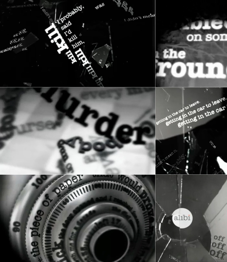
I guess you could say I’m not much of a fan of the overall quality of the rebrand, but there are a few good bits in there - Dave, Blighty and Eden are quite pleasant, with some nice ident work. My favourite by far though is Alibi, previously UKTV Drama. They’ve gone for a treatment reminiscent of your fashionable dynamic typography, but incorporated imagery of escape, fear, crime and violence. The typewriter typeface is perhaps a little cliché for the genre, done to death in countless private investigator made-for-tv stuff, but the stylish animation rescues it, keeping the familiar associations while providing some originality and freshness. There’s a montage of the channel idents here, and I’ve a few screenshots below.
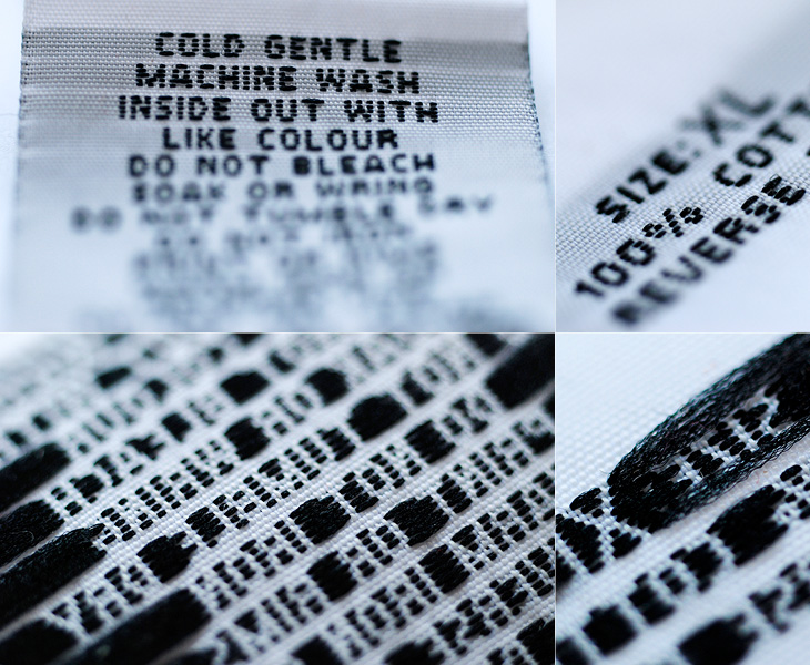
I’ve had this care label sat around on my desk for a couple of weeks, I was going to throw it out but I just like the lettering on it. Care labels are usually just printed bits of scratchy nylon and polyester, so even though this one was just as scratchy, it’s at least embroidered and has nice lettering. I especially love how the reverse looks too, with the lettered parts all tight and neatly stitched and the rest of it all fuzzy and loose.
I love projects like this, a Flickr group purely for Royal Mail postboxes identified by postcode. There are currently 5679 photos in the group, so is getting to be a pretty good catalogue of the postboxes in the UK - though with 115,000 in total there’s still a way to go. One of the first ones I clicked was pretty close to where I’m from, and lo, a quick search reveals the one very close to where I grew up. Ah, memories.
One of the interesting things about all these postboxes is the variety in the emblems of the reigning monarch - from Victoria to Elizabeth, they range from the florid and calligraphic to the frankly rather austere. Naturally, I’ve had a play around recreating some of the emblems, below. I wonder at the unnumbered George ones though; I’d guess they must be from during the Second World War, or directly afterwards - they suggest the Austerity period to me, but why no number? The extra metal and work required would be minimal, after all. As for the other later ones, the lettering looks to be inspired by Caslon types, though with plenty of variation from the hand-carved moulds, which has given them various profile styles from soft to sharp-edged, strengthening and highlighting the symbols - a kind of 3D hinting, if you like. I hope the effect was intentional, as it’s rather nice.
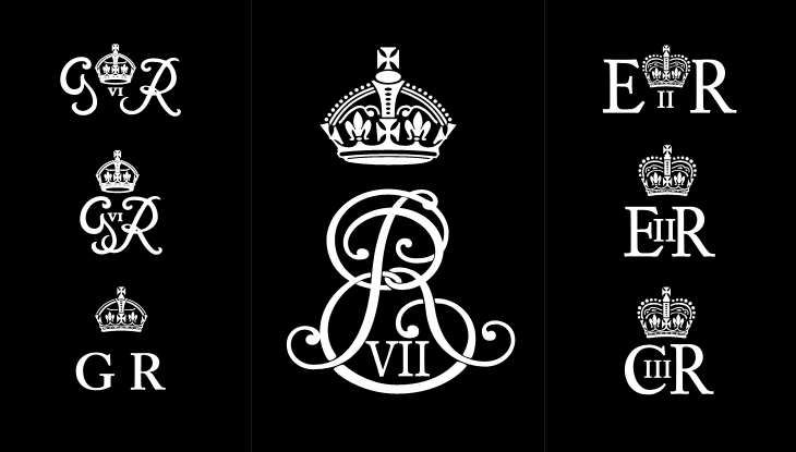
Some of the emblems - which I rather freely recreated rather than tracing them accurately. Show here are the rare Edward VII, variants on George VI, Elizabeth II and my very own wild speculation at Charles III (if that is indeed what he takes as his regnal name).
Perhaps controversially, I also had a bit of a play at creating a symbol for Prince Charles when (or if?) he becomes king. He may choose to reign as George VII, though from a design point of view I hope not - if he keeps his current first name he can have that ‘III’ fitting into the counter of the C, which I rather like the look of.
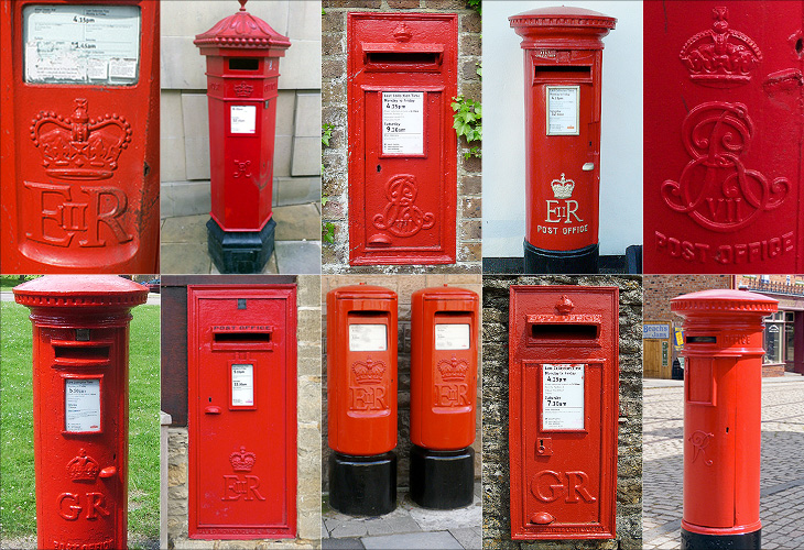
Some details of photos from the set. Clockwise from top, they are Ponthir NP18 123, Edinburgh EH1 585, Haywards Heath RH17 79, Garstang Road PR3 215, Whitley Bay NE26 294, Beamish DH9, Hawkesbury Upton GL9 213, Lancaster LA1 122, Northleach GL54 244, Potters Bar EN6 1NR
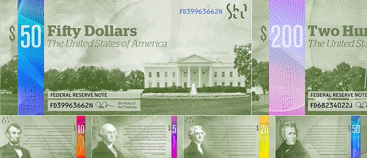
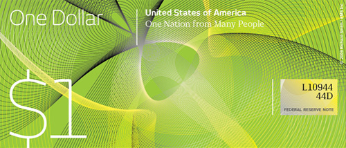
I saw this linked from ISO50 this morning: The Dollar Redesign Project is a competition (Campaign? Bit of fun?) to promote the idea of fully redesigning the US banknotes, possibly on a regular basis, like many banknotes the world over:
The American Dollar has not truly been redesigned since about the 1930s. The Dollar ReDe$ign Project is your opportunity to theoretically ‘change’ that. Yes, technically there are many limitations and complications when it comes to bank note design, but if the Swiss can do it on a regular basis, why can’t we North Americans too?The Dollar Redesign Project
There are only a few designs on there at the moment, some a bit jokey, but of the serious ideas I quite like the ones in the first set below. I can’t see any notes that deviate too far from the originals being successful, as there are so many cultural and linguistic associations with the ol’ greenback; it may seem tediously conservative, but notes that aren’t predominantly green just won’t feel like dollars. I hope the designs go further than the ‘stick a guilloche on it and call it a banknote’ idea - guilloches are beautiful things - I wrote about them before, here - but it takes more than a few of those to make a successful banknote.

One usability feature common to many banknote systems, and I’m surprised the designs so far haven’t addressed it, is to have different denominations in different sizes. UK banknotes do this (see right) and it’s reasonably easy to feel whether you’ve a £5 or a $20 note in your pocket because of it. £50 notes, while far from the tablecloth-sized notes of old, seem positively enormous compared to a fiver. I wonder how many mistakes are made every year from having all the notes the same size?
Of course, no article about banknote design would be complete without a mention of Ootje Oxenaar’s designs for the banknotes of the Netherlands below, now sadly replaced by the rather dull Euro notes. At the risk of seemingly terribly shallow for a moment, to my mind the design of the Euro is a pretty good reason for the UK to keep the pound. Banknotes are like little works of art, and to squander the opportunity to produce a remarkable and beautiful design for them is a sad thing. I shall be watching what comes out of the Dollar Redesign Project with interest. I may even have a go myself.
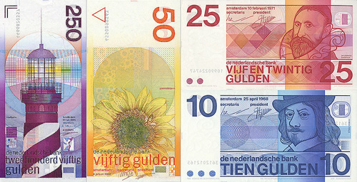
A few of Ootje Oxenaar’s designs for the Netherlands banknotes. More here.
While browsing Ffffound I, er, found a few of the images from this article on Things To Look At on a new book about Geigy’s design and advertising. Some of the examples just call out to be traced - especially the bugs on the pesticide packaging. The illustration for Neocid is quite gloriously morbid - there’s no doubt at all what this stuff is designed to do, even without reading the tagline, “A barrier to house vermin”. The thin white barrier - of death.
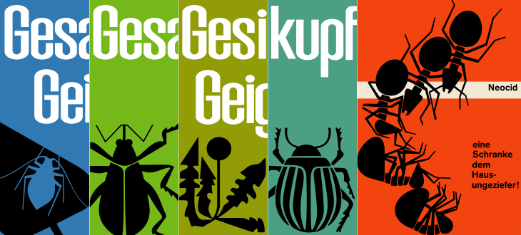
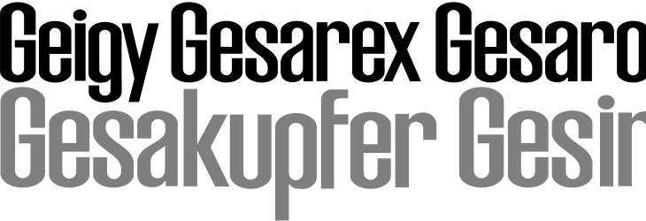
The examples make pretty consistent use of (I would guess) Berthold’s Akzidenz Grotesk, with a few other bits of interesting lettering on things like the herbicide and pesticide packaging above. I traced as best I could the letters from the photos, and though I’m not sure what typeface it is (if it is even a typeface) because of the flat curves and how closed the letterforms are, it reminds me just a little bit of House Gothic 23.

One thing that interests me on some of the examples is the Geigy roundel logo (at right). It’s so at odds with the simple wordmark used elsewhere, and with this other logo on Grain Edit, that I’m wondering where it came from - and where it went. I’m not saying it’s any great loss - I find it rather ugly - but it is very curious, and I will admit the treatment of it in one of the examples (detail below) is rather appealing. Does it have historical relevance I wonder?
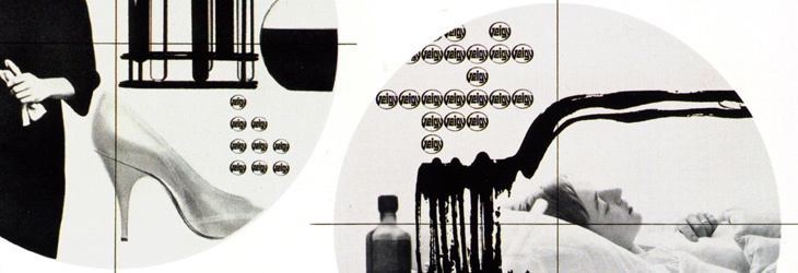
It’s a logo that works best in multiples, which might explain why it went. Perhaps the book has the answer. And on that note, I would link directly to the book on the publisher’s site, but they don’t have individual pages for them so I can’t. It’s in this list. Look for dolphins.
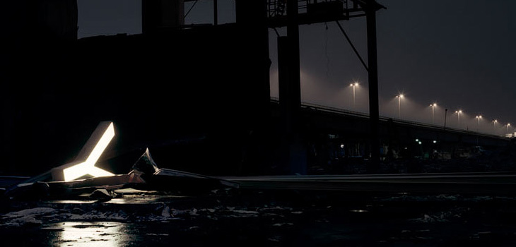
Fancy some big, glowing letters? Adrian Giddings linked to the Character website on Twitter (also via Design Observer), who refurbish and sell old letters from signs. They’re rain-proof and illuminated with LEDs, so I’d guess they’re good for the garden and will last quite a long time. I quite fancy a garden illuminated with big letters dotted about in the foliage. Mind, if you’re after the post-industrial look, the site’s home page has some lovely photos of some of the letters in dark and moody settings for your inspiration.

About 25 years ago I was given a full set of 1930s-era encyclopædias, The Wonderland of Knowledge, and I’m glad to still have them in good condition, countless house moves and two burglaries later. They’re fascinating things, with lots of illustrations and an engaging conversational style written to appeal (I guess) to older children. The illustrations are remarkable and are frequently quite beautiful. Each volume has a full colour frontispiece, colour and monochrome inserts throughout and many photos and diagrams in the text.
The beautiful frontispiece for Volume Ⅰ, painted by Charles Robinson.
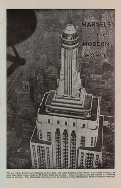
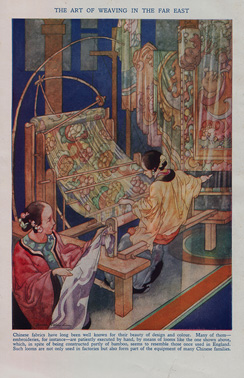
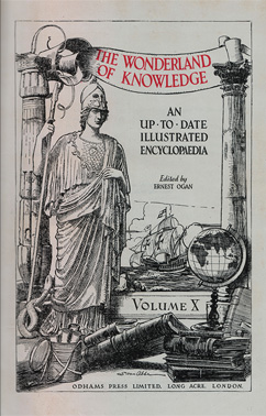
Left: A sample of one of the rotary photogravure inserts. Centre and right: The frontispiece and title page for Volume Ⅹ. You can click each image for a larger version on Flickr.
The content, however, is very much of its time, with antiquated attitudes to race, nationality, gender and so on, and some interesting attitudes to the portrayal of history itself; this account of Oliver Cromwell, for example, shows how anything negative or critical is delicately avoided. Perhaps youngsters weren’t to be troubled with such complexities?
On the less-contentious subjects of science and technology there are some good articles, and some of them stand as being pretty informative and relevant today, including the one I’ve taken the title from for this post, The Romance of Printing. It’s a pretty good primer on the history and techniques of printing, covering ancient origins through Gutenberg and Caxton up to linotype and monotype machines, braille printing, etching, lithography and photogravure. I’ve put it up on Flickr in quite high resolution so you can have a read and see it in all its glory. I’ve also got a lower-resolution PDF here.

Pages from The Romance of Printing. There are high-res scans here, or a lower-res PDF here.
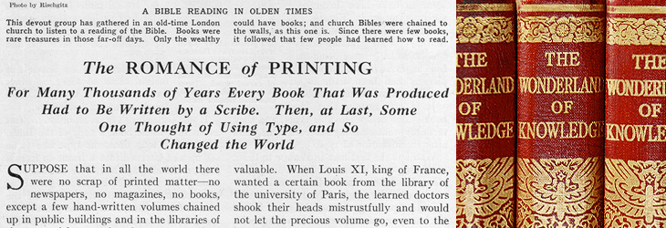
When the article gets to a description of the monotype process, there’s a little clue to the typeface used in the books. I did wonder what it was, but never got around to looking it up; it always seemed such a characteristic part of the books that I’d never really thought of it being something used elsewhere too:
The type for the book you are now reading was set and cast on a monotype machine.The Romance of Printing, Vol Ⅷ, p3964
So yes indeedy, from that little snippet it’s not a great mental leap to assume the typeface is the original of this Monotype Old Style, with optical weights for the captions and the indices that aren’t included in the digitised version.
The main reason I’d wondered about the typeface was because I did once have a completely mad plan to scan in the whole encyclopædia, do some OCR on it and have it online in some format, but I quickly realised that I’d need something like this to even start the job. Scanning in just the pages for this post took several hours, and considering that without the inserts there are 6144 pages, so the chances of seeing it all online are pretty slim.

This may be a bit of an old link, but it’s new for me, I think. The St. John’s Bible is a project by Donald Jackson (and team) and Minnesota’s Saint John’s Benedictine Abbey & University to produce a hand-written and illuminated bible to, as they put it, celebrate the new millennium. It’s both a massive project and a massive book - over 1000 pages with spreads 80cm wide by 60cm high, produced over 10 years at a cost of four million dollars (though its value may be denominated in other ways). The origin of the work is interesting in that it comes from the classic desire to complete a magnum opus:
For many years Donald Jackson, Senior Illuminator to Her Majesty’s Crown Office, had dreamed of creating a modern, illuminated Bible to celebrate the new millennium. Finally, in November 1995, he presented the idea to Saint John’s Benedictine Abbey & University in Minnesota.¶ Work started in 2000 and is scheduled for completion in 2007, at a total cost of over £2 million. It is taking place in a scriptorium in Monmouth, Wales, under the artistic direction of Donald Jackson and his team of scribes and illuminators.The Victoria and Albert Museum
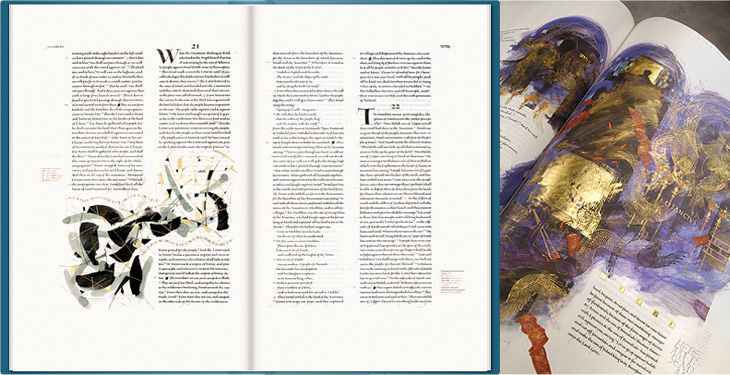
Some sample pages from the bible. The images on the left are from the St John’s Bible website, the ones on the right are from the Victoria and Albert Museum.
Jackson has brought together an incredible range of styles for the bible, from rich, lush, gold-encrusted illuminations reminiscent of Eastern Orthodoxy to crisp and spare compositions more like the modern style of the Church of England (to my mind at least):
The Saint John’s Bible will represent mankind’s achievements over the past 500 years. It will be a contemporary blending of religious imagery from various Eastern and Western traditions, as befits our modern understanding of the global village.St John’s Bible website FAQs
The disparate styles are unified by the common thread of that beautiful lettering and calligraphy, and by the script for the main text designed specifically for this project by Jackson himself. I’d love to hear more about that project! You can just about make out the script on the larger watermarked images. Just.
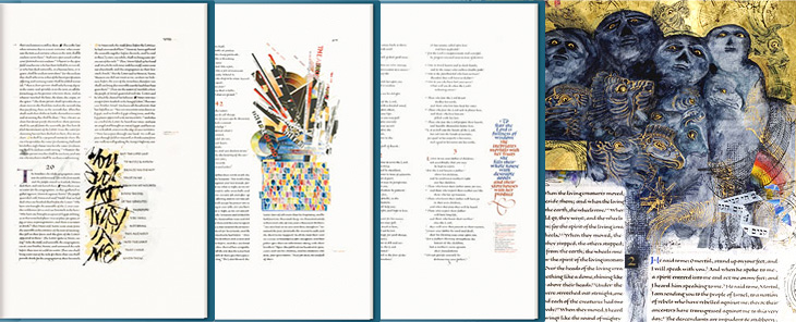
Some sample pages from the bible. The three on the left are from the St John’s Bible website, the rightmost one from Victoria and Albert Museum.
Which last point leads me nicely onto my one little whinge, not about the project, but about the website for it: I just wish there were a couple of closeup photos of the bible on the site. I can see why they’d be wary of possibly having their hard work ripped off, but it’s not like you need full-page scans to see the quality of the calligraphy and detail; a few square centimetres would do. After all, the prints aren’t all that cheap, and getting a bit of a closer look would be reassuring. Of course, if you’re seriously loaded, you can buy a copy of the Heritage Edition, for $145,000. If there are any left, that is.
Link via Greg Storey at Airbag.
The other week Grain Edit posted some photos of these 1970s playing cards produced by El Al and beautifully illustrated by Jean David. They depict Kings, Queens and Heroes from Israel’s biblical past, and come as a boxed pair of sets with an illustrated cardboard sleeve. I had a look around for some clearer photos so I could get a better look, or even a good source of info on Jean David, but there’s not much out there at all. I did, however, find an eBay auction for a set of the cards, so I got my very own set - eventually, and they really are lovely:
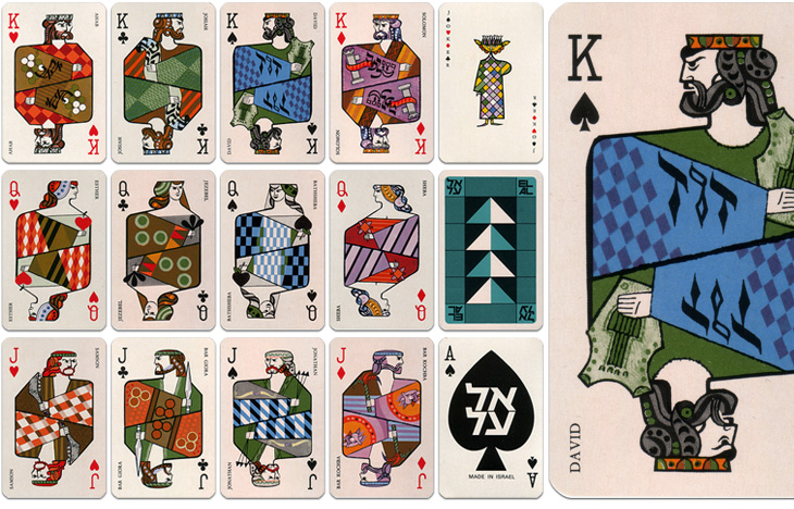
The cards are indeed beautiful and are also nice depictions of the biblical characters - wise Solomon with his scrolls, Jonathan with his arrows, Samson with his jawbone, etc., and reflect the tradition of representing the legendary or historical characters on cards. There is a nice nod to the Paris court tradition of playing card characters by keeping the depiction of David as the King of Spades. Of the other traditional biblical characters, Sheba replaces Rachel as Queen of Diamonds and (unsurprisingly) Judith is replaced with Esther as Queen of Hearts. Julius Caesar is an obvious one to leave off (far better to show Solomon), and instead of the sometimes-shown Judas Maccabeus as Jack of Clubs there’s another leader of a revolt, Bar Giora. I guess it’s hard to choose such a small number from all the people in Israeli history, but if you’re going to show Bar Kochba, you have to show Bar Giora too. Perhaps.
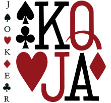
Beyond the history lesson, looking at them got me thinking about the type used to identify individual cards in general. The individual numbers and letters work very well on the card, and are pretty much standard for all cards, but put them together and you see that there’s not much consistency between them at all. As a set, they’re discordant, drawn on a whole different scale to each other, the curve of the J appears exaggerated and incredibly wide compared to the Q, and the K’s slab serifs are enormous, but individually, they each work just fine. I’ve seen playing cards motifs and designs implemented as branding and packaging (such as this rather nicely branded wine), and I notice now that they never used the actual type style from the cards themselves - obviously, designing characters to sit alone is a different art to designing them to sit together.
While I’m on the topic of characters sitting together, it’s a shame (and surprising) that the type for the names isn’t kerned, and more so that it’s the King David card where this is most obvious. Fortunately, apart from Bathsheba, the names of the others are pretty forgiving and the lack of kerning isn’t very noticeable. Still, it’s surprising that that was allowed through, given the overall quality of the cards.
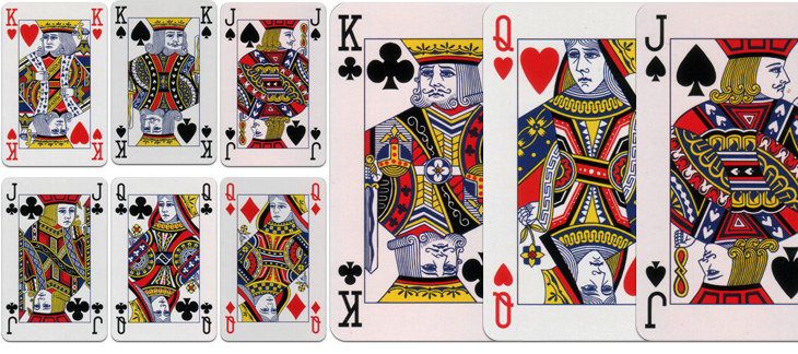
I dug out my standard set when I got the El Al ones so I could compare them. There’s something quite comforting about how they’re familiar they are, but I was wondering how standardised they really are. Looking at the set above, which is a fancy-schmancy House of Lords set and comparing them to a cheap £1 set from a newsagents, there is a fair bit of difference in the quality and the detail of the drawing, although many of the design elements are consistent; for comparison, I’ve put a queen card from each next to each other here. I had imagined there would be a bunch of royalty free EPS files that you could buy or download and slap on your cards, but perhaps not. One thing that seems to be important for standard cards is that all the characters have to look really, really tired and unhappy, a convention I’m glad to say wasn’t followed with the El Al cards.