While browsing Ffffound I, er, found a few of the images from this article on Things To Look At on a new book about Geigy’s design and advertising. Some of the examples just call out to be traced - especially the bugs on the pesticide packaging. The illustration for Neocid is quite gloriously morbid - there’s no doubt at all what this stuff is designed to do, even without reading the tagline, “A barrier to house vermin”. The thin white barrier - of death.
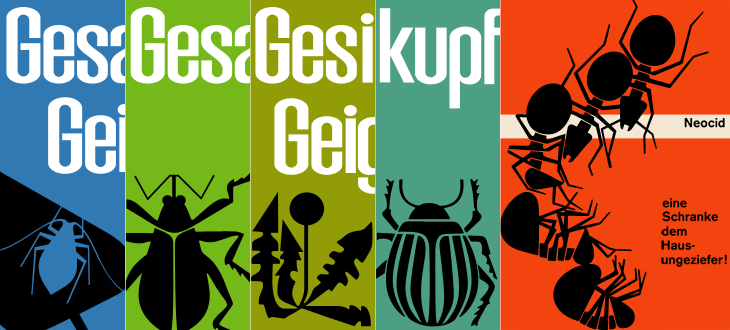
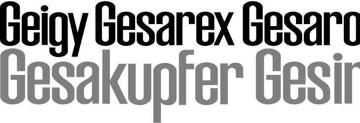
The examples make pretty consistent use of (I would guess) Berthold’s Akzidenz Grotesk, with a few other bits of interesting lettering on things like the herbicide and pesticide packaging above. I traced as best I could the letters from the photos, and though I’m not sure what typeface it is (if it is even a typeface) because of the flat curves and how closed the letterforms are, it reminds me just a little bit of House Gothic 23.
One thing that interests me on some of the examples is the Geigy roundel logo (at right). It’s so at odds with the simple wordmark used elsewhere, and with this other logo on Grain Edit, that I’m wondering where it came from - and where it went. I’m not saying it’s any great loss - I find it rather ugly - but it is very curious, and I will admit the treatment of it in one of the examples (detail below) is rather appealing. Does it have historical relevance I wonder?
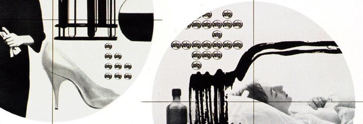
It’s a logo that works best in multiples, which might explain why it went. Perhaps the book has the answer. And on that note, I would link directly to the book on the publisher’s site, but they don’t have individual pages for them so I can’t. It’s in this list. Look for dolphins.