About 25 years ago I was given a full set of 1930s-era encyclopædias, The Wonderland of Knowledge, and I’m glad to still have them in good condition, countless house moves and two burglaries later. They’re fascinating things, with lots of illustrations and an engaging conversational style written to appeal (I guess) to older children. The illustrations are remarkable and are frequently quite beautiful. Each volume has a full colour frontispiece, colour and monochrome inserts throughout and many photos and diagrams in the text.
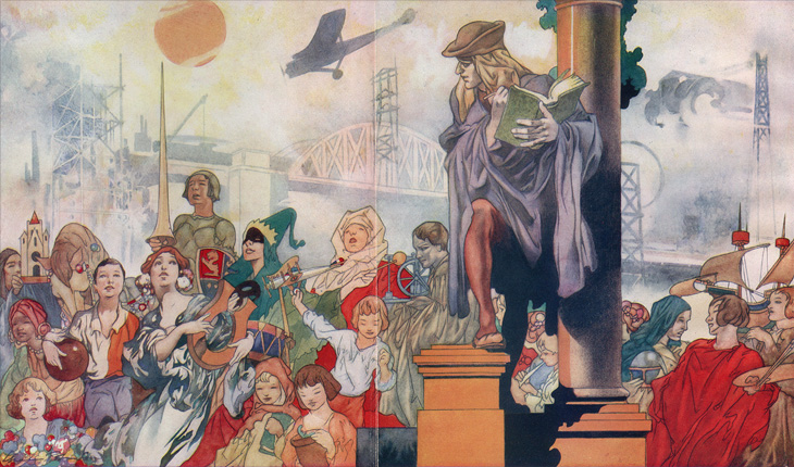
The beautiful frontispiece for Volume Ⅰ, painted by Charles Robinson.
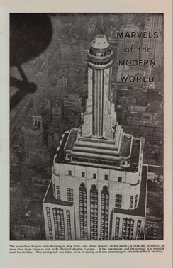
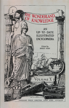
Left: A sample of one of the rotary photogravure inserts. Centre and right: The frontispiece and title page for Volume Ⅹ. You can click each image for a larger version on Flickr.
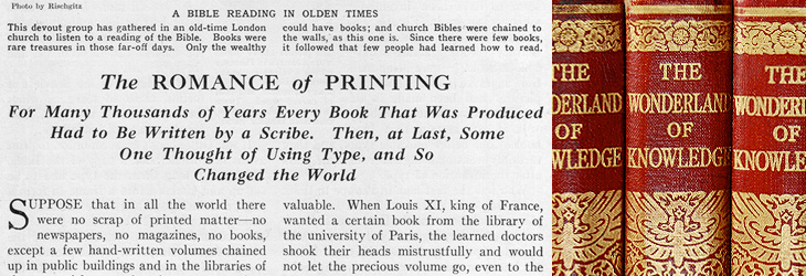
The content, however, is very much of its time, with antiquated attitudes to race, nationality, gender and so on, and some interesting attitudes to the portrayal of history itself; this account of Oliver Cromwell, for example, shows how anything negative or critical is delicately avoided. Perhaps youngsters weren’t to be troubled with such complexities?
On the less-contentious subjects of science and technology there are some good articles, and some of them stand as being pretty informative and relevant today, including the one I’ve taken the title from for this post, The Romance of Printing. It’s a pretty good primer on the history and techniques of printing, covering ancient origins through Gutenberg and Caxton up to linotype and monotype machines, braille printing, etching, lithography and photogravure. I’ve put it up on Flickr in quite high resolution so you can have a read and see it in all its glory. I’ve also got a lower-resolution PDF here.
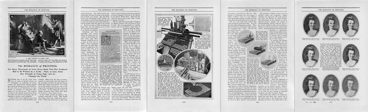
Pages from The Romance of Printing. There are high-res scans here, or a lower-res PDF here.
When the article gets to a description of the monotype process, there’s a little clue to the typeface used in the books. I did wonder what it was, but never got around to looking it up; it always seemed such a characteristic part of the books that I’d never really thought of it being something used elsewhere too:
The type for the book you are now reading was set and cast on a monotype machine.The Romance of Printing, Vol Ⅷ, p3964
So yes indeedy, from that little snippet it’s not a great mental leap to assume the typeface is the original of this Monotype Old Style, with optical weights for the captions and the indices that aren’t included in the digitised version.
The main reason I’d wondered about the typeface was because I did once have a completely mad plan to scan in the whole encyclopædia, do some OCR on it and have it online in some format, but I quickly realised that I’d need something like this to even start the job. Scanning in just the pages for this post took several hours, and considering that without the inserts there are 6144 pages, so the chances of seeing it all online are pretty slim.