Star Posters

These posters by Mark Brooks for Santa Monica are great. I’ve had the page on ISO50 open in a tab for a while — The idea here is interesting and worth looking at; using the Santa Monica logo to create the halftone pattern, but using a two and three-layer effect using different sizes and treatments of the star. I wanted to have a closer look and see whether it was hard to create the effect. Turns out it’s not really, it’s just a bit time consuming and needs some concentration. It also makes your eyes go squiffy so best to work with low contrast colours until you’re done. I did my own little version using a Baskerville Italic ampersand, below the posters by Brooks here. There’s some more images on Mark Brooks’ Behance portfolio.

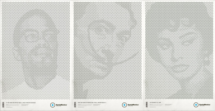
Some of the Mark Brooks posters. Originals and more here.

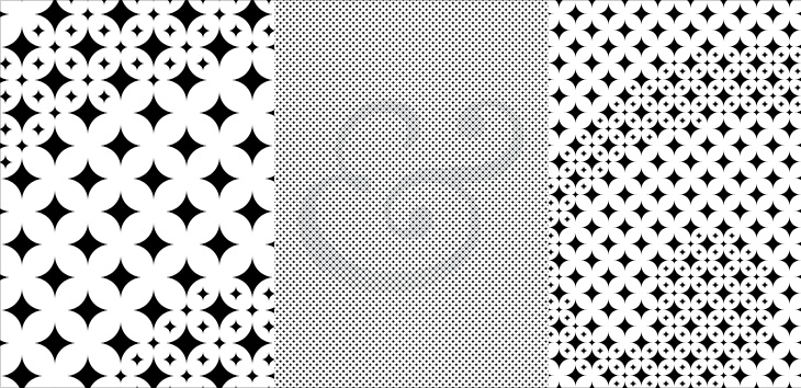
Me playing around with the idea. I love the Baskerville Italic ampersand. When viewed close, the effect is extraordinarily pretty.

Playboy Magazine

Entirely coincidentally, I get to post about another archive of a long-running and well-known magazine; this time, Playboy. John of I Love Typography tweeted a link to this, just over 50 issues of Playboy from 1954 to 2006. The site will require you to install Silverlight, but is fairly well put together and easy to use, with a nice contents feature that also lists the ads and a search function that works well. To be clear, Playboy is a pornographic magazine that used to use good journalism and good design as a fig-leaf (as it were) to try to get some respectability. It's still a magazine for pornography, objectifying women. Of course, the images and type I’ve included below are not pornographic.

I’ve never looked at Playboy magazine before — its reputation preceded it and there are many better ways to read good journalism. There are some interesting-sounding articles in the earlier editions though; just a quick look through reveals interviews with Fidel Castro, Miles Davis, Sterling Moss, loads of fiction, journalism, pages and pages of dense, dense text. Then, so randomly you almost ask “What’s that doing there?” a picture of a young woman with not much on. I must admit I didn’t really look at the newer issues, as after the logotype changes in 1972 the whole thing looks a whole lot less appealing, and makes me think perhaps the magazine becomes a bit more straightforwardly pornographic from this point. The bits of type and spreads below are mostly from the late ’50s and early ’60s, and are just an example of some of the lovely bits of type and layouts in the magazine. So yes, go and have a look at the Playboy magazine archive, but keep in mind the attitudes and harms it represents.

The ‘$4.32’ bit is from an advert, all the rest is from editorial content. I haven’t verified these forensically, but the editorial text looks like a mix of Clarendon, Nimbus Sans, Caslon, Caslon Italic and Cheltenham.
I love the use of the rabbit device to end an article, and that it’s still in use today. Note also that the Playboy wordmark at the top left of the page has a serif on the A, which is missing on all other uses of it. I’ve reproduced it larger at the top of this article.

LIFE Magazine

I’ve been browsing through some of the copies of LIFE magazine in this wonderful archive on Google Books, and as well as the photography and journalism I’ve found some real type treasures, especially in the advertisments. Some of the slogans and phrases read just like bits of pangrams or the beautiful mini-stories that Font Bureau create for their type samplers, and some of the type and lettering is quite lovely. The ones below are mostly from this issue from May 1945. A few are also from this one, which also has a short article and some photos (from page 43) of the first Lewes Bonfire night after the end of World War Ⅱ - something of local interest at least to me (and other Sussex people).

I’m sure you could make many amusing stories with a bit of patient searching through the archive.

The New York Times in Turkish

This week sees the launch of a new Turkish-language edition of the New York Times’ International Weekly, distributed for free with the Sunday edition of Turkey’s Sabah newspaper. To advertise the launch, the newspapers commissioned this incredible animation - a typographic tour starting from Liberty Island, across various bits of Manhattan, very nearly making it over to Brooklyn before arriving on the Bosphorus with a gorgeous view of Istanbul rendered in type.

I’ve seen a fair few animations of the places-rendered-as-words variety, and more than plenty of the ‘kinetic typography’ kind, but this one is very nicely done — it hangs together beautifully, and the level of subtle detail rewards re-watching. The waves, rippling banners and flags are a lovely touch, just noticeable enough to add to the sense of place without distracting you from the overall theme.

I’d love a desktop-resolution still of this scene. This is taken from the downloadable movie.

There’s one especially lovely bit when the camera turns to show you the Brooklyn Bridge being created from type — definitely go and watch this one. It’s quite lovely, and thanks to @typographerorg (of Typographer.org, naturally) for sending me it.

Not the scene I mention, I won’t spoil that for you.

Negative Space

Drawn linked to this set of posters by Noma Bar that make clever use of negative space, and they reminded me of an image I’ve had saved on my computer since last year, this poster for the Humana Festival by Tomer Hanuka, below. It doesn’t need any explanation, I just love it — the image is beautifully conceived and rendered. You can read more about its development on Hanuka’s site, Tropical Toxic.

I would tweak the type a little bit thought, especially the ‘31st’ — for some reason the height of the 3 hasn’t been optically adjusted, making it look much smaller than the 1. It’s rather odd that was done like that.

Skanno

This feels more like a found type entry than anything else, even if I didn’t strictly find it, and that it’s more lettering than type. The Contemporist posted an article and series of photos of Habitare ’09, Finland’s largest furniture and interior design fair. Buried deep in the photos were these two, of Finnish store Skanno‘s stand, showing large letters (presumably spelling the name of the store) made out of plastic tubes and suspended like venetian blinds as dividers. It’s a simple technique, well done. I want some letters like that.

Guerrilla Typography

One for the ‘what a nice idea’ pile, this. Cardon Webb goes round upgrading notices pinned up in the streets - you know the ones, ‘Lost Cat’ and the like. There’s one I saw the other day near me that was pleading for the return of a lost plush bunny. I hope they found it; the tone of desperation told a whole story in itself, a wailing inconsolable child, pushchair left unfolded in the hall, coat fallen to the floor, scattered attempts to make-it-all-better: a melted bowl of ice cream, other toys, the Teletubbies DVD and so on, and still the sobbing.

Anyway, back to the nice things. I found this on idsgn, who had created a nice header graphic out of the ‘before’ and ‘after’ images of one of them, and I found that such an appealing presentation I’ve recreated it myself. Still, the original works are the stars of the show, so have a look round on Cardon Copy at the others. I initially thought that the idea was to simply improve the original notices but found a few of them rather hard to read, reading the Cardon Mission reveals all:

Cardon copy takes the vernacular of self-distributed fliers and tear-offs we have all seen in our neighborhoods. It involves hijacking these unconsidered fliers and redesigning them, overpowering their message with a new visual language. I then replace the original with the redesign in its authentic environment.Cardon Copy

So there you go, the key phrase is ‘overpowering their message’. Explains some of them. The others, like the one below, are far more appealing. You’d keep an eye out for that cat:

This is my favourite one.
Harder to read at a glance, but probably more likely to make you stop and look than the originals.

I Luv It

Here’s something I’ve been meaning to post about for a while, and happily it’s a local project, right here in Brighton and Hove. There’s a new service, just launched, which lets you text a code for a particular bus stop to a number and get an SMS back telling you the next five buses to go from that stop. It’s quite a neat idea and pretty fast (I tried it), and a nice complement to the other ways of getting bus information*.

So that’s the back-story. What is good, and particularly appealing to me, is the advertising campaign and the various materials to help people keep a track of the bus stop codes, designed by David Earls of Typographer.org, for Brighton & Hove City Council. I saw a fair bit of the development work on this and I’m glad that this design was chosen and made it through to print unscathed. It’s a beautiful arrangement of type and colour, designed to appeal mainly to teenagers and young adults (and, incidentally, typographers) and adapts well to a wide variety of applications. The typeface (Rockwell Extra Bold) lends itself well to this kind of extreme kerning, with the nicely balanced word shapes the alternating colours and tones ensuring the message remains perfectly readable. The campaign included billboards, bus-stop adshels, A4 posters, information stickers, leaflets with punch-out cards, and a competition to win a new mobile phone:

Available for pick up from buses, local ticket and travel agencies and council offices, these cardstock leaflets publicised the scheme, and…
…they have a wallet-sized card you can pop out for you to record bus stop codes on. The card stock is only glossy on one side to make it easier to write on the reverse.
A mockup of the bus stop adverts.

Austrian Applied Art

A while back Jo at Languste Fonts sent me a link to the collection of the Austrian Museum of Applied and Contemporary Arts. Their collections site is pretty huge, with sections for ornamental and woodblock prints, textiles, drawings, and posters. Lots and lots of posters. They’re arranged in categories, but the best thing is just to keep clicking through them and enjoy the variety - there’s some pretty gorgeous lettering, type and illustration in there. I’ve (of course) traced some of it, and I love the blackletter calligraphy below. I’d link to the page, but it’s one of those sites that doesn’t have unique URLs for things. Just search for Nieder Österreich and it’ll be in there somewhere.

The lettering on this one is beautiful; it’s so expressive and playful! Shame the illustration wasn’t finished to the same quality, even though the overall effect is still rather attractive.

While I liked the lettering on this, it was the illustration that caught my eye - it’d make a good poster in its own right.

This beautiful uncial lettering is from this poster, showing the tower and spire of St Stephen’s Cathedral in Vienna, which I traced on another poster here.

Leo Beukeboom

Another gem found through Coudal, this. Re-Type posted an article about the beautiful lettering by Leo Beukeboom on the windows of bars and cafes in Amsterdam (with a nice appreciation of decent, old-style, non-trendy bars in there too). There’s a series of photos with the article, which I’ve traced the lettering from (below), and as a bonus Re-Type themselves are working on interpreting the lettering into an Opentype face, which so far looks great - can’t wait to see it finished.

Top image traced from the image here. Bottom two traced from images on Re-Type’s article.

I did a bit of hunting around for more information on Beukeboom, and found this article on David Quay’s site, containing a lot of background information and an interview, which is fascinating and well worth a read. I’m particularly taken by this:

The letter you use on a pub window depends on the type of pub. If you have a traditional brown café, with lace curtains on copper curtain rods, with stained glass windows, you choose a nice, ornamental curly letter, because it fits in with the environment. It is not the information that counts, because everyone can tell it’s a café, but it’s about decoration, about creating an atmosphere. For the lettering on the traditional brown cafés I developed my own script based on the calligraphy of Jan van den Velde.Leo Beukeboom, from David Quay Design

I love that. The words themselves become secondary to the style in conveying information - without knowing what it says, you know what it says. Certainly not an infallible system, but most types of place (and many things) have their signature look, and as I’ve posted before (warning, extremely wordy article) you should know what you’re doing before you mess with it. They’re the design patterns of urban existence, if you will, though in the case of Beukeboom’s lettering, this is one that is slowly fading - unless anyone wants to become his apprentice that is. If he still wants one.