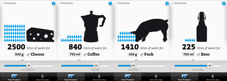
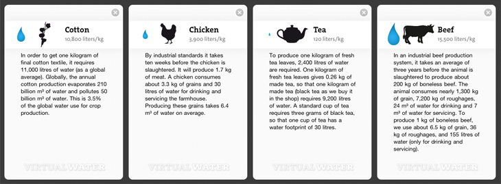
I remember seeing, and liking, the first edition of the Virtual Water poster, and I see now there’s not only a new version but an iPhone app, which has even more information in it. I particularly like the visual style of the project — the simple black silhouettes and the blue accent colour work beautifully (a combo you may notice I rather like already), and the bold, slab-serif typeface (see below) just looks perfect. The little info cards behind each item are nicely laid out too, reminding me of classic recipe cards (or cocktail bar cards), and the short sharp explanations and consistent use of units back up the infographics nicely.
Some screens from the app. I like the indicator of the ‘usual’ amounts on the slider.The background info cards.
I’m guessing the face is TheSerif Classic by Luc de Groot), though for unknown reasons I’ve never used it, it looks so incredibly familiar that I was convinced I must have. But, I hadn’t. How very odd! I may have to remedy the situation soon.
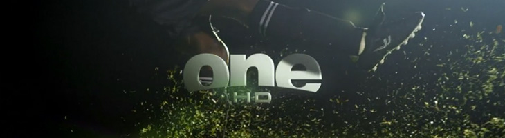
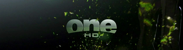
John Beohm of Idents.tv posted the six new idents for Australia’s ONE HD tv channel — I don’t have much to say on them other than they’re lovely and simple and I really like the logo. As John points out, it’s good that they avoid the crass overdone clichés of floodlit stadia and huge billboards, generally I don’t find myself watching sports channels but of what I’ve seen their idents (and identities) are all pretty much of a muchness. Lots of glassy, glossy, glittery effects, dramatic perspectives across giant dystopian stadia-cities shrouded in perpetual night; the impression you’re supposed to get is that this is epic, this is a clash of titans, a great battle to end all battles, an extraordinary experience that will resonate through time and space, this is it, and then, just as you’re (theoretically) driven to the very peak of excitement and anticipation, here’s the golf. Woo.
So yes, it’s nice to have a set of idents that have some of the actual sporting action in them. The logo looks to be a very slightly tweaked Helvetica Black — the version I have has a slightly wider aperture in the lowercase e (but it could just be the 3D rendering creating the illusion). The curve cut out of the bottom hints slightly of the epic view-over-the-horizon style of usual sports channel logos, but it’s subtly executed and provides a perfect frame for the HD suffix. Anyway, slightly more than I was intending to write on this one. It’s nice. Go and watch the videos on Idents.tv.
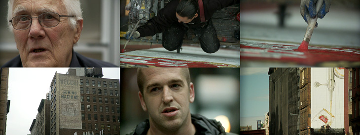
Up There is one of those things that’s been linked to like crazy across Twitter and most of the sites I read, but I’d not got around to watching it. I find that with a lot of online video, I mark it to watch later when I’ve a bit of time to devote to it and then, well, don’t get around to it. So, if you’re like me and haven’t seen this yet, I do recommend watching it. It’s only 12 minutes, very well composed and edited and really gives you an insight into the work of people who hand paint signs and adverts on the sides of buildings. It’s a craft that (not surprisingly) is dying out, but one that can be kept alive by commissions from a few enlightened companies and agencies. The film was sponsored by Stella Artois who, as JJ from Graphicology points out, are producing more narrative-based advertising lately. Kudos to them for this, I’ve a lot more respect for Stella Artois the company now. Less said about the lager.
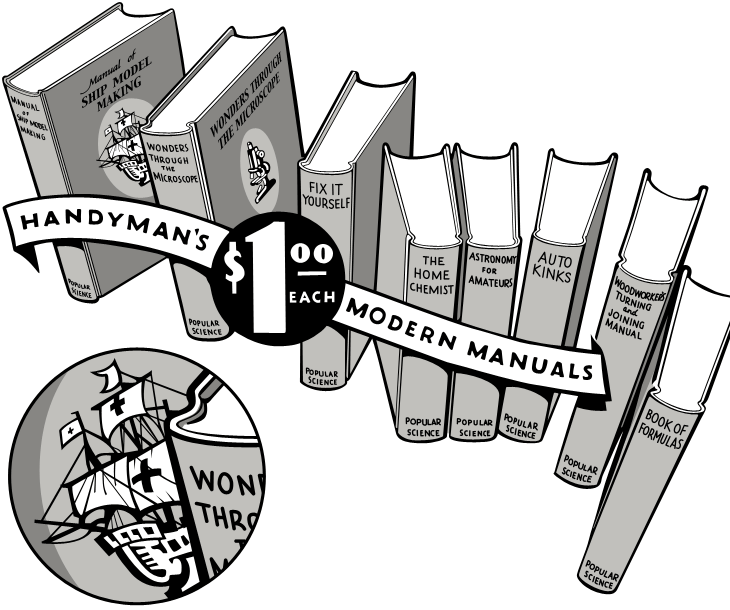
I was having a look through this collection of Popular Science editions on Google Books, and saw this beautiful advertising illustration. Naturally I’ve traced it, but the original ticks so many boxes — it’s hand-drawn, it has a strong sense of dimension, leaping out of the page at you, and the lettering on the banner and especially the price roundel is, like the illustration as a whole, beautifully composed.
My tracing — the detail circle is my own addition, I’d love to see the front of this book properly.
The arrangement of books creates a lovely dance across the page — it’s a shame the type composition of the rest of the advert, while competently done, doesn’t have as much flair. I’d like to know who the illustrator was, and what the front of the books really looked like — I’m fascinated by that little ship illustration and would love to see the whole thing properly. In fact, what are the books like? In an earlier advert there was a hint at some of the cover illustrations, but I’d like to see the ‘real thing’. Anyone out there got some?
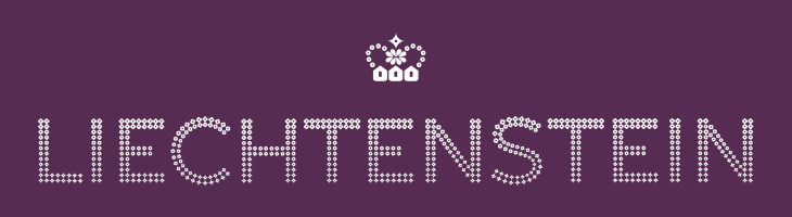
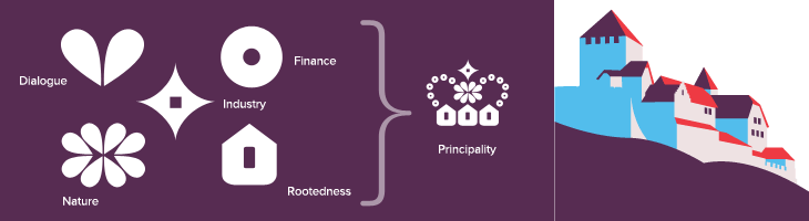
This post falls squarely into an imaginary new-to-me category, as it’s apparently been around since 2004 and I’ve never ever seen it before. I’m not sure how, I’m convinced I’ve looked at stuff related to Liechtenstein in the last 6 years, and this is exactly the kind of thing I like. So yes, the other day I was emailed a link to the portal of The Principality of Liechtenstein with a message to have a look at their ‘new’ brand (I think my correspondent may have seen it here on Creative Roots). I’m wondering whether the brand just hasn’t been promoted much — or maybe I’ve just missed it. That website doesn’t do it any favours that’s for sure. Anyway, big surprise: it turns out the brand was designed by Wollf Olins, so I can only assume that their work from 2004 must predate whatever decision they made to push ugly and huh? as brand virtues, as this is rather lovely.
The type is essentially made from dots (an idea I love) and this presents a nice twist on that, using stages on a morph between a flower and a star, theoretically including a circle as one of the steps. According to the brand documentation, the flower represents the agrarian roots of the Principality, the circle is the financial side and the star is ‘industry’. I’m a little unconvinced by that, as I’m pretty sure that industry wasn’t the endpoint in Liechtenstein’s development, nor was finance merely a step along the way. Perhaps it’s best thought of as a device to indicate the range of things you can find in Liechtenstein. Regardless of that, it makes for a pretty story and an attractive logo. The overall effect is of something encrusted in diamonds (or at least Swarovski crystals), though looking at it again I’m reminded a little of early-20th Century theatre illuminations, the old ‘name in lights’ thing. Certainly the associations are of glamour and wealth, which seems to suit the Principality just fine.
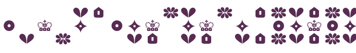
The crown is a nice touch as well, and if I’m honest was what caught my eye at first — one of the perils of using a crown as your own logo I guess. Again, as is apparently unavoidable with country branding, the elements of the crown have particular meaning related to aspects of how Liechtenstein would like you to think it thinks of itself as having (sorry). Made of symbols for nature, dialogue, finance, industry and rootedness the crown works well and forms a recognisable little device when used on its own or with the abbreviated LI mark. The component symbols are used across brochures and other materials as a rather refreshingly retro pattern. I doubt I’m alone in being reminded of 1970s wallpaper, but all in all it works well and compliments the other decorative elements — the flowers, mountains, trees and (especially) that nice illustration of Vaduz Castle.
Here’s a nice topical post for St. Valentine’s Day. I just read about this fun project over on Brand New: Redesigning Valentine’s Day. Studio 360 came up with the idea, following on from previous ‘challenges’ to redesign Christmas Day and the Gay Freedom Flag. I normally like reading things like this because of the fresh thinking and the usually interesting return to first principles as a place to start, but this feels a bit flat. Brand New give a list of positives and negative aspects of Valentine’s Day, and they have some interesting ideas, but if this was a branding brief, I’d start with a list of brand aims, what we want to achieve:
Accessible—Whatever symbols you use, they have to be recognisable. At some level it’s a similar task to designing a national flag; a child must be able to draw it recognisably.
Obvious—Love may not actually be blind, but it’s certainly not thinking at full capacity, so whatever you use to characterise it has to work on an emotional, intuitive level. If you have to think about it too much, it’s failed.
Fun—It really can’t be serious. Romantic love is mad, illogical, impulsive and emotional — there’s no tedious routine here, no worries about bills or ailments or whatever, it’s about life, and it’s exciting.
Optimistic—It has to speak of unbounded promise, of potential, of positivity, happiness and, not to put too fine a point on it, the fruits of love — kids, basically, assuming reproduction is possible with one’s intended. It has to lift our spirits and make us feel good.
To go with the brand aims, you want to see what’s wrong with the existing brand:
Commercialisation—Money (or the exchange of valuable/useful items) has been part of love, marriage and romance for however long we care to look back into human history: dowries, bride prices, dynastic unions, etc. Negative? Perhaps. Just part of life. I say deal with it.
Waste—An increasingly valid point. If you value something, you keep it safe, dry and clean. Otherwise, you’re going to discard it, right? You’d want it to be biodegradable and recyclable — and surely you wouldn’t want the symbols of your unending love to have poisoned a river with its manufacturing byproducts?
Taste—Ah, it’s all so crass, isn’t it? The schmalzy, glittering gifts, the plush, the fluff, the overly decorated crap that fills the shops, the low-quality chocolate, the forced roses, the sheer lowbrow nature of it all. Yes, if I admit it, this is the main problem I have with it all.
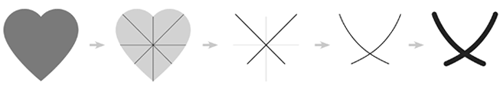
So what did Brand New come up with? A cross, essentially, a cross that sort of looks like a V. Made from the diagonal axes of the heart symbol, curved a bit to soften them up, and vertically orientable to indicate availability, it’s iconic and reasonably flexible, and the suggested application on Facebook and the like is pretty nice. The thing is, with those colours it really reminds me of the brands for the Pink Ribbon Campaign and Breakthrough Breast Cancer. If I saw this symbol without knowing its origins, I’d assume it was part of the branding for one of these two charities, and given that Valentine’s isn’t serious, and breast cancer is, this is a problem. Also, it’s too reliant on accurate reproduction of those gentle curves. In most people’s hands it’ll just be a plain ‘X’, a symbol of affection certainly, but not quite the heartfelt romantic love you’re trying to get across. So as much as I respect Armin and Bryony, I think this symbol is a dud. It’s too serious, too cold, too (sorry) dull. It’s based on diagonals across a heart, so it’s based on a heart. Why not use a heart symbol then?
What defines the new curves on the cross? Where do they come from? It’s all a bit arbitrary.
And this is the root of it. We already have a set of well-recognised, simple, straightforward symbols we use to indicate romance and love, and we have a very flexible brand palette, ranging from rose pink to carmine red. The biological (and anatomical) associations with the colour are pretty obvious, and happily elicit a strong emotional response of exactly the sort we’re looking for with Valentine’s Day. No other colour does the job; for example even if Tiffany Blue is a welcome sight for some on Valentine’s Day, it’s not the colour that people will ever associate with love, just merely one of the benefits of it.
So, let’s look at the symbols of love and Valentine’s Day, then. What do we have?
The Heart
Hearts on everything! This surely is the main thing everyone associates with Valentine’s Day. It’s simple, obvious, easy to draw, recognisable, and even has a kind of logic to it. It may not be a perfect image of a human heart, but it’s close enough — the way it’s usually drawn, it’s round, plump, healthy, it’s a symbol of fullness, of comfort, of abundance. It’s even the symbol Armin and Bryony started with to create their cross, so why gild the lily?
Cupid
The god of erotic love, we all recognise Cupid; the winged, plump little boy carrying a bow and arrow. These days he’s pretty much interchangeable with the legions of generic winged babies floating around with ribbons, hearts, garlands of flowers and the rest. They’re often called cherubs, but these aren’t the four-winged, four-faced, ninth-rank angels from the Bible at all, so while there’s not going to be much confusion, you can call them putti. Whatever you call them, they’re often depicted doing something slightly mischievous; Cupid represents the impulsive and childish nature of love. He is anything but serious, he is newborn love personified. In a literal sense too, he represents that ultimate product and beneficiary of love - the child.
Roses
What better symbol of romantic love than the genitals of a plant? I guess a picture of our own organs would be considered a little forward and might embarrass the waiter at that nice restaurant you’re at. People give all sorts of flowers on Valentine’s Day, but it’s the rose, the red rose that’s become the ultimate gift of love. It’s the richness of colour, the fullness of the shape of the flower, the heady scent, they’re beautiful and inspire our senses. They’re also a bit pricey around Valentine’s Day, so to be cynical for a moment, they say, “Look, you’re worth me shelling out for these things, even if they are going to be dead tomorrow”.
Food
Chocolates, sweets, a nice meal – a gift of food has been a tangible sign of love for as long as we can tell. It has to be something rich and indulgent, preferably sweet, uncommon and yes, expensive. In the past, honey was the acme of sweets, to get at it you usually had to kill the hive (and face the angry bees), and that made it much, much more expensive. It’s no accident that we have a honeymoon (not exactly an everyday occurrence) and that the promised land was described as a land of milk and honey. Giving a gift of honey to your beloved showed that you were willing to spend money on them, and that you had it to spend. Commercialisation is hardly new when it comes to love.
The Brand
I think the branding of St Valentine’s Day is pretty much perfect. It fulfils everything it needs to do. Sure, it can be tasteless and crass, but it can be refined and beautiful too. You’ve four symbols with which to express your love, the abstract heart, the figurative cupid, the symbolic flowers and the tangible gifts of food, and you have a colour scheme you can use to brand any additional gifts and accessories, lingerie, wines, foods, lighting, and so on — you can simply do whatever you want with them.
Valentine’s Day is an incredibly democratic event; the barriers are low, the incentive to be creative high, and the rewards of success extraordinary.
And, of course, you can refuse to have anything to do with it and grumble about all these grinning idiots facehugging all over the damn place and upsetting the horses. Clearly, that’s the sensible opinion, held by all right-thinking people, which, I guess, is the point.
There’s quite a few things I’ve been meaning to post about lately. One of them is this post by FPO on Siquis’ annual gift to their clients — a bottle of wine — but more specifically, the label. It’s a nice idea, every year a different designer gets to design the wine label, and this year’s designer, Greg Bennett, focussed on optimism — the old question, is the glass half full or half empty? Of course, with the ‘full’ side of the glass being a cutout that you can (theoretically) see the wine through, and reversed, if you want to see it you’ll end up pouring out some wine, thereby filling your glass. Of course, that assumes you’ve opened the bottle (and have a glass), which I guess is the point — it’s a subtle way of saying, “drink me”.
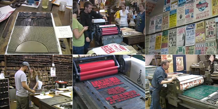
Andy Polaine recently tweeted a link to this video on David Airey’s site about Hatch Show Print, a letterpress shop established in 1879 in Nashville, Tennessee, which is still operating. The manager, Jim Sherraden, has strong views on how to run the shop, with a motto of “preservation through production”, the idea being that all the equipment, all the blocks, everything, is still used regularly, even if it’s for one print. Sherradden regards the shop as a living museum; everything is letterpress, and done by hand, and interestingly:
we don’t introduce new typefaces because I don’t want to pollute the integrity of the archive.
I’m glad someone is doing this. I’m glad that this style, so American, is being maintained, that these wood blocks are being used for printing and not for decorating someone’s wall, and that these presses are still operating and being maintained. I’m glad someone’s doing this, because I don’t think I’d want to. I know I’d find myself craving new typefaces, screenprinting, digital print, variety. So yes, I’m glad someone’s doing this. Someone else.
Some stills from the video. Look at all those wood blocks. Wow.
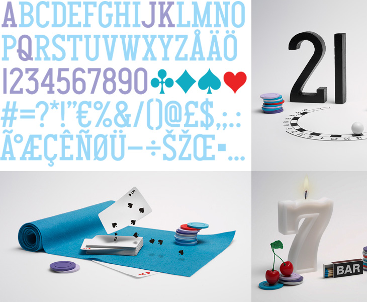
One of the design sites I read regularly is Fubiz, and on there I recently read this post on Daniel Carlsten’s work for the new gambling site, Gnuf. I’m rather fond of the type and iconography of playing cards (as I’ve posted before), so a new identity using many of those themes is going to get my attention, especially as Carlsten has designed a typeface for Gnuf based on them. Looking at how the whole identity works on gnuf.com, I like how he’s not tried to ‘smooth out’ the type, keeping the instead the odd widths and shapes of the letters and numerals and their exaggerated, oddly-placed serifs. I guess there are free fonts out there that do the playing card thing well enough, since the theme hardly requires fine kerning or balance, but it’s unusual and worthy of comment to see it as part of a nicely integrated identity like this. It’s worth checking out the rest of Carlsten’s work too, there’s some lovely work in his portfolio.
Normally I find all-Flash websites intensely frustrating and rarely recommend them to anyone. I think no matter how glittering with effects, how technically accomplished they may be, they represent a regrettable attitude to the web; a lack of ‘playing nice with others’ that keeps the information locked away, often unlinkable, frequently unquotable and usually inaccessible. Still, sometimes there are sites that do something so nice it’s worth linking to them, despite their Flashtastic nature. A few days ago It’s Nice That linked to the new site of Established & Sons which has some lovely things, and some lovelier type treatments using URW’s Didoni. One of my favourite examples is below: