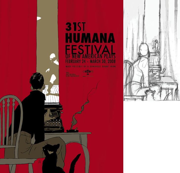
Drawn linked to this set of posters by Noma Bar that make clever use of negative space, and they reminded me of an image I’ve had saved on my computer since last year, this poster for the Humana Festival by Tomer Hanuka, below. It doesn’t need any explanation, I just love it — the image is beautifully conceived and rendered. You can read more about its development on Hanuka’s site, Tropical Toxic.

I would tweak the type a little bit thought, especially the ‘31st’ — for some reason the height of the 3 hasn’t been optically adjusted, making it look much smaller than the 1. It’s rather odd that was done like that.
