Glagolitic

I’ve been pondering this article for a while, since coming across Jonathan Hoefler’s posts (and here) about Glagolitic script in my RSS reader. It’s a script I’d never heard of before, and I’m always fascinated by writing systems, so I followed some links, sent a couple of emails and did some research on it.

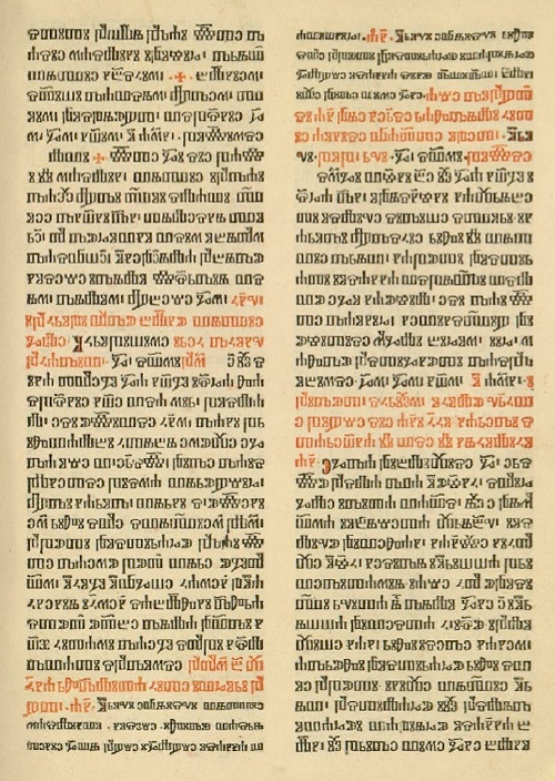
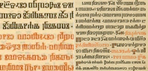
First off, I have to say thank you to Typonine for sending me the font used for some of the illustrations in this post, and specifically Nikola Djurek who designed and developed it, based on the first Croatian printed book in the script: the “Misal po zakonu rimskoga dvora”, printed in 1483. A page, and details, from that book are shown below.

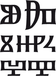
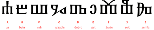
One of the things I noticed when looking at examples of Glagolitic is the way some characters appear and disappear; I was trying to set some text in it, and whichever bit of text I tried had some extra characters that weren’t in the font or in any other examples - each one seemed to have characters unique to it. Of course, this isn’t a deficiency of the font (or of the language), but more a sign of the evolution of the written language and of the strong influences on it from Latin, Cyrillic and Church Slavonic over the years. Croatian was written in all three systems in parallel, and as a local system not widely known outside of the Balkans (despite being the oldest of the Slavic alphabets), the form of written Glagolitic has perhaps been more influenced than influencing; In some written examples there are Cyrillic characters, while in others the characters are presumably the original Glagolitic ones, or newer hybrid forms.

Some ligatures in Glagolitic script.

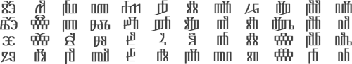
This leads on nicely to arguably the most interesting feature of Glagolitic (for a typographer at least) - the sheer number of ligatures. This interesting PDF states that in one work alone, the Brozić breviary, there are 250 ligatures - a number you’d more expect to find in a hand-written work from a top scriptorium rather than a printed book of over a thousand pages. Also unique to Glagolitic among printed languages are the broken ligatures, where half of one letter is joined to another letter, adding thousands of apparently new glyphs to the language. Of course, for anyone (like me) trying to set some text in Glagolitic, it all appears rather confusing and frustrating - but the reason why I tried (and why I’m always tracing things) is to learn more about something, and in that it’s certainly succeeded. If you’re interested in finding out more, for further reading there are a few articles out there, including (of course) Wikipedia, and this introduction to the history of the script.

So after all that I didn’t get to set some text properly in Glagolitic. I think to do so I’d need to spend some time learning a lot more about the language - so it’s added to ‘the queue’ of Things That I Must Learn More About. In the meantime, for my own pleasure and so you can see how attractive the glyphs are in Nikola Djurek’s font, I’ve created a pattern using it.

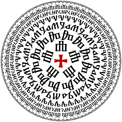
Now, if reading across the circles spells anything rude or inappropriate, let me know, OK? The contact form should be working again after the server move.

Things That Go Beep In The Night

The site was briefly inaccessible today, and the RSS may show up as having some duplicate entries. Why? The Ministry of Type has moved! Servers that is. I would like to convey the sense of a thrumming nexus of raw computing power; a darkly gleaming enclosure of steel and carbon fibre buried deep underground in an impregnable vault under some faded ancient pile just off Whitehall, but I fear the truth is a little more prosaic.

Instead of a tiny patch of disc space on an overcrowded server among thousands of others in a vast, grey, air-conditioned warehouse in one of London’s more dismal suburbs, the Ministry’s online presence now occupies a spacious new server dedicated to a few carefully selected occupants. It’s most likely still in a vast, grey, air-conditioned warehouse in one of London’s more dismal suburbs though, but I gather that that’s by far the best habitat for servers.

So yes. Welcome to the new server!

Watch the Baseline

I just followed a link to this interesting demo of the latest webkit wonders on Shaun Inman’s site. I’m excited of course by the possibilities that the transitions and effects could provide - from more responsive UIs to having vertical labels on a graph or spreadsheet without graphics or flash, for example - but, and there’s always a but in things like this, that baseline is seriously wonky. Oddly, Photoshop has this problem too - you can’t just rotate a chunk of text and have it maintain a smooth, straight baseline, so you end up converting text to outlines instead and having to start afresh with each content edit. Annoying!

Openfolk

You know when you see something and think, “If only that little bit was like this instead of that”? Well I just had that with the Openfolk Manifesto logo by Steve Jankowksi (bottom of the page), which is really rather attractive, but I think I would have ‘squared off’ a couple of the corners, instead of having them all rounded. So, you know, just to verify that idea, I redrew it. To be honest I’m not entirely convinced my redrawing is an undisputed improvement anyway, but it’s fun to play, no?

Also, on that page, take note of the Listening Party Five logo, which is rather nice too (though the roman numeral implies that this is actually Listening Party Four)

Typographic Tree Columns

The Denver Egotist sent me a link to this rather nice piece of work, for Crawley Library in West Sussex. The new library is due to open in January 2009, so I might have to go up and have a look - I’ve not been to Crawley in years. There’s some more info on the Crawley Borough Council website, and some pictures on the Crawley Library Flickr set.

I can only hope that their new library gets a better logo than the one for Brighton’s, which is a typographic abomination.

Political Grids

There’s been loads written about the high quality and consistency of Barack Obama’s campaign branding and design. I don’t disagree with any of it, but I’ve not really seen anything that really grabs my eye, that makes me look closer and see how it was done. Maybe I’m being cynical because it’s advertising for a political campaign, but they’re perhaps too knowing, too carefully designed, sometimes perhaps too derivative, to be commented on individually as pieces of design work. That is in itself quite remarkable, of course, and collectively they’re interesting as an example of brand power, but at the end of the campaign it’ll be interesting to look at all of it together, as a single body of work, and I fully expect there to be a book published to allow us to do just that. I’ll probably buy it, too.

So, having said all that, I just came across this scan of a flyer promoting Obama’s speech at the Tiergarten in Berlin last week, and it’s a bit more special. It’s got a very nice grid, which to some, invites some comparison to the work of the Bauhaus, though I can’t be the only one to realise that diagonal grids are unique to the Bauhaus. Indeed, they’re quite often used in political, commercial and (dare I say it) theatrical advertising. Still, the flyer below is an excellent example of a diagonal grid, well applied:

The Superest

I’ve been enjoying The Superest for a while now (since it started I think) after following a link from Chris Glass (I think), and while every post on it is good, it’s the ones by Kevin Cornell that I look forward to the most. Apart from the fantastic illustration, there’s often gorgeous lettering to look at. His site, Bearskinrug, is a joy to visit as well.

I’ve nabbed some of his work from The Superest to illustrate the point - I put them on a cards for my own amusement, as the site reminds me of Top Trumps (and because I think you need to visit the site to see the full ones). Go and visit this, and his main site.

Great Ideas

I’ve had these covers saved on my desktop for a while now, and I keep meaning to link to them. I saw the first set of Great Ideas books when visiting family last year, and was struck by the variety, creativity and humour of the cover designs. It turns out that there are two more sets, all done to the same standard. You can find the first set here, and the second set here. The third set seems only to be viewable on Flickr for now. I tried to find links to the boxed sets on Amazon but they appear to be unavailable - seems you can only buy the individual books. I like all the designs, but here are a few of my favourites:

These are from the first set. The ampersand on Confessions of a Sinner is quite special, the Meditations cover looks like it uses every ligature in Jupiter, and The Inner Life cover is just lovely - I’d like it as a large print.

English may not be Chinese, but when using monospace type, and with the right subject, you can get away with columnar type. There are some very nice typographic designs in the second set.

I have a couple of other favourites from the third set too, but these three are great.

Are You Serious?

I found this article (via Kottke) about Serious Sans, yet another attempt to produce yet another version of Comic Sans, one that maybe this time people will like; one justified by a bunch of vaguely defined supposedly academic advantages. There is a particular belief about Comic Sans that always seems to come up as a justification why it’s actually not that bad, and that people who hate it are horrid type snobs in ivory towers (or should that be lead towers?) who really don’t get how the common man or woman perceives type. It is summed up rather well in this quote:

Struggling to understand what could possibly be good about Comic Sans, Valerio — together with partners Hugo Timm, Filip Tydén and Erwan Lhussier — found that the doggedly goofy font’s irregular forms made it one of the easiest typefaces for dyslexics to read.

Now, this is to many intents and purposes, quite true. However, it is also true of almost every other sans-serif face out there; Avenir, Helvetica, MS Sans Serif, Verdana, Arial, and so on. There is nothing unique or special about Comic Sans that makes it particularly good for dyslexics, except in the case of “you read best what you know best” - a dyslexic used to Comic Sans may well find it easier to read, but others may not. The trick is to find a happy medium; something that works best for most people (i.e. your audience of, say, dyslexics) and reasonably well for the rest; something that does no harm*. I have done a lot of work designing UIs with accessibility as a primary requirement, and in one of the largest projects an ‘expert’ demanded that the interface and all instructional graphics be set in Comic Sans. Later, after consultation with real experts at the Royal National Institute for the Blind, we ended up with the following advice, summed up in this rather pithy quote from the RNIB website:

Avoid highly stylised typefaces, such as those with ornamental, decorative or handwriting styles.

The RNIB consultant basically recommended Arial: it is commonly available, people are well used to it, and is an unornamented and regular sans-serif with clear letterforms. It also has a clear advantage of not being incredibly insulting to adults who were using the learning programme, and believe me, they did find it insulting. I’d know - I was there.

Oh, and as for Serious Sans, well, there’s not much to say. It’s not very good, but I don’t think it’s really meant to be. If you’d like to see the results of a genuine and serious project to produce a legible and accessible face, have a look here.

I have ranted on this subject before.