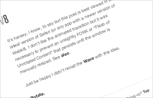
I just followed a link to this interesting demo of the latest webkit wonders on Shaun Inman’s site. I’m excited of course by the possibilities that the transitions and effects could provide - from more responsive UIs to having vertical labels on a graph or spreadsheet without graphics or flash, for example - but, and there’s always a but in things like this, that baseline is seriously wonky. Oddly, Photoshop has this problem too - you can’t just rotate a chunk of text and have it maintain a smooth, straight baseline, so you end up converting text to outlines instead and having to start afresh with each content edit. Annoying!

