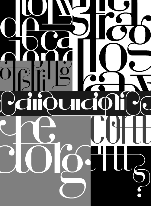
I found a link to this preview of The Illustrated Ape magazine the other day. Such fantastic lettering! I don’t know whether I’ve been completely unobservant or my local bookshops are just crap, but I’ve never seen a paper copy of the magazine before. I’ll keep an eye out for it now though - I just love the lettering. I’ve cropped together some bits from the titles in the preview:
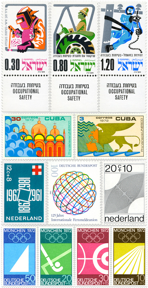
All The Stamps
So yes, I rather like stamps. I’ve traced a couple of sets now, and then the other day I came across this incredible set of stamps, via Grain Edit. They’re incredible. Stamps are fascinating in the same way as banknotes, but while banknotes have to remain current for years and survive the harshest treatment, stamps are short-lived things, designed to be kept flat, used once, then thrown away. There are new designs, limited-edition runs, all the time.
Having said all that, I’m still going to trace some of these (because quite frankly I won’t be able to resist), so here are a few of my favourites.
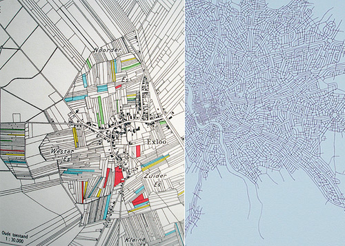
Ffffound Maps
I often find myself browsing through ffffound, sometimes because I’ve remembered to look, sometimes because it comes up in search results, and other times because my own images appear there and it shows up in my logs. Still, after all this time it’s invite only. Strange! It seems to work, and the “You may like these images” is usually spot on, so I’m thinking the limit may be down to scalability (current scourge of Twitter) or to keep the riff-raff out (this is the internet after all).
Anyway. I’ve had these two images knocking around in a couple of my hundreds of open tabs - I like maps so they appeal to me.
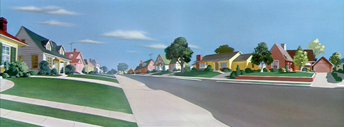
Animation Backgrounds
This site is astounding. I’ve been browsing through it for, oh, an hour now, and there are more and more amazing images. Some of them (my favourites) look like they inspired, or were inspired by, Edward Hopper, and others seem right from Ladybird books I had at junior school. They’re quite inspiring and evocative - looking at the first one here, I’m taken right back to visiting my grandparents when I was a child:
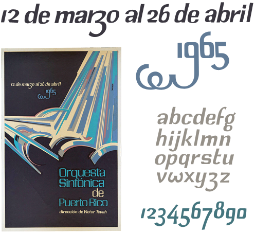
Orquesta Sinfónica de Puerto Rico
I was browsing through Bibliodyssey last night and found this poster in an article about Lorenzo Homar. I love the beautiful and lively lettering, especially the dramatic swash on the 9. I’ve (as usual) traced it with trusty beziers (I love bezier curves) and sketched out a very rough alphabet, which I might take a bit further at some point - redrawing the numbers from scratch, I think, as I’m not very happy with them.
To create a font based on this would be quite a project as the original lettering was clearly done by hand, though I’m sure with a deft application of Opentype rules you could create something that has much of the rhythm and charm of the original. However, I think I’ll create a stock of basic letterforms and apply variants and tweaks as I need them - I doubt I’ll be setting much body type in this. The lettering doesn’t look like it would suit a standard set of uppercase glyphs, but having ornamental lowercase forms in their place would work rather well - the swashed 9 shows what direction to take.
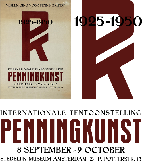
Vereeniging voor Penningkunst
I rediscovered a set of saved images and links I had, labelled “150 Years of Dutch Advertising Art”. I’ve had the link sitting around for quite some time in the vast dusty archives of my home directory, and I can’t understand why I’ve not put it up here before. The site is an incredible collection of fascinating and inspiring images, from the baroque and painterly to the most sparse and graphic. Great stuff.
As usual, I’ve had to trace some of them with trusty beziers - I’ve just finished doing this one. I love the PK monogram and the composition of the two styles. Fun to trace too.
If Only It Was This Exciting
John Gruber (Daring Fireball) linked to this interesting article on Android, which is worth a read, but stop a moment and admire the illustration by Christian Montenegro. It’s quite something - the flat slab of technology and this glorious fountain of swirling colour coming out of the sharp-edged screen - if only real phones were nearly as exciting, with 3D display technology like that and everything. I’d go for an interface that launched out of the phone like that.
Browser Kerning and Ligatures
David sent me this article, discussing and demonstrating some of the new text rendering features in Firefox 3, compared to Safari. Finally, we have kerning. Hurrah! It really works, too. Now kern-sensitive souls can read Textism without having to scroll the site name off the top of the viewport.
Firefox also supports contextual and discretionary ligatures, which I was fully prepared to get quite excited about until I read that it appears to be somewhat broken when presented with languages other than English. As Ralf Herrmann points out, contextual ligatures are dependent on more than the context of neighbouring characters - the context of language matters too. Fancy that. The Turkish example is especially interesting, as the dotted-i and dotless-i are not interchangable, and using one in place of the other has caused deaths, quite recently too:
The life of 20-year-old Emine, and her 24-year-old husband Ramazan Çalçoban was pretty much the normal life of any couple in a separation process. After deciding to split up, the two kept having bitter arguments over the cellphone, sending text messages to each other until one day Ramazan wrote “you change the topic every time you run out of arguments.” That day, the lack of a single dot over a letter - product of a faulty localization of the cellphone’s typing system - caused a chain of events that ended in a violent blood bath. Gizmodo - rest of story here
As most of my work involves working in multiple languages, I tend to be a bit sensitive to things like this; where developers of a product build in a cultural or linguistic bias even when that product is destined for an international audience. The Firefox team clearly aren’t just intending their browser to be used within the confines of the United States - just one look at this map shows their global ambition. So they should have fully implemented the rules for contextual ligatures in other languages, if they’re going to do it at all. I’m sure it’s an oversight, but if you’re going to do something, you should always try and do it properly - after all, the ligatures could be turned off for languages where the rules haven’t yet been implemented.
But still, kerning! In a browser!
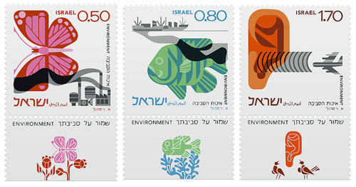
Israeli Stamps of 1975
Yes, more stamps! This time courtesy of Richard at Ace Jet 170 who posted this article about a set of Israeli stamps he bought. They depict three environmental concerns, air pollution, water pollution and noise pollution, and were apparently designed by Eliezer Weishoff (thanks to Yotam for the info). The stamp itself shows the problem situation with an additional detachable design depicting (iconographically) the ideal; butterflies visit flowers, fish swim among seaweeds and ears hear birdsong. Yes, that is an ear - the least successful image of the three I think - though I do like the birds in the tear-off.
I was asked for prints of the Polish stamp designs and I’d certainly like to, but I need to research the copyright. I traced the designs for my own understanding, and I’d love it for more people to see these designs at large scale and up close, but I’m not going to violate anyone’s copyright - I am a designer after all! Of course, if anyone’s a copyright lawyer in the UK/EU and fancies offering some tips, I’d greatly appreciate it.
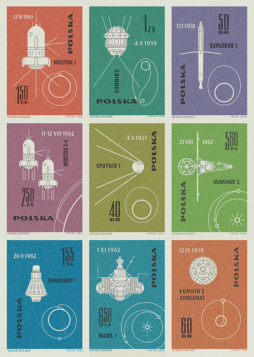
Polish Stamps of 1963
I saw pictures of these stamps on Ace Jet 170, and was absolutely fascinated by them. I love the illustrations of the orbits and paths taken by the space vehicles - the Łunnik 3 (Luna 3) one especially. As usual, I felt compelled to redraw them so as to understand them better, and they really are very well done - the orbits of Mars, Earth and Venus aren’t drawn perfectly circular, and the relative sizes of the planets are nicely visualised. The whole collection looks to have been a celebration of 60 years since the publication of Konstanty CioÅ‚kowski’s treatise on powered spaceflight “Изслѣдованiе мировыхъ пространствъ реактивными приборами” (The Exploration of Cosmic Space by Means of Reaction Devices), in 1903 - showing some of the results of the research his work started.
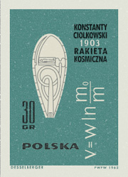
The first (or tenth?) stamp in the collection was devoted entirely to him, and the illustration is that of a design for a powered spacecraft from the cover of published versions of his paper - my redrawing of it is at right. The others show a variety of space missions, with the interesting date convention of having the month depicted with roman numerals. It’s not something I’d come across before, but it looks quite useful*. No longer would Americans and Europeans have any doubt over whether 01/03/08 is the 1st of March or the 3rd of January. Anyway, that’s another one of my must-do-something-with-this bookmarks cleared up, and it’s been quite a fun process in redrawing them. Here are the images I made based on the stamps. I’ve got them as vectors, so I’m thinking of getting them printed out A3 size.