There’s been loads written about the high quality and consistency of Barack Obama’s campaign branding and design. I don’t disagree with any of it, but I’ve not really seen anything that really grabs my eye, that makes me look closer and see how it was done. Maybe I’m being cynical because it’s advertising for a political campaign, but they’re perhaps too knowing, too carefully designed, sometimes perhaps too derivative, to be commented on individually as pieces of design work. That is in itself quite remarkable, of course, and collectively they’re interesting as an example of brand power, but at the end of the campaign it’ll be interesting to look at all of it together, as a single body of work, and I fully expect there to be a book published to allow us to do just that. I’ll probably buy it, too.
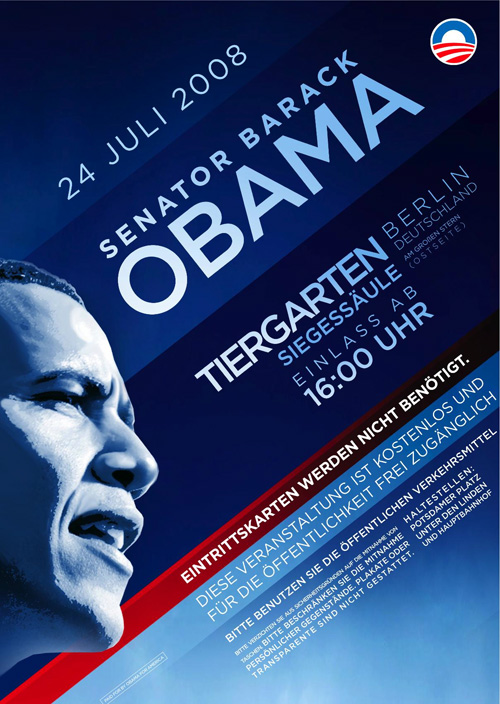
So, having said all that, I just came across this scan of a flyer promoting Obama’s speech at the Tiergarten in Berlin last week, and it’s a bit more special. It’s got a very nice grid, which to some, invites some comparison to the work of the Bauhaus, though I can’t be the only one to realise that diagonal grids are unique to the Bauhaus. Indeed, they’re quite often used in political, commercial and (dare I say it) theatrical advertising. Still, the flyer below is an excellent example of a diagonal grid, well applied: