John Emerson sent me a link to this article ages ago, and I’ve just re-read it. It’s worth a read as an introduction to how type has been used to enforce and shape national identity around the world:
Hindi and Urdu also share a common vocabulary and grammatical structure, and linguists refer to them as one language: Hindi-Urdu. In print, however, the distinction has religious and political significance. Hindi is written in Devanagari, historically associated with Hinduism, while Urdu is written in an Arabic script associated with Islam. Hindi is used in India, while Urdu is used in Pakistan. The ideological wedge between what it means to be Serbian or Croatian, Hindu or Muslim, has been used by nationalist demagogues to promote conflict and political power.
As I’ve mentioned before, one of my obsessions is for maps, especially maps of cities. Maps and images of cities. Walled cities that exist into the modern era are especially fascinating to me. In most societies the conditions that forced people to defend themselves with walls (and for those walls to be successful as a defensive measure) have long gone. Walls can be breached with artillery, bypassed by cruise missiles, made insignificant by ICBMs, and made irrelevant by changes in economies and societies. However, there are still walled cities in the world, and some have even been revitalised (however briefly) by modern conditions.
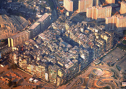
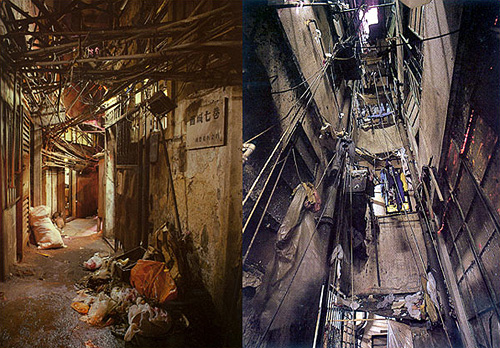
One such was Kowloon Walled City, a small patch of Hong Kong technically never in the British mandate, but never de facto controlled by the Chinese either. As a territory in limbo, it became an incredibly dense city, almost a single building, covering only 0.026 km² and at its peak apparently having a population as high as 350,000 people; though as a virtual anarchy detailed census figures naturally don’t exist. I wish that someone had been brave and resourceful enough to mount a survey of the city at its peak - the place was, as far as I can tell, unique in the modern world. Knowing more about it, how the societies within it interacted, how the buildings were modified over time, the nature of personal vs. public space and how the power structures (and their limits) altered over time would help with the study of our own increasingly dense societies.
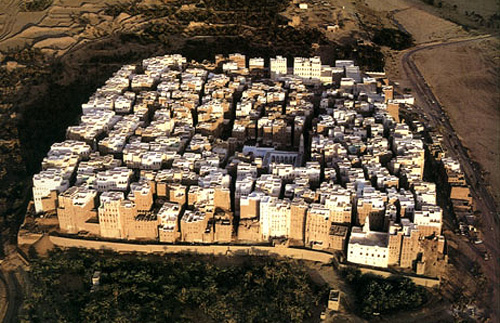
Looking at pictures of it, I’m reminded of these pictures of Shibam in Yemen. The structural similarity to Kowloon Walled City is remarkable:
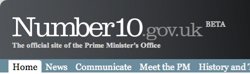
Steve sent me a link to the all-new official site for the Prime Minister of the UK, which, incredibly, is in beta. Get that: The official online presence for the leader of (allegedly) the fifth richest country in the world is a crummy beta site with dodgy kerning, inconsistent use of typefaces, colours, rounded corners, spacing, and, well everything apart from general crumminess. Look at the masthead. It’s in Clarendon, Times New Roman Bold and Georgia. The typographic soup continues with the addition of Arial for body text (and oddly, some headlines too), and on a graphic, Copperplate. There are boxes with rounded corners at the top but not the bottom, containing images that also have rounded corners but where the curvature doesn’t match the container (and appears to be damaged by JPEG artifacting on most images). The site is a mess.
The masthead at the time of writing.
The idea of adding features to the site such as YouTube, Twitter and Flickr feeds is a good one, and yes, these things can be a bit messy to integrate at first, but it’s not hard to get those things up and running in any design. The hard bits, especially for a site as prominent as this, is to ensure security, that the background infrastructure can handle the traffic and (importantly) all your content is written and entered into the site. Is this a site that got designed and implemented by several groups who never communicated? It looks like there may have been a design done at pitch stage, but largely ignored throughout development. A good, consistent design is vital for any site, and sticking to it is a must throughout all stages of development.
Still. All these things can be fixed. The design can be clarified, the layout can be rationalised, attention can be paid to consistency and quality, the HTML and CSS can be cleaned up, but it beggars the question, why did they launch an unfinished site and call it a beta? This is not what betas are about. This is arguably one of the most important sites representing the UK and should be implemented to the highest of standards, and yet they launched a crap blog and tried to cover their arses by calling it a beta. Very poor show indeed.
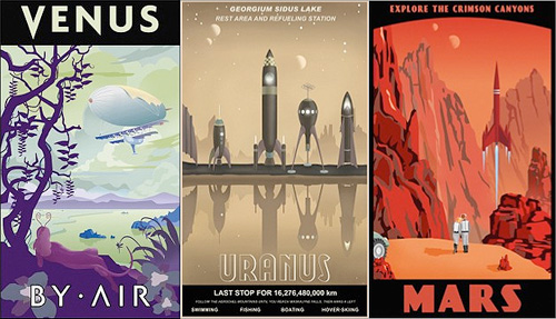
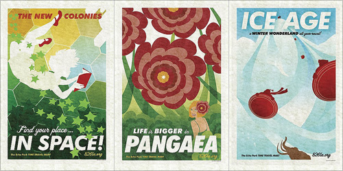
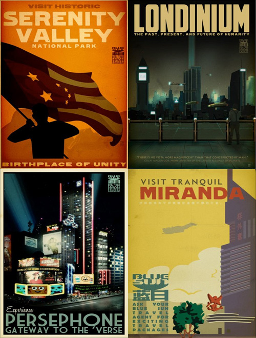
Again, some other things that have been doing the rounds but got stuck in my pile of ‘things to look at’. These travel posters by Steve Thomas, Amy Martin and Adam Levermore-Rich promote travel to exotic eras and destinations, such as the Crimson Canyons of Mars, Tranquil Miranda, or the Winter Wonderland of the Ice Age.
I like the ones for destinations in the solar system by Steve Thomas. Aside from their obvious fantasy, I find them a little poignant though. They evoke the ideas of the early 20th Century when we were going to colonise space pretty soon and it was going to be amazing. Except we didn’t, and space is pretty expensive and we’re only just starting to get space tourism, and even that barely above our atmosphere. Still, perhaps looking at these posters we can live in hope! Well, not for Uranus, what with it not having a solid surface and all, oh, and Venus needing some hefty terraforming… but Mars is about right! Oh, except it’s brown, not red. Ho hum:
Then the Amy Martin ones, which are simply beautiful. The colours are lovely, and these are the ones that to me more closely resemble travel posters:
Lastly, the ones that are from the universe of Firefly and Serenity. I have to admit I’ve not watched either so I can’t really comment other than to say they’re rather attractive. You can buy them here though.
Found via Blue Tea, and via the visits to 826LA I made for the Robot Milk post.
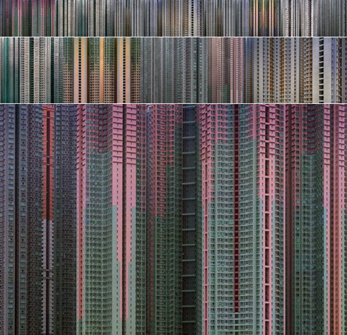
I’ve had a link saved to these pictures for quite a while, and of course they’ve been linked from countless sites over the years, but hey, they’re still worth linking to again.
The thing that I’ve noticed about them is the effect of the small thumbnails all together. You click them and in a way some of the mystery is dispelled, as the smaller size allows you to see the overall pattern. They could be microchip designs or supermarket shelves, so I put them together at a couple of sizes below. To see the details there’s an original size one too.
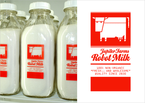
I love robots, I love invented brands, and I love well-made artifacts, so this set of bottles really got my attention. Trouble is, there’s very little I can find out about it. I know it’s something to do with 826LA, it might be a student project, the bottles themselves might be for sale (though not from their online store) and that I would like one. Or two. Or three.
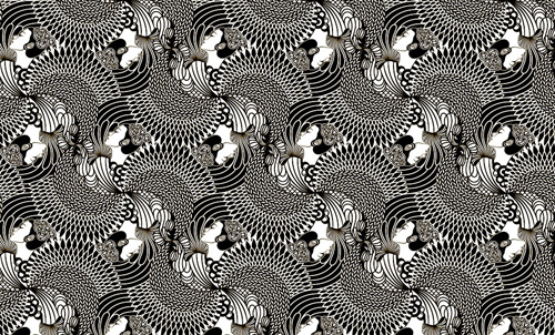
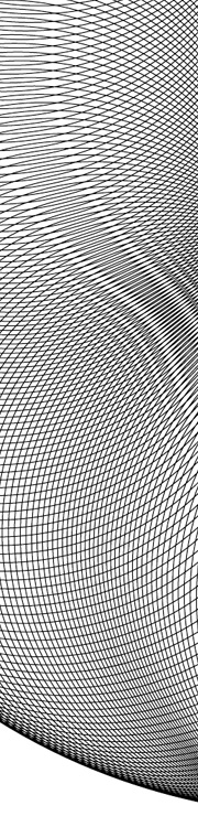
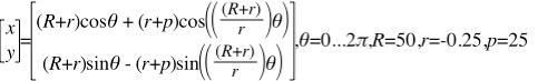
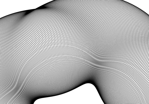
Banknote patterns fascinate me. I can get lost for hours in all the details, seeing how the patterns fit together, how the lettering works, the tiny security ‘flaws’ - they’re amazing. Central to banknote designs are Guilloche patterns, which can be created mechanically with a geometric lathe, or more likely these days, mathematically. The mathematical process attracted me immediately as I don’t have a geometric lathe and nor do I have anywhere to put one. I do, however, have a computer, and at the point I first started playing with the designs (mid-2004) Illustrator and Photoshop had gained the ability to be scripted. So off I went, using the hypotrochoid equations on Mathworld to create rather rough and ready patterns - scripting at this point didn’t have a very usable set of functions for creating beziers, so I had to use crummy line segments. The process took ages and served just to prove to me that I could do it, but the results were too poor to go much further.
Then, a couple of years later I discovered Grapher on the Mac. Aha! Now here was a program that could create the patterns I was after and export to EPS. Well, kind of. It could create the patterns, most of the time, and export to EPS, though not always. I got a couple of patterns out of it and had a look round for other options. Again, not much - not much that I could afford, that is.
The basic hypertrochoid equation. This makes a nice rosette.
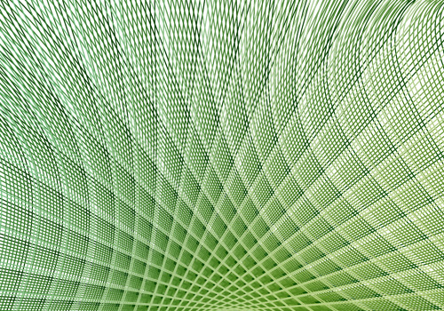
Then we get to now. I give Grapher another go, and at last, I can create and export patterns:
There are still some extremely frustrating limitations though. First of these is the resolution of drawing the graph. I’m sure for most graphs the default resolution is fine, but when creating these patterns you need tiny increments. Tiny tiny ones. If the line is going from one side of the graph to the other and back again a thousand times in a couple of radians, you don’t want the graph program to start dropping line segments, or corners, or anything really. Grapher does allow you to increase the resolution, but it’s not sticky - change anything in the equation and it pops right back to the default. Every. Single. Time. The same thing seems to happen with the line thickness too - I wanted all the designs to be at 0.1, but it kept changing it back to 1.0. Frustrating! There are a couple of other UI things I’d change, like having an option to keep axes at 1:1 ratio to each other, even when you resize the window.
Another, deeply irritating frustration with the whole process is to do with Illustrator. Try and open an exported EPS in it, and you get “An unknown error occurred”. Photoshop can accept the EPSs as placed objects, and InkScape can (eventually) open them, so Grapher seems to be outputting valid EPS files. I suspect that the number of lines in the graph is causing the premier vector editing app in the industry to fall over. Oh dear.
Still, after all this, I can still get the patterns made, and get them into an image editing program, which is quite something. Now I just need to find the magic numbers to create just the right patterns I want.
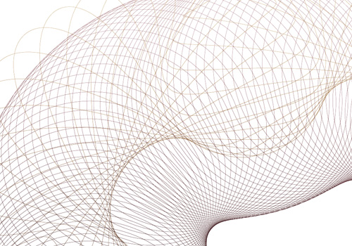
This beast creates the pattern above. The 'm' is not strictly necessary for this one, but varying it is good for experimentation.
The Boston Globe’s Bigger Picture has a series of images of the Beijing Olympics opening ceremony. I missed it on TV as I was travelling, so I’ll have to watch it later, but I’ve heard a bit about it. I can’t quite remember all the hyperbole, but apparently it was spectacular, ground-breaking, amazing, mind-boggling and other great superlatives.
This one also reminds me of the Matrix, or Gattaca, or even Minority Report. It’s all very sci-fi. (AFP PHOTO / Joe Klamar)
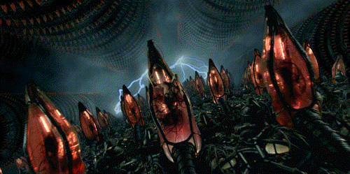
The only negative thing I read about it was that while it meant to represent the history of China, modern China was barely represented at all and that this omission was down to ‘lack of time’. I disagree. I think the whole thing was about modern China - the glitz, glamour, spectacle, all the money and technology poured into the event, it’s all about how China is today. Also, the very means of presentation are a clear and dramatic demonstration of what the country is about nowadays: mass production. Take a look at Edward Burtynsky’s Manufacturing series of photos and you can see what I’m on about:
You can see his work here, though I warn you, the site is one of those idiot ones that resizes your browser for you without asking.
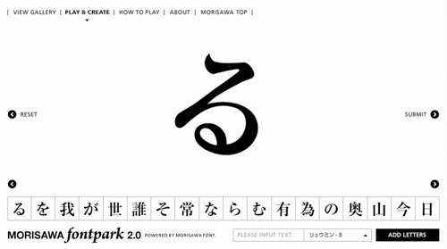
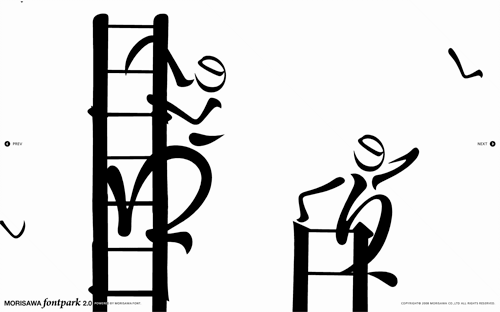
Coudal Partners linked to this rather nice toy by Morisawa & Company. My Japanese knowledge is rather woeful, so I don’t have very much more information than; it’s pretty, it’s fun, it has a very nice interface, and it appears to be promoting the sheer loveliness of Morisawa’s fonts, so please buy some. I was told by a Korean colleague that there are relatively few fonts available for East Asian languages compared to Western ones because of the sheer number of glyphs that need to be designed, so I would guess a new one would elicit at least a moderate fanfare. Maybe. Anyway, have a play - here are a few screenshots: