Excellent news; Erik Spiekermann’s brainchild The Fontfeed has relaunched as a new, independent site. Combining the insights of Erik Spiekermann himself, Stephen Coles and Yves Peters, this is definitely a site to add to your RSS reading list, or should you be so inclined, your bookmarks. It sounds like it’ll be very much worth it:
Along with delivering advice and inspiration, our goal is to add a perceptive voice to the type community, bridging the gap between font users and font suppliers. We hope to stimulate interaction and kick start a valuable and lasting discourse between all parties, so don’t hesitate to let us know your thoughts.
Peter Gabor’s gallery of Herb Lubalin’s work has been linked to from lots of places as the Tribute to Herbert Lubalin, and if you’ve not seen it yet, it’s worth a look. However, that’s just the gallery for a whole category of articles by Gabor about Lubalin, so that’s worth a look too (it’s all in French, mind). While the gallery does have plenty of great examples, the pages don’t have any background information or titles for any of the pieces of Lubalin’s work; it’s not so much of a tribute as a teaser, or a portfolio that really needs the artist there to explain each piece - at least to say what it was for.
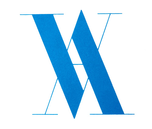
Victoria and Albert logo, by Alan Fletcher, 1989.
The case in point for me is the “VA” logo below. Who or what was it for? Searching for it online gives a list of everything Lubalin did in Virginia, but nothing that appears to explain this. It’s a mystery. And yes, it does remind me of the Victoria and Albert Museum logo by Alan Fletcher, at right.
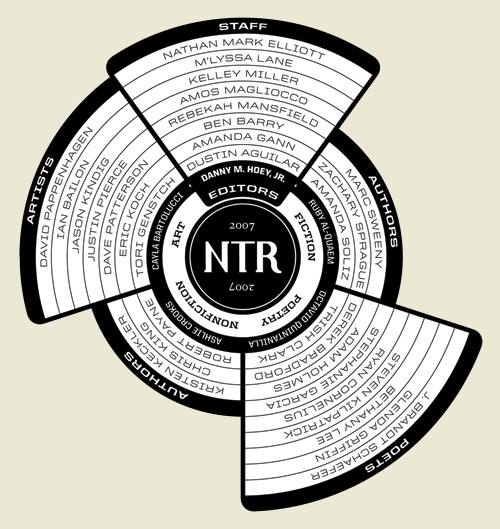
This is a great bit of information design, by Ben Barry. Typical lists of participants in an event or project tend to be dull affairs that don’t really grab the attention and most likely just get ignored; the names of the participants might as well be replaced with Lorem Ipsum for the amount anyone reads them. Something like this, however, is visually appealing and encourages you to have a look, to see what it’s all about. It’s not hard to work out, but part of the appeal here is that there is something to work out - that Octavio Quintanilla (what a great name) is the editor for the poetry, and that Chris King is a non-fiction author. It’s very nicely done, and I’m saving it for future inspiration. Read more about the project here.
There’s some nice calligraphy and lettering over on Sam Friedman’s site. I particularly liked these two. The “Flipped it” one because the way the letters connect is unusual and could bear some study. The “Obscene” one is a nice piece of lettering.
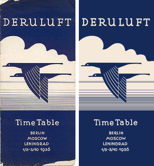
I love this timetable cover for Deruluft - the double bird motif is really quite lovely. The use of the motif in their brand imagery apparently starts out strong (good) and then falls out of favour entirely between 1933 and 1935 (strange) - even in the 1932 brochure it’s reduced to a small image on the flag, then finally being nicely refined and promoted to the central image on the 1936 timetable.
The type is interesting as a monoline form too - the serifs are enormous, and the one on the ‘a’ is just strange, especially given how close it comes to the ‘T’. I really like the numbers though - the balance between the 9 and the 6 in the year is particularly pleasing.
The airline was a joint venture between Germany and the Soviet Union, which didn’t survive the changing political situation between the two countries:
Deruluft’s route network remained fairly intact until the airline discontinued operations in March 1937. By then, relations between Nazi Germany and the Soviet Union had deteriorated to a point where a joint venture was politically impossible. Deutsche Lufthansa took over the route through the Baltic countries, but a service to Moscow was reopened only after the unexpected German-Soviet nonaggression pact of August 1939 had temporarily brought the two countries closer to each other.timetableimages.com
Of course, I had to trace the cover. Mind, much of the appeal of the original is down to the artifacts produced from the printing process, which I didn’t replicate here. I gather there are now filters for Photoshop to create them though.
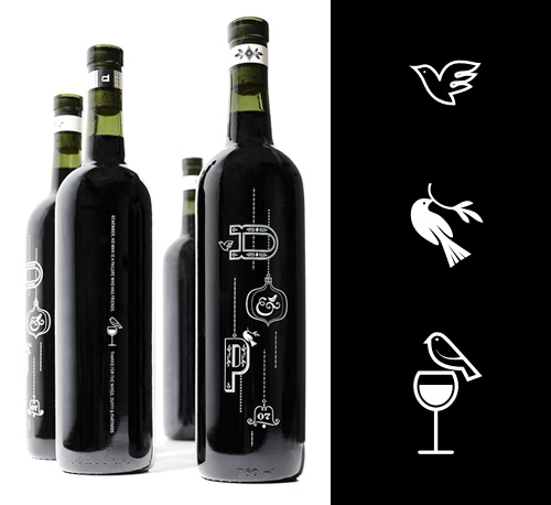
I saw this nice wine bottle design on The Dieline, and had to draw the little bird illustrations on them for myself. Just, because, you know. The bottle designs were done by the design director of Zeus Jones, Brad Surcey, and there’s more good stuff on the agency’s site.
There’s some lovely identity and online design work here. I found it via Graphic Exchange, who commented that the presentation style adds to the visual appeal. I have to agree. Identity work is often about the feel and weight of the physical artifacts - the headed paper, folders, envelopes - and a good way to document them is with good macro photography. You can’t feel the paper, but you can see how it might feel.
Anyway, here are some of my favourites - it’s only a very small sample and they’re scaled down quite a bit, so take a look at the full site. The UI of the site is all flash, but it’s a pretty good example of the genre. I like the way the colours change as you move through the work.
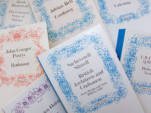
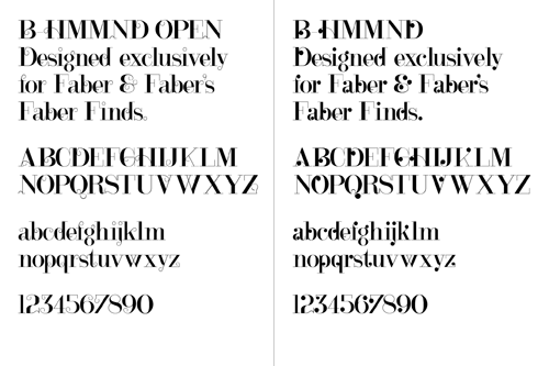
Looking back through CR Blog, I followed a link to this article about the Faber Finds service by the developers and designers, PostSpectacular. The whole thing is incredibly fascinating and quite exciting - taking its cue from the growth in low-volume self publishing services, the service goes further down the mass-customisation route so that each book is printed only when it’s ordered and with a unique, automatically-generated cover design. The cover designs are the most interesting bit, and while the Post Spectacular article doesn’t say whether Faber actually do generate a new one for each and every book (there are a couple of comments about that), the technology is definitely there to do it.
I actually did mean the latter too, every physical printed copy unique, leaving the era of mass production behind - the software was built for this exact context. Though having said this, I really can’t tell if Faber are following fully through with this plan.Karsten Schmidt
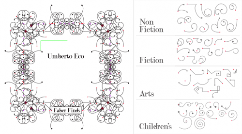
The patterns are based on sketches by Marian Bantjes, with four different types depending on the subject category of the book. The books are assembled on the fly as a web service using Processing, PHP and Java, and apparently while each cover takes only a second to generate, another automatic process weeds out ‘off brand’ ones. I’m often surprised by the almost casual way some really quite remarkable ideas and advances in artificial intelligence are used today - I’ve some knowledge of the subject from many years ago and such things as automatically detecting off brand designs would have been the stuff of futurists and science fiction back then. The description makes it sound simple and straightforward, which perhaps indicates how far things have developed.
Finding appropriate values to these design parameters required a phase of constant experimentation and conversations with Faber’s design team - these collaboratively agreed boundary values then became the encoded art direction within the software.
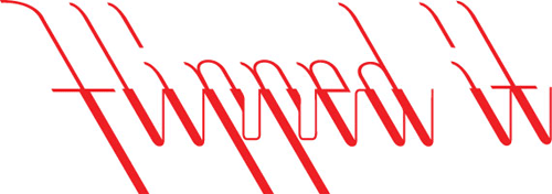
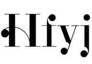
The typeface used for the covers, B HMMND, was designed specifically for the project by Michael C. Place, and while I can appreciate individual letterforms (some at left that I find rather beautiful) and see that they work well with the Bantjes’ patterns (and the Faber logo), they just don’t read very well all together. Some of the titles end up with extraordinarily uneven colour, with great dark patches of ink at one end of a word while the other end is a sketchy ghost of hair-thin lines. Maybe that ‘kookiness’ was the intention but I find it disappointing - the covers are far less appealing as a result; they just look messy and badly typeset. To my mind this typeface would be very successful as-is when manually typeset, or needs a whole bunch of alternates and Opentype rules to allow for a more readable result when set automatically.
I love the idea and how this service has been implemented (the cover titles aside); we definitely need to see more of this kind of thing so that we can get new copies of any out of print book in future. I know that there’ve been old books I’ve wanted to buy only to find that they’re out of print and that second, third and fourth hand copies are incredibly rare - sometimes impossible to find at all. I didn’t want a special first edition or something to squirrel away in an atmosphere-controlled book collection, I just wanted to read the book. For law-abiding, copyright-respecting people like me what options are there? Perhaps one day the whole idea of ‘out of print’ will fade away to be replaced by the very longest of Long Tail economics. I hope so.
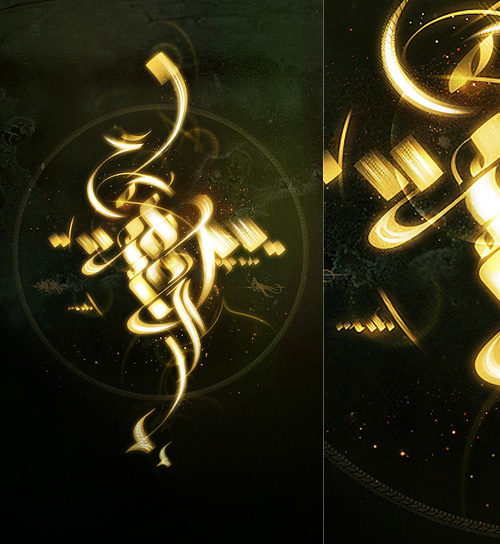
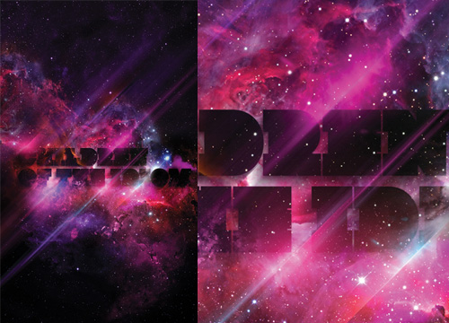
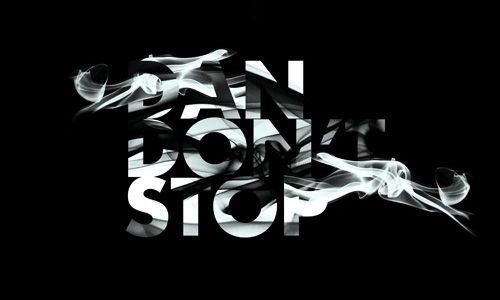
A certain someone commented that many of my recent posts haven’t been about type at all, so, entirely coincidentally I have a post about some very lush type and calligraphy I saw the other day. This post on DesignFeedr has some nice examples of typography on a dark background. Using a dark background is good for making decorative and illustrative type stand out really well - the colours are richer, the darkness concentrates the eye on the main subject, and (on screen at least) the piece literally glows. Some of the examples in the article are nice (others less so) but scroll down for the work by Pablo alFieri, Theo Aartsma and Daniel Gordon especially.
Some of my favourites are below, but visit the article to see all the others.
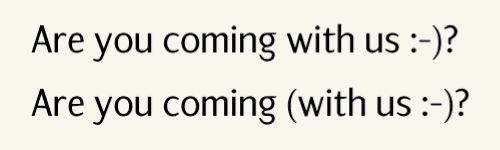
Coudal linked to this interesting article on Art Lebedev about some common problems with typesetting punctuation, such as centering, tracking and bolding. I agree wholeheartedly with all of them, though I’m interested at the solution to the problem of how to punctuate smileys. I may be an old traditionalist here, but I think if you’ve got smileys in your text, you’re not going to be typesetting it. If you have to then you may as well set the smiley in Wingdings and treat it as a normal glyph, rather than leave it as two punctuation marks. Still, when typing in plain text and you’re prone to using smileys, here’s an idea of how to use punctuation with them.
Notice on the Art Lebedev site that the paragraphs are numbered? That’s interesting, no?