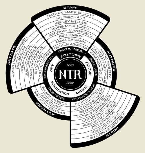
This is a great bit of information design, by Ben Barry. Typical lists of participants in an event or project tend to be dull affairs that don’t really grab the attention and most likely just get ignored; the names of the participants might as well be replaced with Lorem Ipsum for the amount anyone reads them. Something like this, however, is visually appealing and encourages you to have a look, to see what it’s all about. It’s not hard to work out, but part of the appeal here is that there is something to work out - that Octavio Quintanilla (what a great name) is the editor for the poetry, and that Chris King is a non-fiction author. It’s very nicely done, and I’m saving it for future inspiration. Read more about the project here.