Obsessions

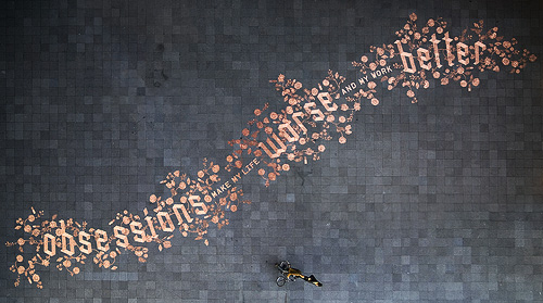
I came across this remarkable piece of work earlier today. It’s a design created with 250,000 euro cents in a public square with the intention that people would interact with it, presumably by taking (or rearranging?) the coins. Even though it’s €2500 lying there, it would take a fair bit of determination to take the lot and get it to (at least) a coin-changing machine, a level of hard work a casual thief is unlikely to want to do I think. The Amsterdam police viewed it rather differently, seeing all this money left on the pavement as being at risk of theft and swept the whole lot up for safekeeping. Rather keen of them, no? The site ExperimentaDesign explains some of the background to the project:

Droog Design and Scott Burnham have assembled a team of some of the most innovative designers and architects from around the world to create 13 newly designed interventions, tools, toys and objects that are temporarily placed along a route on the central IJ-riverfront in Amsterdam.

The design is remarkable and attractive, and there are a few pictures and videos of it before it was ‘saved’. The people building it are clearly working from a plan, but there isn’t a copy of it online that I can find unfortunately. I’ve combined these two photos by Jens to show the whole design - it’s a bit rough but you get the idea:

Inspirational Posters

Fazai38 posted a couple of articles showing some examples of inspirational posters. I’ve a few favourites but at the same time (and coincidentally) Computerlove posted about Negro Nouveau’s new typefaces with a graphic that was happily similar to the Deerhoof poster. I rather enjoy the similarity of the basic motif, and the different effect each of the two implementations give.

I like the little bubbling flask motif on the “We Are Scientists” one, and of course I’m going to like the one that resembles guilloches.

Me, Me, Me

I dislike ‘meta’ posts, posts about posting, or posts about not posting, for that matter, and I’d rather keep my day-to-day work separate from what I write here. However, just this once I’m going to break that rule.

I’ve been busy this week getting my online portfolio up to date with a shiny new design; rather different from the clean spaces of the Ministry I’ll admit, and in a very different tone of voice, but it’s all about being appropriate I guess. Still, I finally got to use some of those guilloches I made!

If anyone needs a rather good (and oh so modest) art director, creative director-designer type hanging about their offices drinking litres of coffee, then do get in touch. The portfolio is here, and the usual LinkedIn profile is here.

The Adventures of Rusty

I found this massive collection  of movie title screens a couple of weeks ago in a Google image search (for something else, naturally) and, well, the nature of life at the moment meant I didn’t have time to have a proper look. I had a look through it today and found this beautiful piece of script lettering. Of course, I had to trace it, and it’s really quite special; the lowercase reminds me of Savoir Faire a bit, but the capitals are just so… movie! Take a look:

I found many other examples of great lettering, but here are four special ones I might trace at some point:

Sweet Type

When I saw this chocolate type I had a thought that it would be fun to try and print using it. Just use warmed rice paper and off you go. OK, the type wouldn’t last very long, but each piece would be unique, and edible. Oddly, and just out of interest, it claims the letters are set in “FF FagoMo Bold”, but unless there’s another foundry out there prefixing their font names with FF, I can’t find it on FontFont’s site.

Writing a Torii

I recently came across this review of the book Arabesque by Gestalten; while I’m probably going to buy it for myself as a present at some point, I couldn’t help but notice the visual similarity between this piece of brushwork and a Torii gate. Purely an irrelevant coincidence I’m sure, but a rather pleasing one nonetheless.

The Lubalin VA Logo

Phillip Niemeyer of Double Triple kindly wrote to explain who that VA logo was for:

I checked my own photo archive of the archive and found the VA business card. VA stands for “Ike Vern & Associates, Photography”. Much of Lubalin’s great graphic work seems to have been simple jobs for small clients. I love that.I posted the VA image, a tissue in Lubalin’s handwriting specing a logo, and a unique logo for the World Trade Center.http://www.doubletriple.net/lubalinPhillip Niemeyer

Technically this is an update to this earlier post, but I wanted to create a new one because I rather like the Double Triple logo, at right - a mirrored ‘3’ in ITC Baskerville.

Ridiculous Design Rules

I came across this site the other day - Ridiculous Design Rules. I’m not quite sure what the basic premise of the site is - whether it’s to collect ridiculous rules together and collectively point and laugh at them by giving them stars, or to collect rules together and rate them as ridiculously good or relevant. It’s very odd. I thought of the ridiculous design rules I’ve encountered before but they tend to be about the audience, or users, for example the truly ridiculous and unproven (and unprovable) “99.9% of people set their browser to the correct language” to the too-many-caveats-to-say-one-way-or-another, “text on screen is unreadable compared to print”.

Whatever you think of the rules or how they’re presented, the site does have some beautiful illustrations by Niels Shoe Meulman - only four for now, but hopefully a lot more soon. I’m particularly taken with the cat picture, it’s a nice Latin script variety of the kind of illustrative Arabic writing I’ve posted about before. Very nice indeed. You can see them larger on the site, or on this Flickr set.