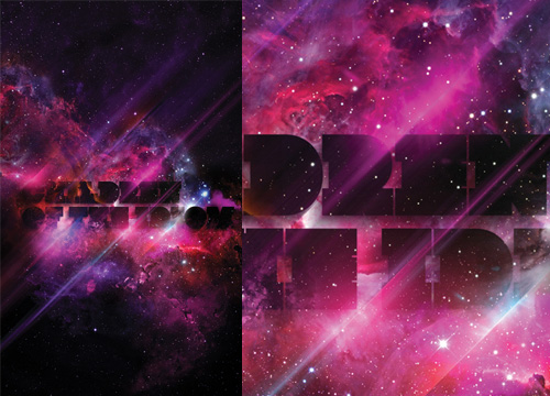
A certain someone commented that many of my recent posts haven’t been about type at all, so, entirely coincidentally I have a post about some very lush type and calligraphy I saw the other day. This post on DesignFeedr has some nice examples of typography on a dark background. Using a dark background is good for making decorative and illustrative type stand out really well - the colours are richer, the darkness concentrates the eye on the main subject, and (on screen at least) the piece literally glows. Some of the examples in the article are nice (others less so) but scroll down for the work by Pablo alFieri, Theo Aartsma and Daniel Gordon especially.
Some of my favourites are below, but visit the article to see all the others.


