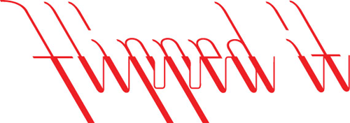
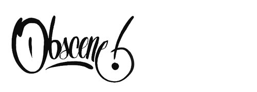
There’s some nice calligraphy and lettering over on Sam Friedman’s site. I particularly liked these two. The “Flipped it” one because the way the letters connect is unusual and could bear some study. The “Obscene” one is a nice piece of lettering.
There’s some nice calligraphy and lettering over on Sam Friedman’s site. I particularly liked these two. The “Flipped it” one because the way the letters connect is unusual and could bear some study. The “Obscene” one is a nice piece of lettering.