Looking back through CR Blog, I followed a link to this article about the Faber Finds service by the developers and designers, PostSpectacular. The whole thing is incredibly fascinating and quite exciting - taking its cue from the growth in low-volume self publishing services, the service goes further down the mass-customisation route so that each book is printed only when it’s ordered and with a unique, automatically-generated cover design. The cover designs are the most interesting bit, and while the Post Spectacular article doesn’t say whether Faber actually do generate a new one for each and every book (there are a couple of comments about that), the technology is definitely there to do it.
I actually did mean the latter too, every physical printed copy unique, leaving the era of mass production behind - the software was built for this exact context. Though having said this, I really can’t tell if Faber are following fully through with this plan.Karsten Schmidt
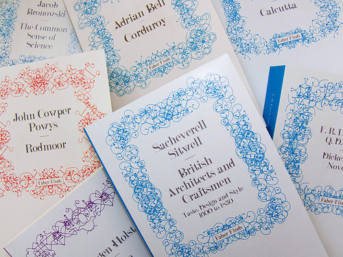
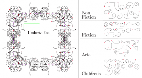
The patterns are based on sketches by Marian Bantjes, with four different types depending on the subject category of the book. The books are assembled on the fly as a web service using Processing, PHP and Java, and apparently while each cover takes only a second to generate, another automatic process weeds out ‘off brand’ ones. I’m often surprised by the almost casual way some really quite remarkable ideas and advances in artificial intelligence are used today - I’ve some knowledge of the subject from many years ago and such things as automatically detecting off brand designs would have been the stuff of futurists and science fiction back then. The description makes it sound simple and straightforward, which perhaps indicates how far things have developed.
Finding appropriate values to these design parameters required a phase of constant experimentation and conversations with Faber’s design team - these collaboratively agreed boundary values then became the encoded art direction within the software.
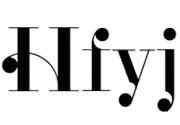
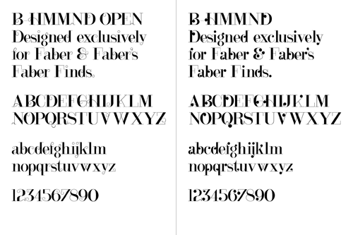
The typeface used for the covers, B HMMND, was designed specifically for the project by Michael C. Place, and while I can appreciate individual letterforms (some at left that I find rather beautiful) and see that they work well with the Bantjes’ patterns (and the Faber logo), they just don’t read very well all together. Some of the titles end up with extraordinarily uneven colour, with great dark patches of ink at one end of a word while the other end is a sketchy ghost of hair-thin lines. Maybe that ‘kookiness’ was the intention but I find it disappointing - the covers are far less appealing as a result; they just look messy and badly typeset. To my mind this typeface would be very successful as-is when manually typeset, or needs a whole bunch of alternates and Opentype rules to allow for a more readable result when set automatically.
I love the idea and how this service has been implemented (the cover titles aside); we definitely need to see more of this kind of thing so that we can get new copies of any out of print book in future. I know that there’ve been old books I’ve wanted to buy only to find that they’re out of print and that second, third and fourth hand copies are incredibly rare - sometimes impossible to find at all. I didn’t want a special first edition or something to squirrel away in an atmosphere-controlled book collection, I just wanted to read the book. For law-abiding, copyright-respecting people like me what options are there? Perhaps one day the whole idea of ‘out of print’ will fade away to be replaced by the very longest of Long Tail economics. I hope so.