I Luv It

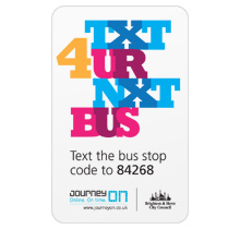
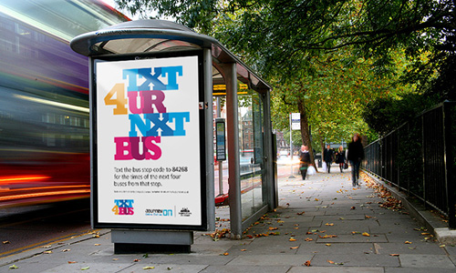
Here’s something I’ve been meaning to post about for a while, and happily it’s a local project, right here in Brighton and Hove. There’s a new service, just launched, which lets you text a code for a particular bus stop to a number and get an SMS back telling you the next five buses to go from that stop. It’s quite a neat idea and pretty fast (I tried it), and a nice complement to the other ways of getting bus information*.

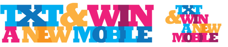
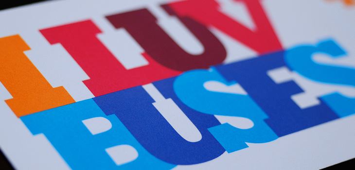
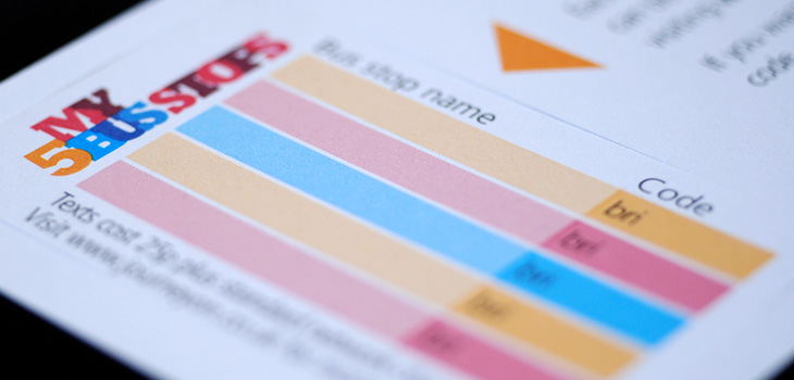
So that’s the back-story. What is good, and particularly appealing to me, is the advertising campaign and the various materials to help people keep a track of the bus stop codes, designed by David Earls of Typographer.org, for Brighton & Hove City Council. I saw a fair bit of the development work on this and I’m glad that this design was chosen and made it through to print unscathed. It’s a beautiful arrangement of type and colour, designed to appeal mainly to teenagers and young adults (and, incidentally, typographers) and adapts well to a wide variety of applications. The typeface (Rockwell Extra Bold) lends itself well to this kind of extreme kerning, with the nicely balanced word shapes the alternating colours and tones ensuring the message remains perfectly readable. The campaign included billboards, bus-stop adshels, A4 posters, information stickers, leaflets with punch-out cards, and a competition to win a new mobile phone:

Available for pick up from buses, local ticket and travel agencies and council offices, these cardstock leaflets publicised the scheme, and…
…they have a wallet-sized card you can pop out for you to record bus stop codes on. The card stock is only glossy on one side to make it easier to write on the reverse.
A mockup of the bus stop adverts.

Alibi

The rebranding of UKTV’s channel lineup has been going on for a while now; every couple of months another of their channels gets a new name and identity, and the original, extraordinarily pleasant and consistent network branding (at right) takes another step closer to oblivion. One of the recent rebrands was for UKTV Style, which got a pretty dreadful implementation of a reasonably nice idea - David Earls wrote more about that on Typographer.org. Next to go is UKTV Food, which will get a logo more suited to a free supermarket magazine (it really reminds me of the old Sainsbury’s one).

I guess you could say I’m not much of a fan of the overall quality of the rebrand, but there are a few good bits in there - Dave, Blighty and Eden are quite pleasant, with some nice ident work. My favourite by far though is Alibi, previously UKTV Drama. They’ve gone for a treatment reminiscent of your fashionable dynamic typography, but incorporated imagery of escape, fear, crime and violence. The typewriter typeface is perhaps a little cliché for the genre, done to death in countless private investigator made-for-tv stuff, but the stylish animation rescues it, keeping the familiar associations while providing some originality and freshness. There’s a montage of the channel idents here, and I’ve a few screenshots below.

Lovely.

Textual Textile

I’ve had this care label sat around on my desk for a couple of weeks, I was going to throw it out but I just like the lettering on it. Care labels are usually just printed bits of scratchy nylon and polyester, so even though this one was just as scratchy, it’s at least embroidered and has nice lettering. I especially love how the reverse looks too, with the lettered parts all tight and neatly stitched and the rest of it all fuzzy and loose.

Notice the obvious similarities between this lettering and those tiny pixel fonts you can get.

Royal Mail՚s Royal Insignia

I love projects like this, a Flickr group purely for Royal Mail postboxes identified by postcode. There are currently 5679 photos in the group, so is getting to be a pretty good catalogue of the postboxes in the UK - though with 115,000 in total there’s still a way to go. One of the first ones I clicked was pretty close to where I’m from, and lo, a quick search reveals the one very close to where I grew up. Ah, memories.

One of the interesting things about all these postboxes is the variety in the emblems of the reigning monarch - from Victoria to Elizabeth, they range from the florid and calligraphic to the frankly rather austere. Naturally, I’ve had a play around recreating some of the emblems, below. I wonder at the unnumbered George ones though; I’d guess they must be from during the Second World War, or directly afterwards - they suggest the Austerity period to me, but why no number? The extra metal and work required would be minimal, after all. As for the other later ones, the lettering looks to be inspired by Caslon types, though with plenty of variation from the hand-carved moulds, which has given them various profile styles from soft to sharp-edged, strengthening and highlighting the symbols - a kind of 3D hinting, if you like. I hope the effect was intentional, as it’s rather nice.

Some of the emblems - which I rather freely recreated rather than tracing them accurately. Show here are the rare Edward VII, variants on George VI, Elizabeth II and my very own wild speculation at Charles III (if that is indeed what he takes as his regnal name).

Perhaps controversially, I also had a bit of a play at creating a symbol for Prince Charles when (or if?) he becomes king. He may choose to reign as George VII, though from a design point of view I hope not - if he keeps his current first name he can have that ‘III’ fitting into the counter of the C, which I rather like the look of.

Some details of photos from the set. Clockwise from top, they are Ponthir NP18 123, Edinburgh EH1 585, Haywards Heath RH17 79, Garstang Road PR3 215, Whitley Bay NE26 294, Beamish DH9, Hawkesbury Upton GL9 213, Lancaster LA1 122, Northleach GL54 244, Potters Bar EN6 1NR

Austrian Applied Art

A while back Jo at Languste Fonts sent me a link to the collection of the Austrian Museum of Applied and Contemporary Arts. Their collections site is pretty huge, with sections for ornamental and woodblock prints, textiles, drawings, and posters. Lots and lots of posters. They’re arranged in categories, but the best thing is just to keep clicking through them and enjoy the variety - there’s some pretty gorgeous lettering, type and illustration in there. I’ve (of course) traced some of it, and I love the blackletter calligraphy below. I’d link to the page, but it’s one of those sites that doesn’t have unique URLs for things. Just search for Nieder Österreich and it’ll be in there somewhere.

The lettering on this one is beautiful; it’s so expressive and playful! Shame the illustration wasn’t finished to the same quality, even though the overall effect is still rather attractive.

While I liked the lettering on this, it was the illustration that caught my eye - it’d make a good poster in its own right.

This beautiful uncial lettering is from this poster, showing the tower and spire of St Stephen’s Cathedral in Vienna, which I traced on another poster here.

Rob Chiu

Monoscope linked to the showreel of Rob Chiu the other day, it’s definitely worth a look, but one thing that particularly caught my eye was this piece for Flash on the Beach. It’s a conference that happens every year in Brighton, and these days is more about everything Adobe and everything design than Flash specifically. I think a big part of the appeal is seeing the nicely composed shots of the Brighton seafront with the letters arranged in the scene (and frequently getting blown over). It’s nice to see some of the reactions of people walking past too. That’s it really. It’s nice. Go and look.

Genuine Imitations

This Thursday just gone, Matthew Carter presented the fourth annual Justin Howes Memorial Lecture for the St Bride Library, Genuine Imitations, a type designer’s view of revivals, and I was lucky enough to get a ticket for it. All the tickets went in two hours, and St Bride moved the event to Conway Hall to allow more people to go, yet even after that there was a waiting list!

I’ve written up the talk for I Love Typography, so head on over there to read all about it - it’s quite long, but Carter made some good points that I found rather inspirational, and I hope you will too.

Leo Beukeboom

Another gem found through Coudal, this. Re-Type posted an article about the beautiful lettering by Leo Beukeboom on the windows of bars and cafes in Amsterdam (with a nice appreciation of decent, old-style, non-trendy bars in there too). There’s a series of photos with the article, which I’ve traced the lettering from (below), and as a bonus Re-Type themselves are working on interpreting the lettering into an Opentype face, which so far looks great - can’t wait to see it finished.

Top image traced from the image here. Bottom two traced from images on Re-Type’s article.

I did a bit of hunting around for more information on Beukeboom, and found this article on David Quay’s site, containing a lot of background information and an interview, which is fascinating and well worth a read. I’m particularly taken by this:

The letter you use on a pub window depends on the type of pub. If you have a traditional brown café, with lace curtains on copper curtain rods, with stained glass windows, you choose a nice, ornamental curly letter, because it fits in with the environment. It is not the information that counts, because everyone can tell it’s a café, but it’s about decoration, about creating an atmosphere. For the lettering on the traditional brown cafés I developed my own script based on the calligraphy of Jan van den Velde.Leo Beukeboom, from David Quay Design

I love that. The words themselves become secondary to the style in conveying information - without knowing what it says, you know what it says. Certainly not an infallible system, but most types of place (and many things) have their signature look, and as I’ve posted before (warning, extremely wordy article) you should know what you’re doing before you mess with it. They’re the design patterns of urban existence, if you will, though in the case of Beukeboom’s lettering, this is one that is slowly fading - unless anyone wants to become his apprentice that is. If he still wants one.

Serbian Manuscripts

Well that was fun. BibliOdyssey posted these images of manuscripts from the National Library of Serbia last week, and I wasn’t sure if I wanted to trace vyaz script lettering, or redraw it. The urge to redraw won out, and as I was doing it I remembered this post from Tiffany on Flickr, which led me to this thread on Typophile, where Ivan Gulkov shows some virtuoso skills with the style. I can understand the decision not to create a font and instead create a vector file of parts - I ended up creating a set of parts myself for my redrawing below. Creating a font would be a mammoth task, and besides, creating lettering like this is fun. You can see more of Ivan’s work and his portfolio on his personal site. Go take a look.

Top, redrawn from this. Bottom, redrawn from this.

The lettering I’ve redrawn differs a bit from the vyaz script in the Typophile thread, which makes me wonder how much regional variation there was in the script, or whether it was just down to the styles and whims of the individual scribes. In my redrawing I’ve tried to keep to the original lettering, but have straightened the verticals and made the spacing more regular, which I think still keeps to the spirit of the original. I’m also interested in this one, which seems to have some kind of transitional form going on. As the style appears to be more about creating an image rather than being easy to read, it reminds me of the patterning and illustration possible with Arabic calligraphy, which I’ve posted about before.

Further Enduring Characters

Coincidentally, not long after coming across Character, I found this article about the Berlin Museum of Letters on Core77 (via NOTCOT). Obviously enough it’s a museum devoted to letters, big ones created for building signage and wayfinding in wood, metal, glass and plastic. Core77 has some beautiful photographs and a bit of background info on each one. I really, really, want the DaimlerChrysler ones; so shiny! Lovely stuff, go and take a look.

Some of the letters, and the DaimlerChrysler ones on the right. Lovely.

I love this image. This and the other photos in the article are by Aart van Bezooyen.