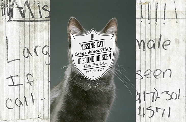
One for the ‘what a nice idea’ pile, this. Cardon Webb goes round upgrading notices pinned up in the streets - you know the ones, ‘Lost Cat’ and the like. There’s one I saw the other day near me that was pleading for the return of a lost plush bunny. I hope they found it; the tone of desperation told a whole story in itself, a wailing inconsolable child, pushchair left unfolded in the hall, coat fallen to the floor, scattered attempts to make-it-all-better: a melted bowl of ice cream, other toys, the Teletubbies DVD and so on, and still the sobbing.
Anyway, back to the nice things. I found this on idsgn, who had created a nice header graphic out of the ‘before’ and ‘after’ images of one of them, and I found that such an appealing presentation I’ve recreated it myself. Still, the original works are the stars of the show, so have a look round on Cardon Copy at the others. I initially thought that the idea was to simply improve the original notices but found a few of them rather hard to read, reading the Cardon Mission reveals all:
Cardon copy takes the vernacular of self-distributed fliers and tear-offs we have all seen in our neighborhoods. It involves hijacking these unconsidered fliers and redesigning them, overpowering their message with a new visual language. I then replace the original with the redesign in its authentic environment.Cardon Copy
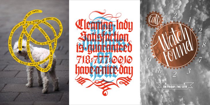
So there you go, the key phrase is ‘overpowering their message’. Explains some of them. The others, like the one below, are far more appealing. You’d keep an eye out for that cat:
This is my favourite one.Harder to read at a glance, but probably more likely to make you stop and look than the originals.
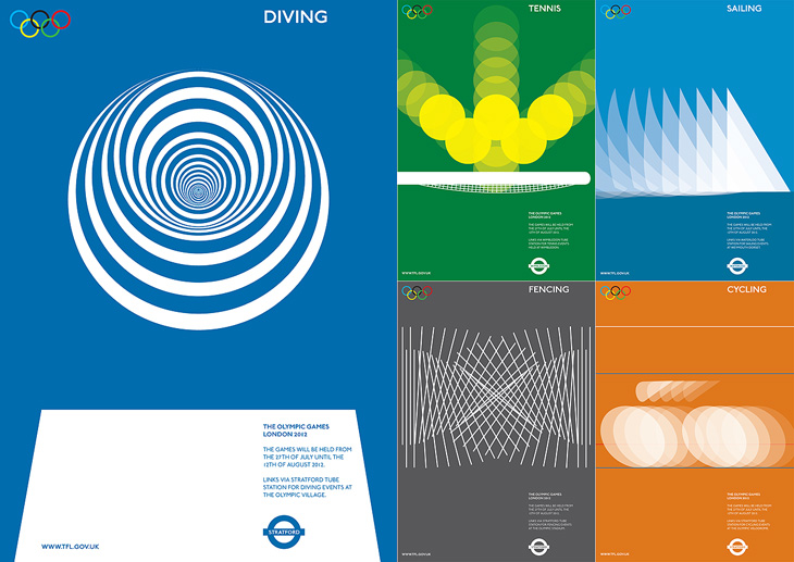
I am indebted to Adrian Giddings for finding the originals of these images. I saw them on Design Crush, and from there to ffffound and from there… a blank. Blogger really needs some kind of reverse lookup for their dreadful impenetrable image URLs, and ffffound needs to better record the URL of the page containing the image. Still, I now know where these posters are from. They’re clever, simple, and have a graphic elegance reminiscent of Otl Aicher’s work for the 1972 Munich Olympics, with typography that is pure London. If Wolf Olins had gone down this route I’m sure there would have been far less controversy about the branding for London 2012.
Of course, these are proposals designed to work with the Transport for London branding, not for the Olympics, and I think work perfectly in that context. For the Olympics itself, for all their cleverness and simplicity, they’d be a bit too classic Olympics, a little too safe. Perhaps.
As for the actual 2012 logo/brand, it’s has been out for quite a while now, but I’m still not entirely sure yet what I think of it - I don’t like it, but it may be exactly right for the event. We won’t really know until after the Olympics, and then, no doubt, we’ll have plenty of learned analyses about it to tell us what to think. I wonder how agnostic I’ll be able to be.
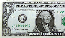
I saw this linked from ISO50 this morning: The Dollar Redesign Project is a competition (Campaign? Bit of fun?) to promote the idea of fully redesigning the US banknotes, possibly on a regular basis, like many banknotes the world over:
The American Dollar has not truly been redesigned since about the 1930s. The Dollar ReDe$ign Project is your opportunity to theoretically ‘change’ that. Yes, technically there are many limitations and complications when it comes to bank note design, but if the Swiss can do it on a regular basis, why can’t we North Americans too?The Dollar Redesign Project
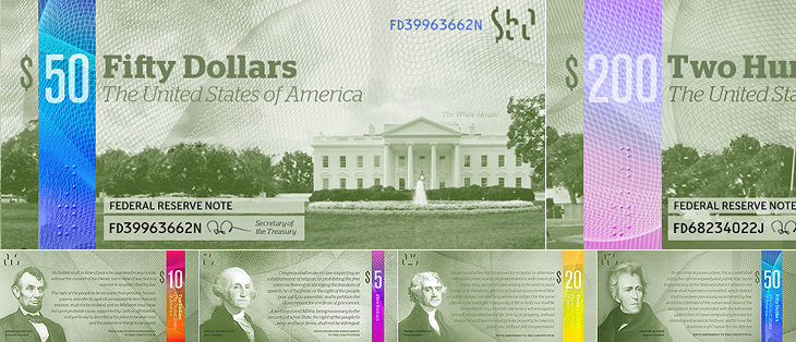
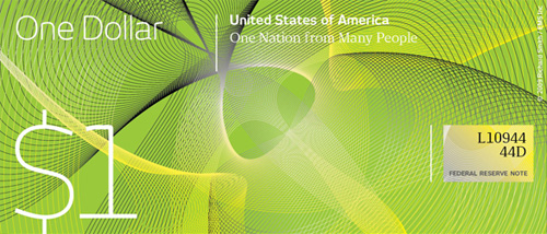
There are only a few designs on there at the moment, some a bit jokey, but of the serious ideas I quite like the ones in the first set below. I can’t see any notes that deviate too far from the originals being successful, as there are so many cultural and linguistic associations with the ol’ greenback; it may seem tediously conservative, but notes that aren’t predominantly green just won’t feel like dollars. I hope the designs go further than the ‘stick a guilloche on it and call it a banknote’ idea - guilloches are beautiful things - I wrote about them before, here - but it takes more than a few of those to make a successful banknote.
Perhaps a little too reliant on that colour bar to tell them apart, but I like these.I like the return of the original US motto, translated and updated as 'E pluribus unum' on this one.Relative sizes of UK notes
One usability feature common to many banknote systems, and I’m surprised the designs so far haven’t addressed it, is to have different denominations in different sizes. UK banknotes do this (see right) and it’s reasonably easy to feel whether you’ve a £5 or a $20 note in your pocket because of it. £50 notes, while far from the tablecloth-sized notes of old, seem positively enormous compared to a fiver. I wonder how many mistakes are made every year from having all the notes the same size?
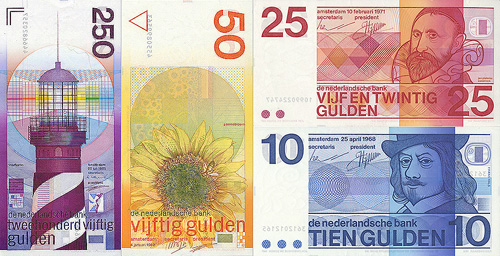
Of course, no article about banknote design would be complete without a mention of Ootje Oxenaar’s designs for the banknotes of the Netherlands below, now sadly replaced by the rather dull Euro notes. At the risk of seemingly terribly shallow for a moment, to my mind the design of the Euro is a pretty good reason for the UK to keep the pound. Banknotes are like little works of art, and to squander the opportunity to produce a remarkable and beautiful design for them is a sad thing. I shall be watching what comes out of the Dollar Redesign Project with interest. I may even have a go myself.
A few of Ootje Oxenaar’s designs for the Netherlands banknotes. More here.
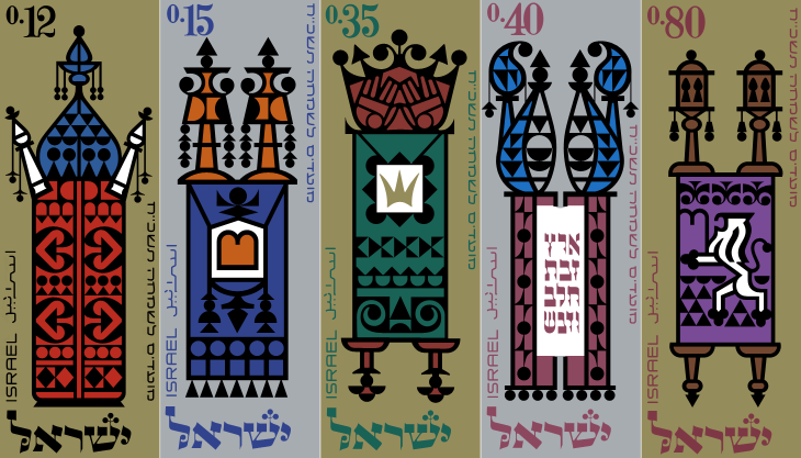
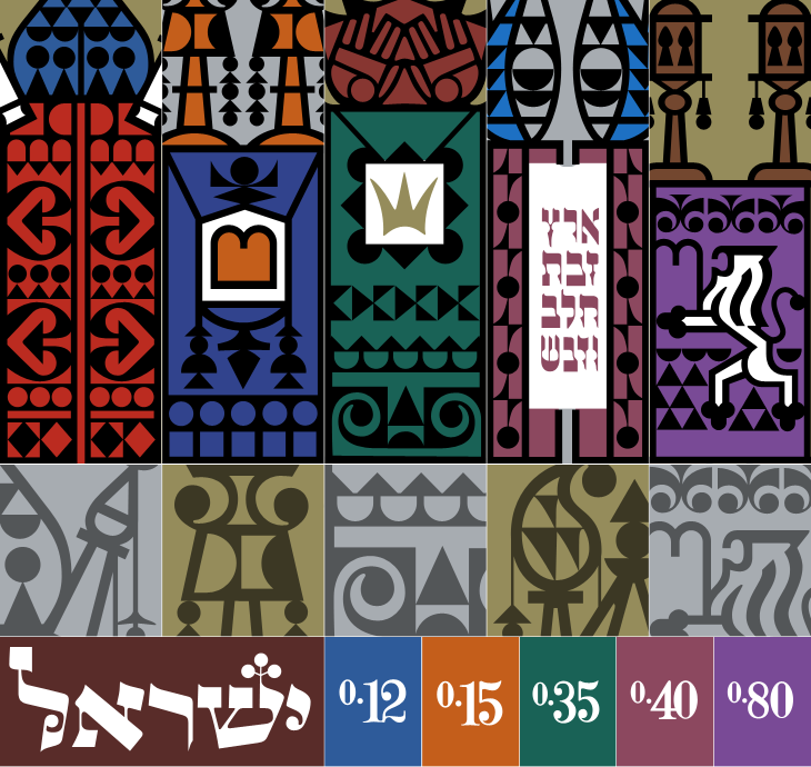
Ffffound is a dangerous site. I try not to visit unless I’ve got a couple of hours to spare as before I know it it’s dark outside and I’ve got a couple of hundred tabs open all with amazing things in. On my last bout of browsing the site I found a couple of links to So Much Pileup, specifically these two posts, Philately Fridays: Israel 1967 and Israel 1976. I’ve traced both, but I’m just going to post the one set for now as I’m not entirely satisfied with how the 1976 ones came out. Some things just need gold ink.
The set of stamps was called “Joyous Festivals 5728”, released in that year (1967) and commemorate five festivals with illustrations of decorated Torah scrolls. Each of the stamps originally had a tab showing an illustration of an open scroll and a biblical sentence, which unfortunately I don’t have decent pictures of. There’s a tiny bit of information here, courtesy of Israel Philatelic Federation’s stamp catalogue (another strangely hard to use website). I’ve included my tracing here. The patterns are beautiful:
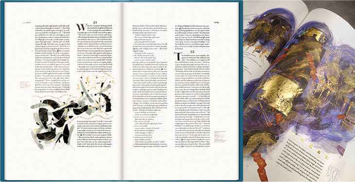
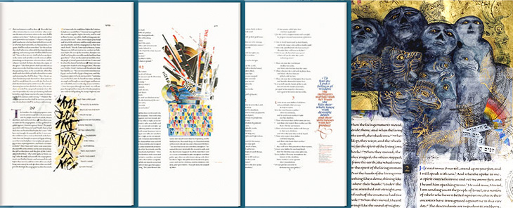
This may be a bit of an old link, but it’s new for me, I think. The St. John’s Bible is a project by Donald Jackson (and team) and Minnesota’s Saint John’s Benedictine Abbey & University to produce a hand-written and illuminated bible to, as they put it, celebrate the new millennium. It’s both a massive project and a massive book - over 1000 pages with spreads 80cm wide by 60cm high, produced over 10 years at a cost of four million dollars (though its value may be denominated in other ways). The origin of the work is interesting in that it comes from the classic desire to complete a magnum opus:
For many years Donald Jackson, Senior Illuminator to Her Majesty’s Crown Office, had dreamed of creating a modern, illuminated Bible to celebrate the new millennium. Finally, in November 1995, he presented the idea to Saint John’s Benedictine Abbey & University in Minnesota.¶ Work started in 2000 and is scheduled for completion in 2007, at a total cost of over £2 million. It is taking place in a scriptorium in Monmouth, Wales, under the artistic direction of Donald Jackson and his team of scribes and illuminators.The Victoria and Albert Museum
Jackson has brought together an incredible range of styles for the bible, from rich, lush, gold-encrusted illuminations reminiscent of Eastern Orthodoxy to crisp and spare compositions more like the modern style of the Church of England (to my mind at least):
The Saint John’s Bible will represent mankind’s achievements over the past 500 years. It will be a contemporary blending of religious imagery from various Eastern and Western traditions, as befits our modern understanding of the global village.St John’s Bible website FAQs
The disparate styles are unified by the common thread of that beautiful lettering and calligraphy, and by the script for the main text designed specifically for this project by Jackson himself. I’d love to hear more about that project! You can just about make out the script on the larger watermarked images. Just.
Which last point leads me nicely onto my one little whinge, not about the project, but about the website for it: I just wish there were a couple of closeup photos of the bible on the site. I can see why they’d be wary of possibly having their hard work ripped off, but it’s not like you need full-page scans to see the quality of the calligraphy and detail; a few square centimetres would do. After all, the prints aren’t all that cheap, and getting a bit of a closer look would be reassuring. Of course, if you’re seriously loaded, you can buy a copy of the Heritage Edition, for $145,000. If there are any left, that is.
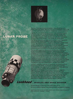
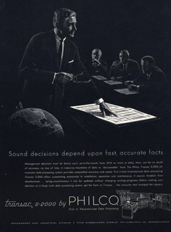
Here’s a great collection of science and techology adverts from the 50s and 60s, full of wonderful illustration, type treatments, vintage logos and some pretty inspirational layouts. I’ve got a few details of some of my favourites below, but be sure to have a good look through the set as there’s a load more in there that are great, such as this, and this. There are a few other interesting Flickr sets by bustbright too, including this collection of Bebrauchsgraphik covers which I’m going to have a look through. This one is great.
Click each image to go to the Flickr page for it.
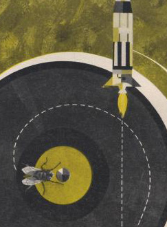
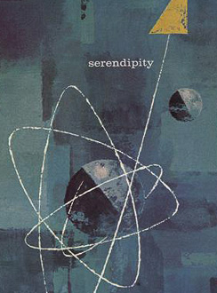
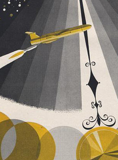
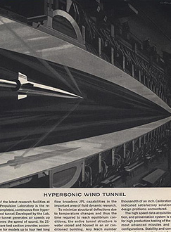
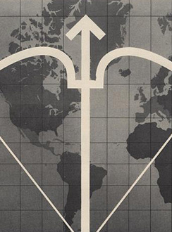
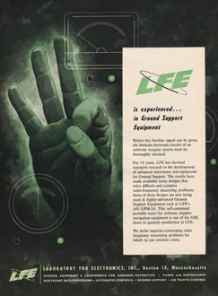
So there are some of my favourites. The top row is that combination of rough-textured painting and precise drawing that characterises mid-century graphic design. I love it. Below those are some nice type and logo treatments: that ampersand, for example, is made from an orbiting particle, yet sits halfway between the classic and commercial ampersands. Interesting! After that there’s six illustration styles: a dramatic JPL illustration which looks like a Victorian steampunk device for testing space-age technology; a cold-war classic world map with presumably The Crossbow of Progress overlaid on it; then a ghostly green hand of A-OK (don’t try this gesture in Turkey)
; a lovely space scene which I think could do without the little globe inset above the text; a spare and sharp layout and illustration for Philco - though the outline drawing of the computer looks like something demanded by the client rather than part of the original design; then an advert promising a level of defence from incoming missiles that even today we don’t have. Old adverts are great.
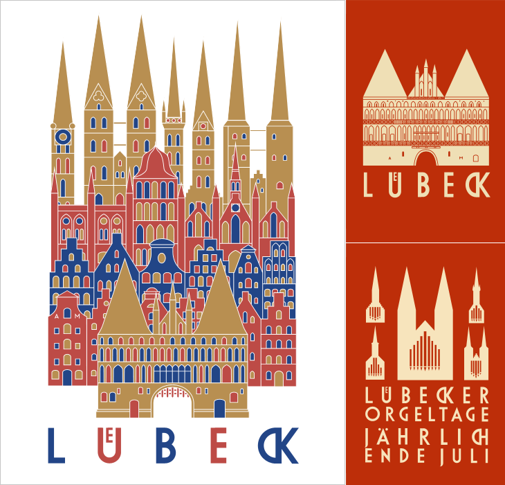
I’ve been following the excellent Cooper Typography Blog for a little while now, and recently Sasha pointed me to his article on Alfred Mahlau, with a short biography and a large collection of images of his work. Of course I’ve traced a few of them below. The lettering is distinctive and highly geometric - the curves are all based on circles - and has some attractive ligatures. As Sasha said in his article, the treatment of some of the umlauts is attractive - replacing the diacritic with a digraph when writing Lübeck. Check out the rest of the site; it’s got great articles, fascinating examples and links (you may lose a day or three with this one), and is definitely well adding to your RSS/bookmarks.
Have a look at this article about Lübeck to see the original of what’s represented in these posters. The distinctive cityscape is also used in the still-used brand identities for Niederegger and Schwartauer Werke, also created by Mahlau.
A few more, so you can see the lettering. More here.
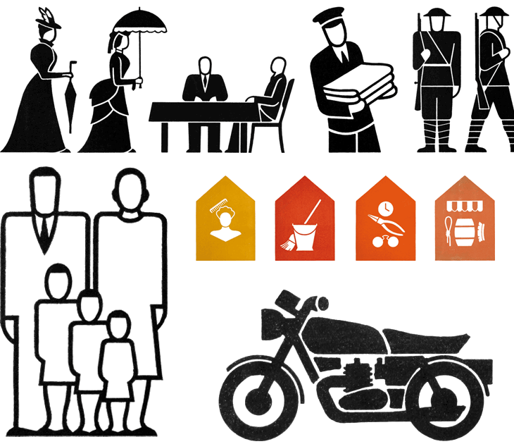
A couple of weeks ago I linked to the AIGA set of passenger and pedestrian symbols, and I find today (again, via Chris Glass) this set of icons by Gerd Arntz. These ones were created much earlier in the 20th Century; as part of the Isotype project set up by Otto Neurath to provide information to the often-illiterate proletariat, newly empancipated by socialism:
This knowledge should not be shrined in opaque scientific language, but directly illustrated in straightforward images and a clear structure, also for people who could not, or hardly, read. Another outspoken goal of this method of visual statistics was to overcome barriers of language and culture, and to be universally understood.gerdarntz.org
The set is worth having a look through, especially if you read this detailed essay on Isotype as well (thanks to Sasha for the link). Gerd Arntz’s earlier work, strongly informed by Otto Neurath, is near the top of the list, while his later work is near the bottom. A few of my favourites from the set here - some of them remind me of the opening titles of the TV series Jeeves and Wooster (set in the same decade most of these were designed):
Some symbols from the Isotype set. There’s much more information on Gerd Arntz, his other works and more about Isotype and Otto Neurath here.
Looking at these, seeing the symbols that were once universal, and those that still are, I can’t help but wonder which of today’s universal symbols will be understood in 50, 100, or 150 years time. Some will of course require updating as technology develops - for example you can see how the shape of cars (and therefore the related symbol) has changed from this vintage one, to this more modern one. Others, such as the family one (above) are still perfectly recognisable today and we can imagine will continue to work perfectly for centuries yet. However, could societal changes mean that future ‘family grouping’ symbols will need to be less gender specific or specify one adult, two, three or more; will extended families or multi-family groups be the norm? How can we design symbols that last when we don’t know what will change? Should we even try? It’s certainly something that occupies the minds of people trying to come up with an effective symbol for nuclear waste. If symbols can become out of date in 50 years, how to design one that still works for 10,000 years ahead?
All the news that’s fit to have yet another icon for.
It’s these changes to what we regard as universal and unchangable that interest me, along with this idea of developing a consistent visual language for a wide range of things. Using a personal example for a moment: like anyone who’s had to design a website or any kind of user interface in the past 10-15 years I’ve designed a fair few icons, and even in that short time there’ve been a lot of changes to once common symbols. There was a time when the prevailing wisdom for corporate websites, intranets and e-learning applications was icons with everything and if you can click it, icon it which meant vast libraries of confusingly similar icons for similar concepts - ones where words would be better. Think how to differentiate (on a small icon) between reloading a file, sending a file, moving a file, receiving a file, copying a file, downloading a file, uploading a file, and so on. Would you use arrows? Pointing which way? Left, right, down, up? Maybe you need curved arrows too. Colours?
Fortunately we’ve moved beyond that (mostly), but I remember that you just had to have an icon for ‘news’, which, so that you wouldn’t confuse it with any ‘documents’ icons, was for a while represented not by a newspaper but by an RKO-style radio mast - indeed, if you remember Pointcast, you may remember the application icon for that was that very thing. Now, our visual language of online icons is part of a rapidly maturing set of design patterns - we see icons, but only for a very small set of functions that are common across sites and often across devices; things such as shopping basket/cart, info, and the audio control icons such as play and pause. It seems that for online applications the idea of a universal visual language is at least seriously out of fashion, and I wonder how much of an influence that will have on the offline world.
Will airports of the future only have symbols for one or two things? I guess that depends less on fashion and more on the growth of literacy in the world, and the decline in the number of languages people will use.
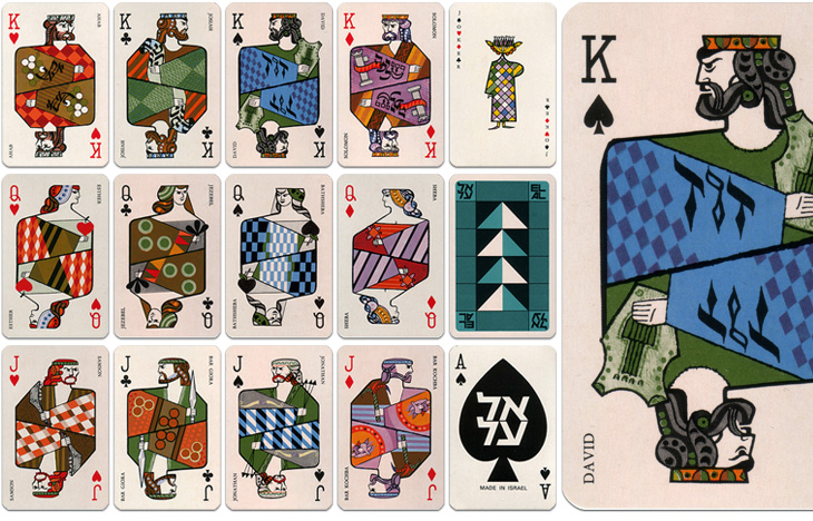
The other week Grain Edit posted some photos of these 1970s playing cards produced by El Al and beautifully illustrated by Jean David. They depict Kings, Queens and Heroes from Israel’s biblical past, and come as a boxed pair of sets with an illustrated cardboard sleeve. I had a look around for some clearer photos so I could get a better look, or even a good source of info on Jean David, but there’s not much out there at all. I did, however, find an eBay auction for a set of the cards, so I got my very own set - eventually, and they really are lovely:
El Al playing cards, Illustrated by Jean David
The cards are indeed beautiful and are also nice depictions of the biblical characters - wise Solomon with his scrolls, Jonathan with his arrows, Samson with his jawbone, etc., and reflect the tradition of representing the legendary or historical characters on cards. There is a nice nod to the Paris court tradition of playing card characters by keeping the depiction of David as the King of Spades. Of the other traditional biblical characters, Sheba replaces Rachel as Queen of Diamonds and (unsurprisingly) Judith is replaced with Esther as Queen of Hearts. Julius Caesar is an obvious one to leave off (far better to show Solomon), and instead of the sometimes-shown Judas Maccabeus as Jack of Clubs there’s another leader of a revolt, Bar Giora. I guess it’s hard to choose such a small number from all the people in Israeli history, but if you’re going to show Bar Kochba, you have to show Bar Giora too. Perhaps.
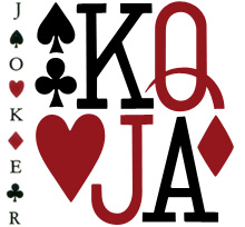
Beyond the history lesson, looking at them got me thinking about the type used to identify individual cards in general. The individual numbers and letters work very well on the card, and are pretty much standard for all cards, but put them together and you see that there’s not much consistency between them at all. As a set, they’re discordant, drawn on a whole different scale to each other, the curve of the J appears exaggerated and incredibly wide compared to the Q, and the K’s slab serifs are enormous, but individually, they each work just fine. I’ve seen playing cards motifs and designs implemented as branding and packaging (such as this rather nicely branded wine), and I notice now that they never used the actual type style from the cards themselves - obviously, designing characters to sit alone is a different art to designing them to sit together.
While I’m on the topic of characters sitting together, it’s a shame (and surprising) that the type for the names isn’t kerned, and more so that it’s the King David card where this is most obvious. Fortunately, apart from Bathsheba, the names of the others are pretty forgiving and the lack of kerning isn’t very noticeable. Still, it’s surprising that that was allowed through, given the overall quality of the cards.
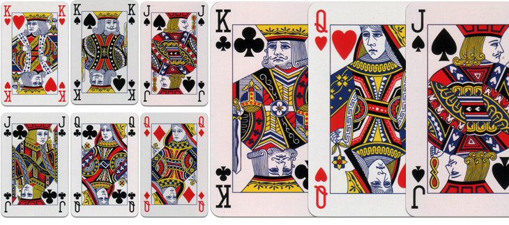
Modern standard card designs. These are from a House of Lords deck.
I dug out my standard set when I got the El Al ones so I could compare them. There’s something quite comforting about how they’re familiar they are, but I was wondering how standardised they really are. Looking at the set above, which is a fancy-schmancy House of Lords set and comparing them to a cheap £1 set from a newsagents, there is a fair bit of difference in the quality and the detail of the drawing, although many of the design elements are consistent; for comparison, I’ve put a queen card from each next to each other here. I had imagined there would be a bunch of royalty free EPS files that you could buy or download and slap on your cards, but perhaps not. One thing that seems to be important for standard cards is that all the characters have to look really, really tired and unhappy, a convention I’m glad to say wasn’t followed with the El Al cards.


